Pivot
Pivot is short for Pivot Table and is a standard data analysis technique (see Wikipedia). In general, pivoting describes a process of binning data based on categorical or numerical values. The Pivot command in DataGraph allows you to:
- bin data using categories or numerical/date ranges
- count values in a category or range
- calculate summary statistics
- dynamically sort values
The Pivot command creates a bar graph using the pivoted data.
Often, pivoting is a two-step process: you create the pivot table, and then use it as a source for a graph or chart. DataGraph does this in one step. The Pivot command computes the pivot table and draws it in the same action.
From the Pivot command, you can also extract the calculated values back into the data table to use in other drawing commands. These extracted columns remain linked to the original data and are updated when the data changes. This makes the Pivot command a very powerful tool for creating graphs and analyzing and understanding data.
Input
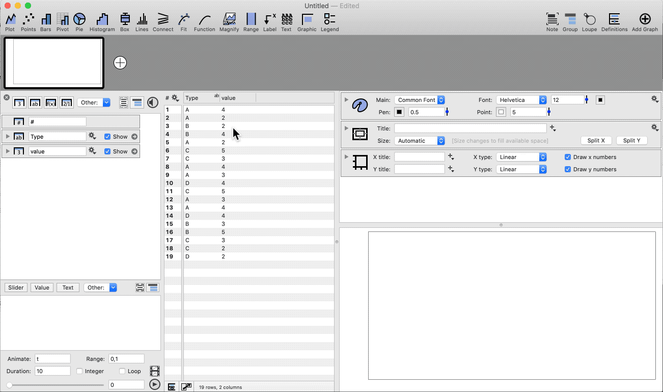
To use a data set in the Pivot command, the format should be a flat or long table of tables, where each entry is a single row. If your data is already in a wide format with many columns, use the Data > Flatten data to prepare the data.
To learn more, see: How to ‘Flatten’ Data.
The input fields on the Pivot command are:
- Rows – categories for binning
- Columns – categories for binning
- Values – numeric data used for summary statistics (optional)
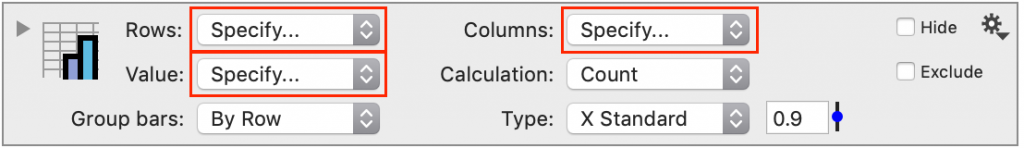
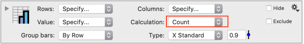
When you create a new Pivot command, the calculation option is ‘Count’.
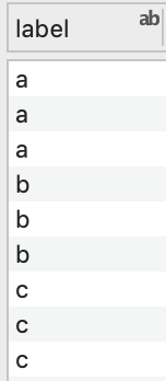
One Column
When one column is selected, the Pivot command will count each unique entry.
The resulting bar graph can show the counts or percentages.
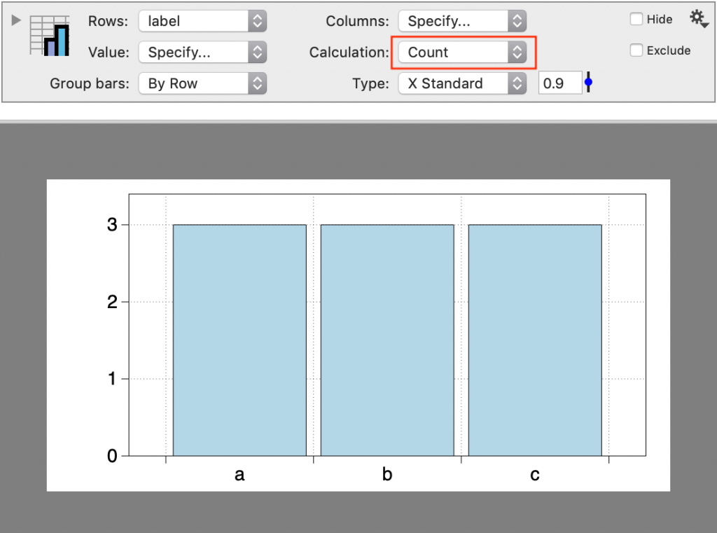
The input column can be a text or a number column.
Two Columns
With two columns, you can also calculate summary statistics.
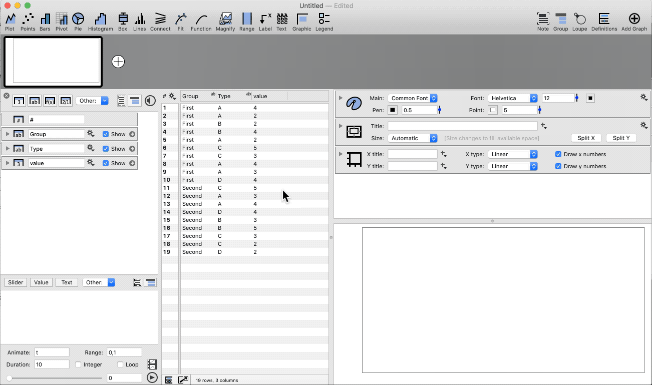
Three Columns
With three columns, the data is divided into a second set of categories. Add a Legend command to show them on the graph.
Quick Create
Highlight the data columns before adding the Pivot command.
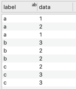
Bin with One Category
When a category has more than one value, the data is binned, and the bar graph can show various summary statistics (i.e., mean, median, minimum, count, range, etc.).
In this example, we have a single column of data that we want to group by a categorical column and calculate the mean and standard error on the mean (SEM).
- Highlight two columns (category, number)
- Select the Pivot command shortcut
- Change the Calculation to ‘Mean + SEM’
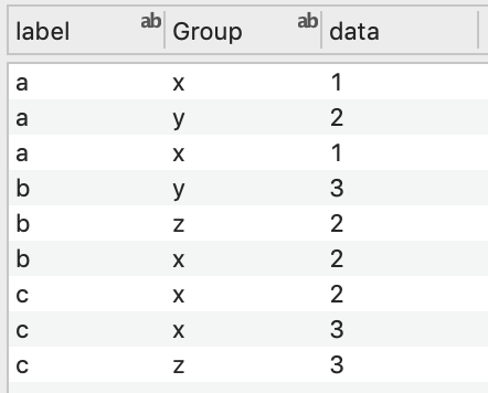
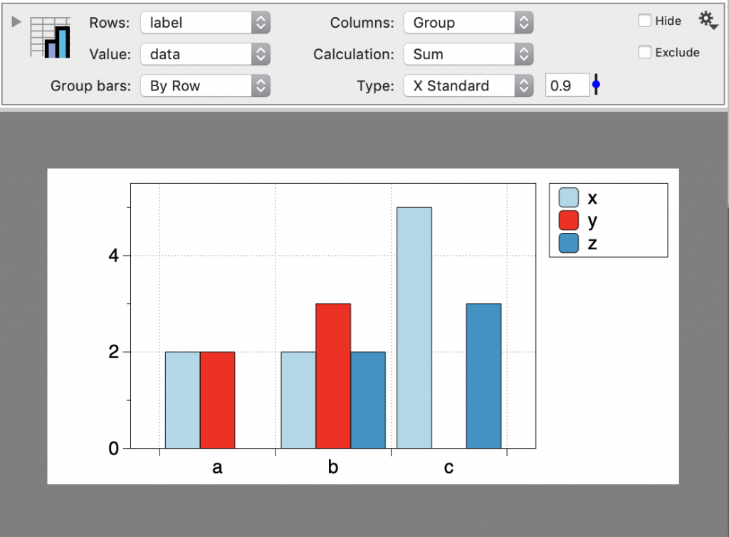
Bin with Two Categories
Group the data based on two categories.
- Highlight three columns (category, category, number)
- Select the Pivot command shortcut
- Add a Legend command
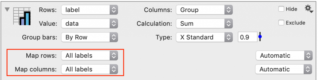
Mapping and Grouping Data
The Pivot command has two drop-down boxes called Map Rows and Map Columns, allowing you to further group and map data. The menu options for these drop-down boxes vary depending on the data type specified in the Rows and Columns drop-down boxes.
Text columns
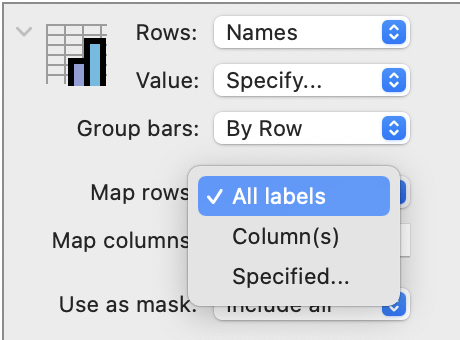
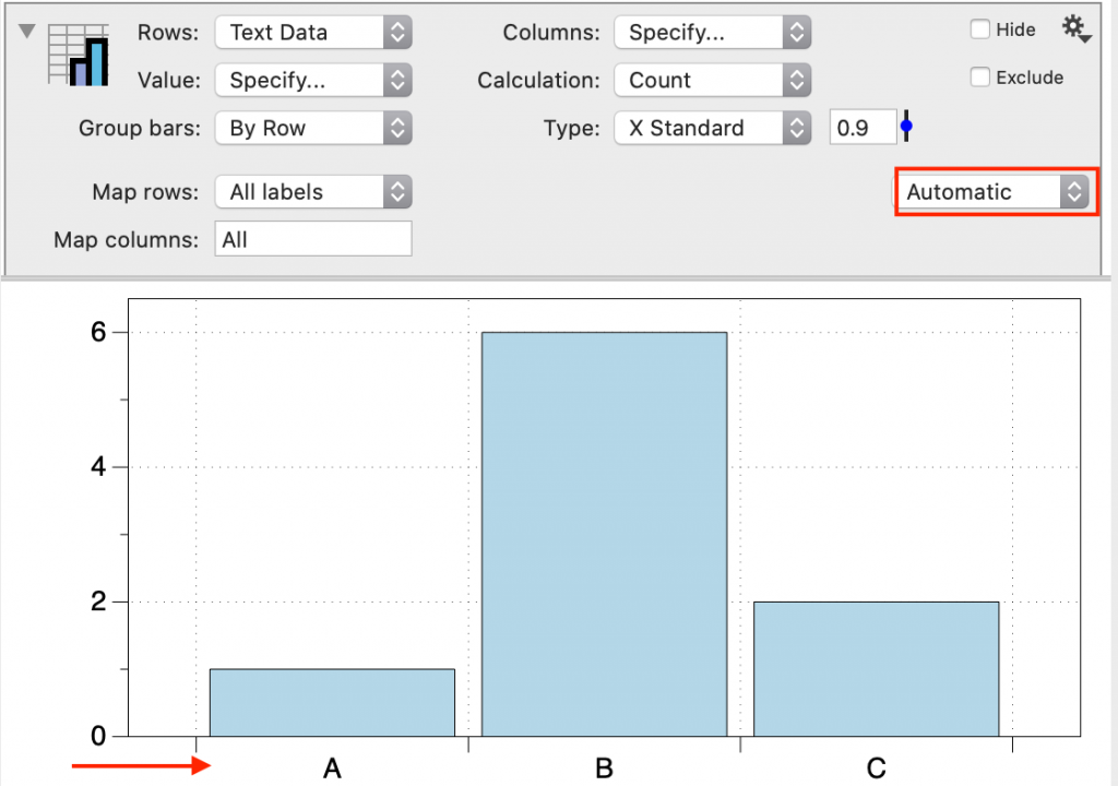
When the selected rows or columns have a Text data type, the default Map setting is ‘All labels’, meaning that all of the unique entries in the input data are included in the resulting bar graph.
There are two other options: ‘Column(s)’ or ‘Specified’.
Using these options, you can dynamically:
- Change the order of entries
- Limit or add entries
- Replace an entry with a label
- Group/Map data based on the new label
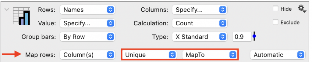
COLUMNS. The order can also be specified from a column. Change the Map rows to ‘Column(s)’ and select the column with the order from the data table. For example, consider this column where the Pivot command will count each unique entry by default.
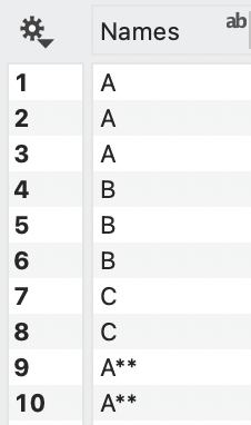

If you want to have ‘A’ and ‘A**’ counted as the same entry, you can create columns that map the entries in the data table. For example, we have added two columns, one with each unique name and a second that shows the name you want for each row.
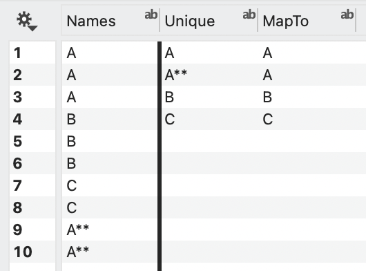
Select these columns as shown.
This will map the ‘A*’ entries to ‘A’, resulting in the following graph.

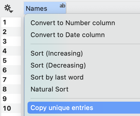
NOTE: To create a list of unique entries from a Text column, control-click on the column header and select ‘Copy unique entries’. Deselect the column and use Edit > Paste to create a new text column.
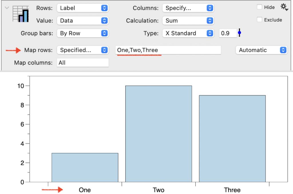
SPECIFIED. If you change Map rows/columns to ‘Specified,’ an entry bar appears where you can manually enter the data groups you want to be displayed as a comma-separated list. This works similarly to a mask since only the entries listed will be included. The bars will also be in the order listed.
Number columns
When the input for Rows or Columns is Number columns, the default setting is ‘Automatic’. DataGraph will bin the numeric data in this setting based on the input. If you want to change how the data are binned, several options are available.
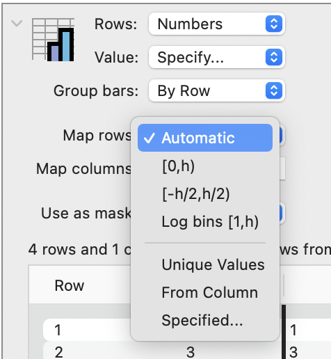
You can also specify numeric values to include using the ‘Specified’ or ‘From Column’ options, similar to those described in the previous section for Text columns.
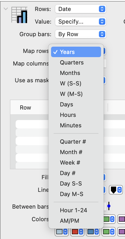
Date columns
In this case, you can group the data over time by years, quarters, months, etc., or you can group the data by a number representing quarters, months, weeks, and days.
Sorting
By default, the menu is set to ‘Automatic’ and sorts alphabetically for text data.
Change the sort option to ‘Increasing’ or ‘Decreasing’ to update the order dynamically.
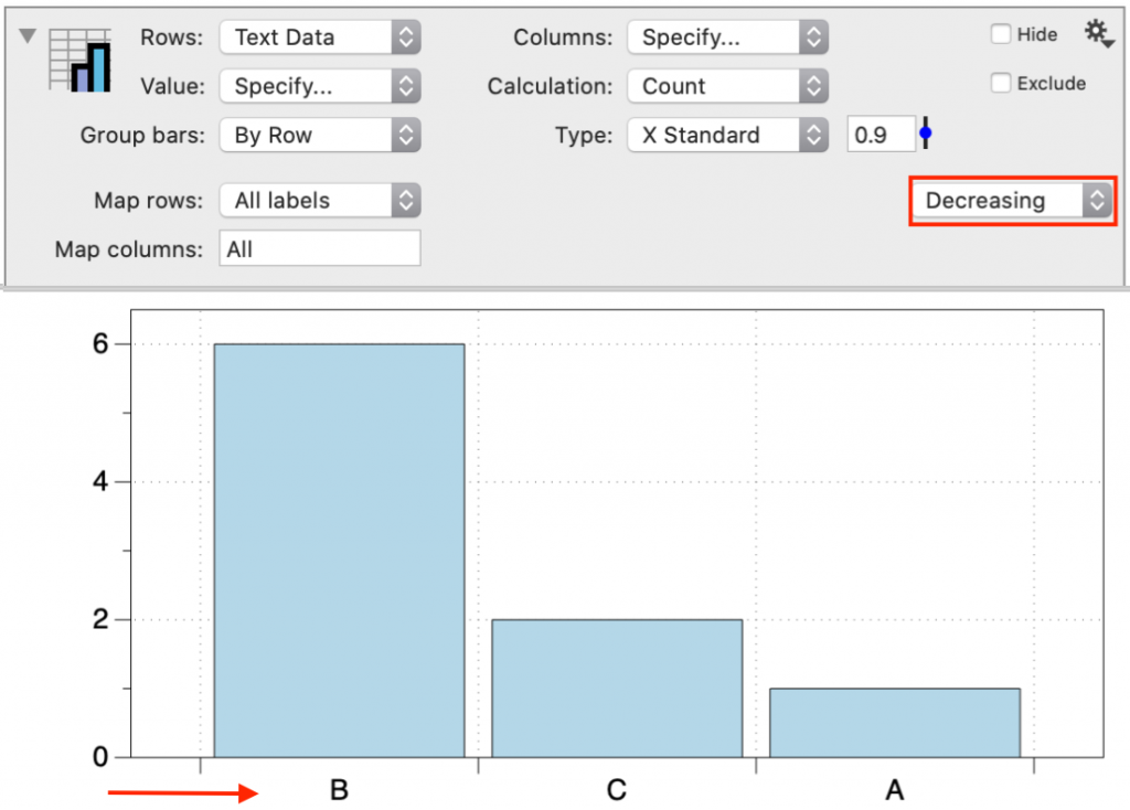
The available sorting options will depend on the data type and how it is grouped.
Output
View Results
The values calculated in the Pivot command can be viewed and examined by expanding the view.
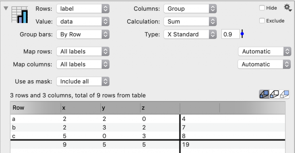
Here, you also see the overall total, which is not shown in the graph.
Extracting Results
Using the Gear menu, you can extract the result back into the data table to use in other commands.
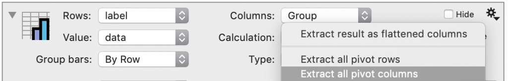
You can extract the data with either group as the column headings (pivot rows versus pivot columns).
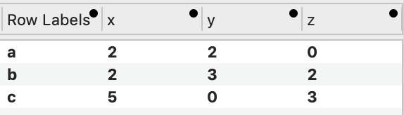
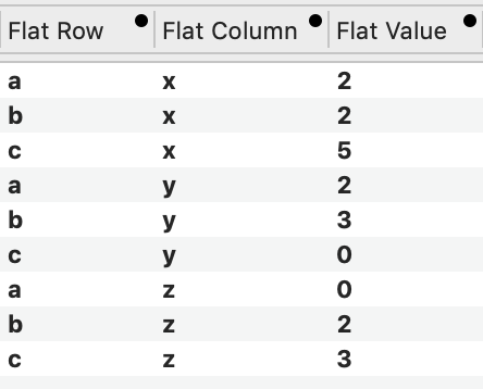
You can extract a flattened version, each value in a single row. Any of the column names can be changed.
These extracted columns will remain linked to the original data. If that data is changed, the extracted values update automatically.