How to Edit Tick Marks
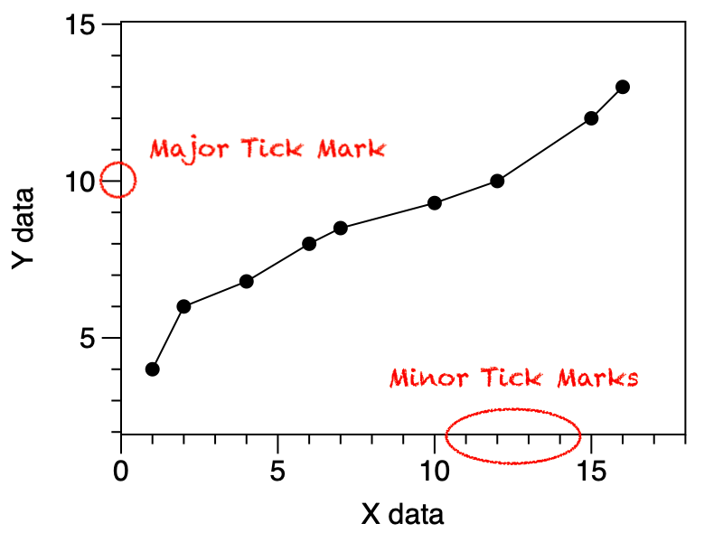
Tick marks are the small lines that show the scale of x- and y-axes. The major tick marks are where you can place labels. The minor tick marks denote values in between the major tick marks.
Automatic Tick Marks
The tick marks are added to graphs by default.
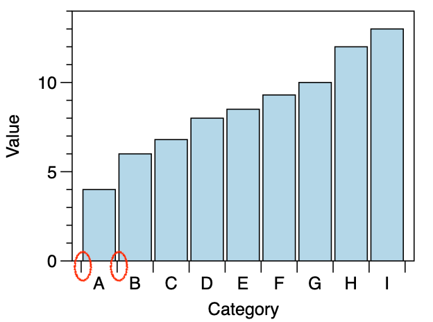
When you have categorical data, the tick marks are in between the categories. For example, a Bar graph with a label for the x-axis, will have the labels centered under the bar, and marks in between.
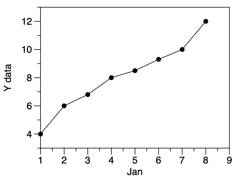
If you are plotting dates, you can still have minor and major tick marks. The month and year are also added automatically to the axis label, depending on the range of the dates. Here only the month is shown since the data does not span across multiple years.
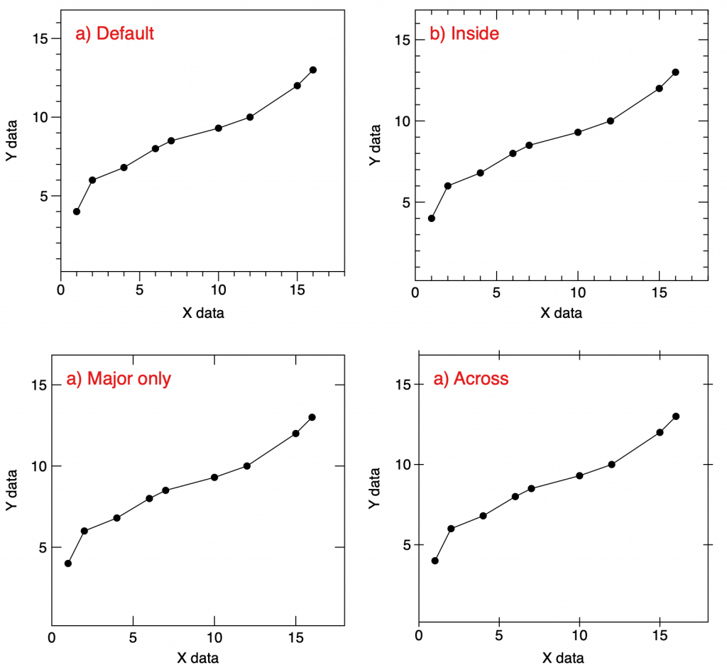
Tick Mark Styles
In the Style settings, you can control how tick marks are displayed on your graph.
Here are some examples.
Tick Mark Locations
The location of the tick marks can be changed in the Axis settings.
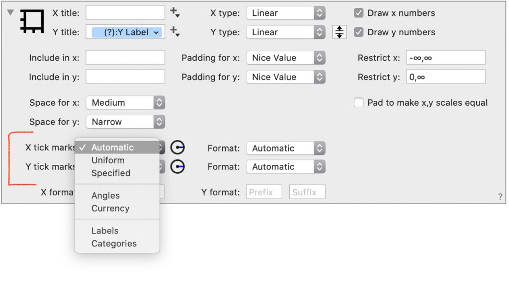
The Automatic setting will change the number of tick marks based on the size of the graph and the font. The chosen locations are intended to give a balanced-looking graph.

The Uniform setting lets you specify a stride for the tick marks. The program will apply a stride in the base unit you select, but will increase by a factor of 10 when the ticks are too crowded. In that sense, this is a semi-automatic setting.
Here the Uniform setting is used to increase the number of tick marks.

Here the Uniform setting is used to decrease the number of tick marks.

When you chose ‘Specified‘ you can enter the locations of the major and minor tick marks as a comma separated list.

Use Angles or Currency for specialized formatting. Angles can be in degrees or radians.
Use Labels or Categories to specify locations using a column of numbers. The Labels setting lets you label the tick mark with a number or text label. Categories also lets you specify a label but creates a categorical axis.
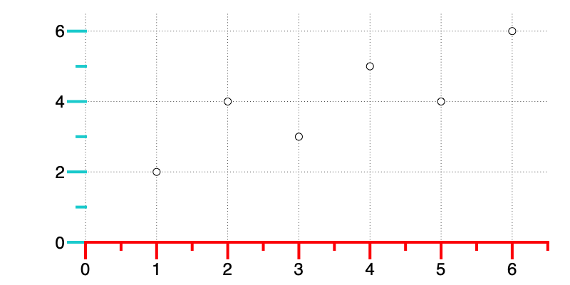
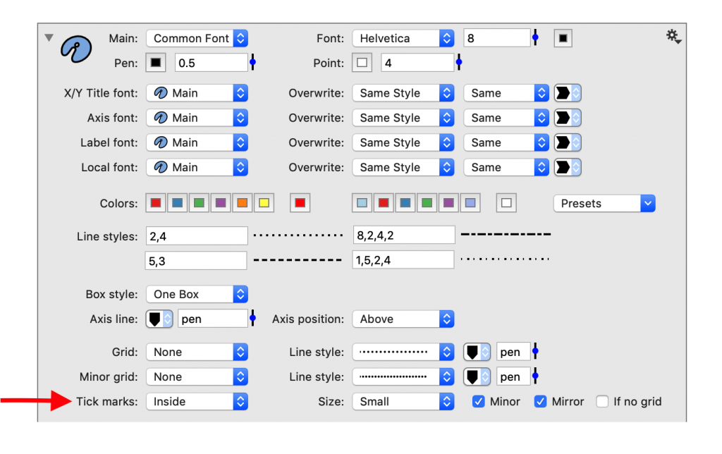
Tick Mark Color
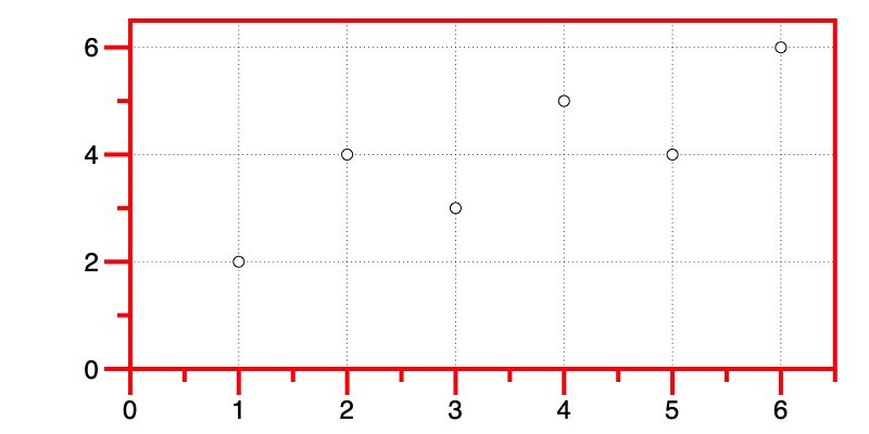
Default settings
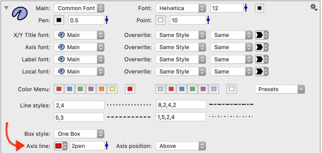
By default, the tick mark color and line thickness are the same as the Axis Line, which can be edited in the Style Settings.
Here the Axis line color has been changed to red and the line thickness is 2 times the pen setting “2pen”.
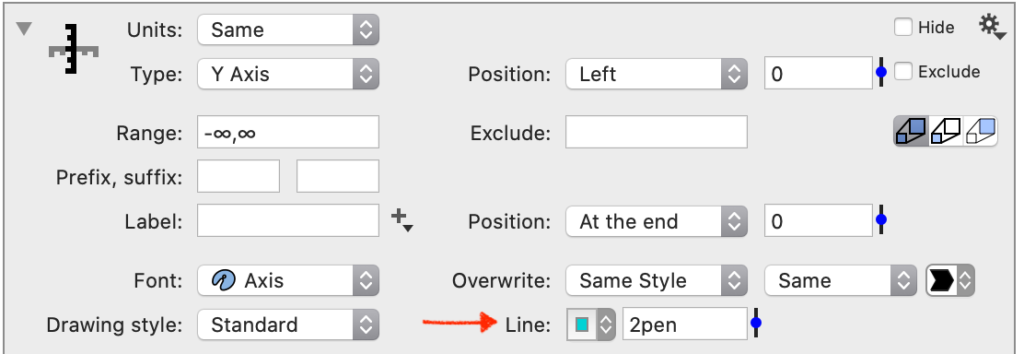
Custom settings
To customize tick marks, hide the default axis and use an Extra Axis command.
- Uncheck ‘Draw x’ or ‘Draw ‘y’ on the right of the Axis settings.
- Select Command > Add Extra Axis.
In the Extra Axis command, the Line setting can be used to change the color.

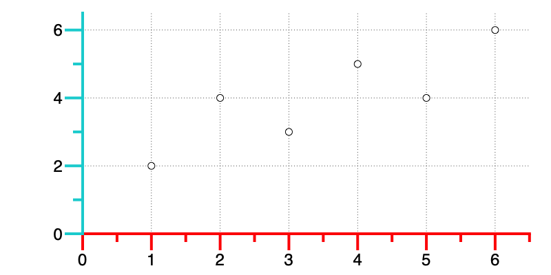
By default, the Extra Axis command draws the tick marks and the y-axis line. Also, the Axis position is set to ‘Above’. Thus, changing the Box style to ‘Only axis’ reveals the y-axis line below.
To draw only tick mark lines, set the Drawing style to ‘Only ticks’ in the Extra Axis command. To include axis labels, and a second Extra Axis command with the Drawing style set to ‘Only labels’.