-
Getting Started
-
User Interface
-
Data
-
Columns
-
Variables
-
Commands
-
Layout settings
-
Customize
-
Functions
-
Exporting
-
Scripting
-
Beta
-
Versions
-
Join the Community
Using Masks
When you use the DataGraph commands, you will use select entire columns of data to graph. This is different from a spreadsheet where you select a range of cells as input.
For example, here is a Plot command where there are two columns of input.

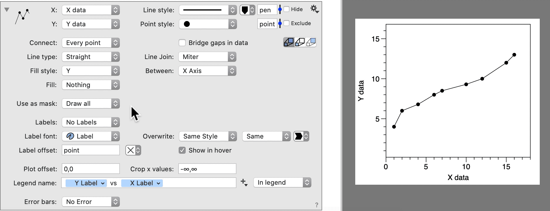
By default, all of the rows in those columns are included in the graph. If you only want a portion of the data in your graph, you can add a Mask to specify which rows to include.
You can apply a mask to individual commands or to a group of commands using a Command Group.
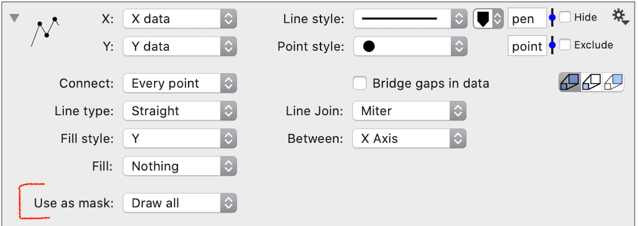
How to Add a Mask
This example shows how to add a Mask to one command.
- Click the top left corner to expand a command.
- Find the Use as mask section.
- Use the menu selector to pick a column to use as a filter.
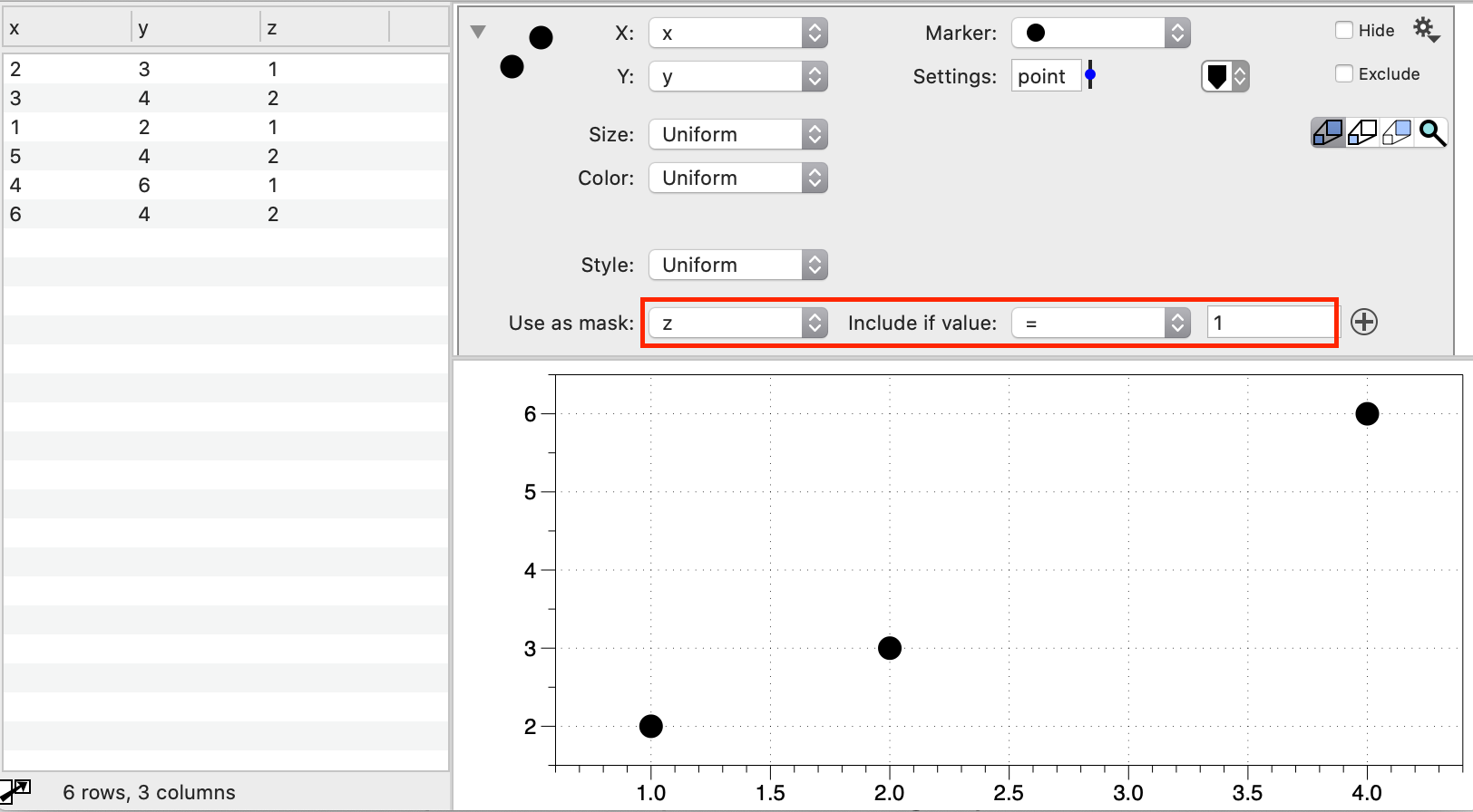
Mask Menu Selector
You can select any column in the data table. You can mask based on a column that is different from the x or y coordinate. Once you select the column, new entries will show up on the right of this menu.
Plot Command Example
Masks are logical statements that can be based on text columns or number columns. You can include multiple lines in your mask.
Here is a simple example.
NOTE: Use the small + button to the right to add additional criteria. There is no limit to the number of criteria.