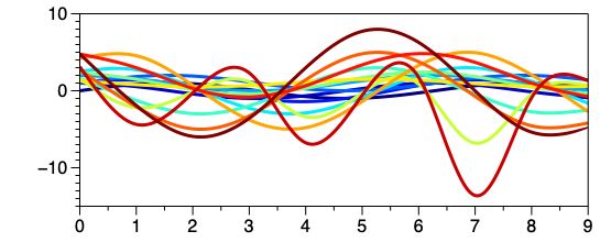
Plots
The Plots command draws one or more line plots that share the same domain. In other words, you have one X column with multiple Y columns, or one Y with multiple Xs.
Input
The Plots command works with number or date columns. You can input multiple columns of data.
Quick Create
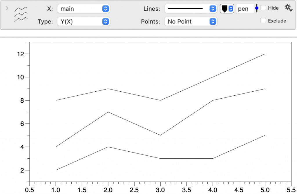
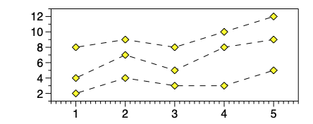
Select a series of columns where the shared axis is the left-most column (e.g., X values).
Select Command > Add Plots. The data will be plotted as shown.
Manual Create
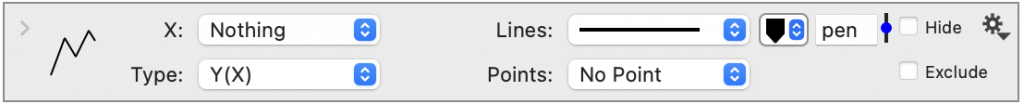
Select Command > Add Plots.
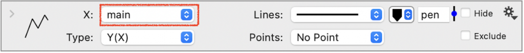
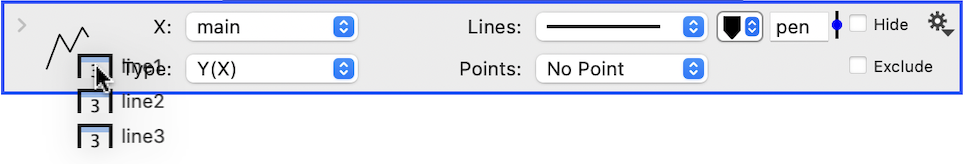
Specify the shared, X column at the top of the command.
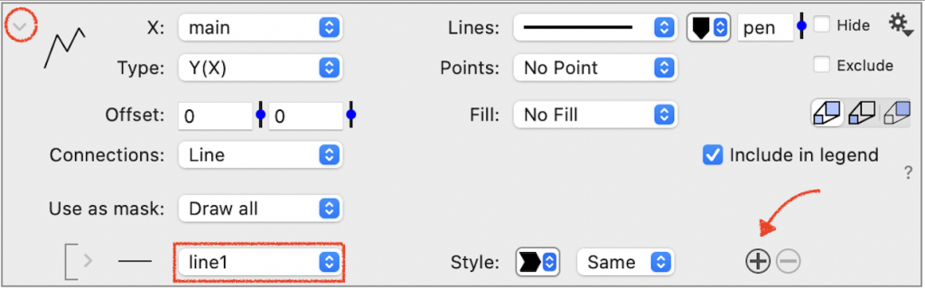
Click the top left corner to expand the command. Use the menu to select the first line of data. To add lines, click the ⨁ symbol to the right of the first line.
Drag and Drop
To add lines, you can select one or more entries in the column list. Drag and drop the selected columns on the command.
The entries will be added or appended to the list of column entries.
Plot Options
Type
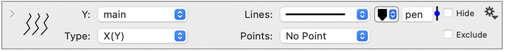
The default Type is ‘Y(X)’ or Y as a function of X. This is typically what you want, where you have one X with many Ys. Change the Type to ‘X(Y)’ to plot the values on the Y axis.
Lines & Points
The Lines and Points options are similar to the Plot command. To edit all the lines at once, change these options on the main portion of the command.

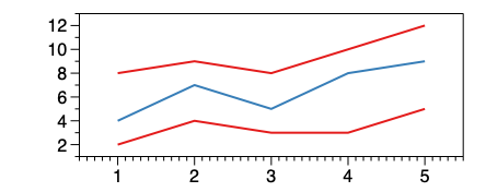
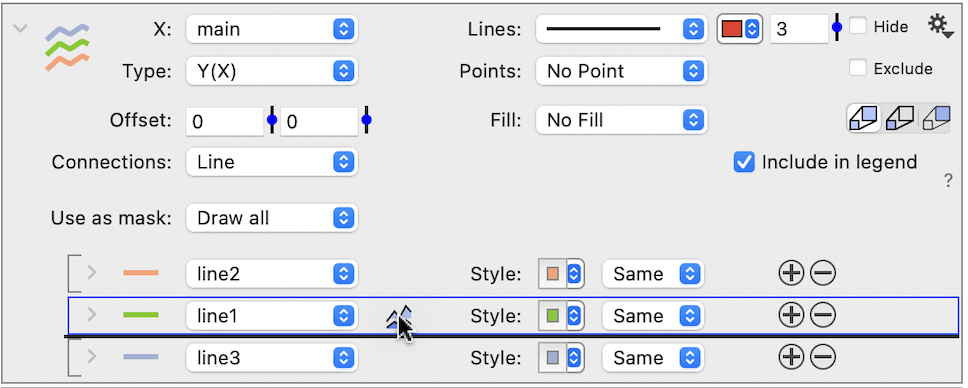
Color
The is a color tile at the top of the command that will change the color for all lines.
Expand the command to see how the color for each line is set to the main line color. The color tiles next to each line can override the main color.
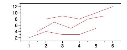
Offset
The Offset will shift lines relative to the first line drawn in the X and Y direction. Enter an exact value or use the slider to adjust. This can be useful for exploring overlapping data.
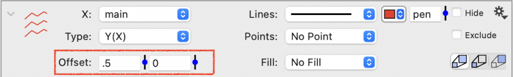
Note: The offset only applies when you have multiple lines drawn.
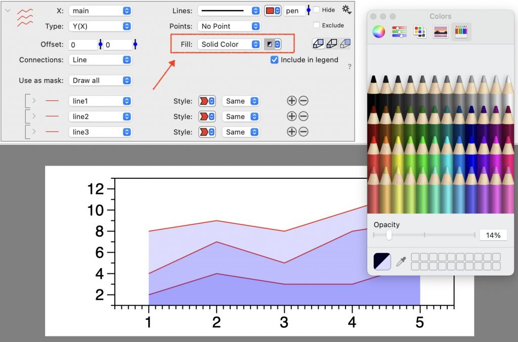
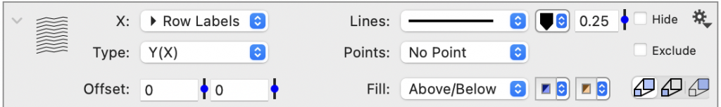
Fill
Add a solid Fill from the line to the axis. Adding opacity to the fill can create a layered effect.
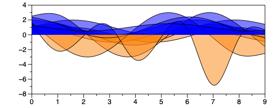
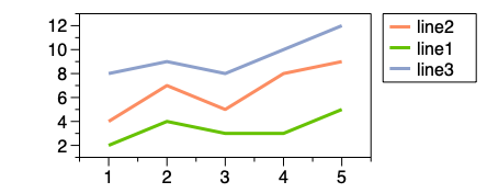
The Fill can be set to ‘Above’ or ‘Below’, to only fill relative to zero. Select ‘Above/Below’, to specify the a different fill for each. For example, here we have multiple lines where the fill ‘Above’ is blue and ‘Below’ is orange.
Connections
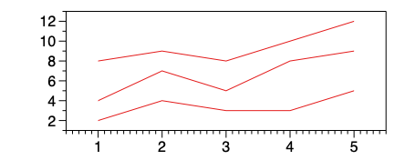
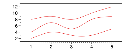
By default, the Connections are set to ‘Straight’. Similar to the Plot command, these can be changed to ‘Smooth’ or ‘Steps’.
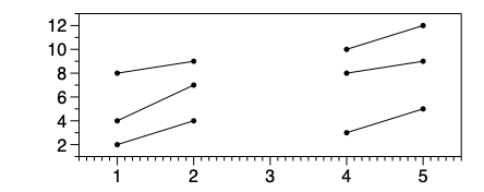
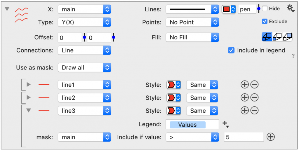
Use as Mask
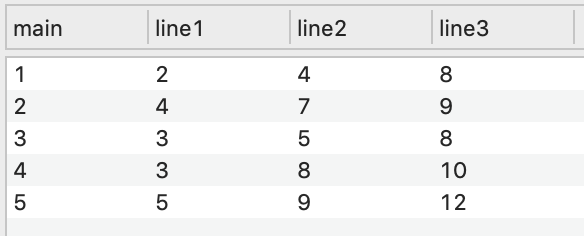
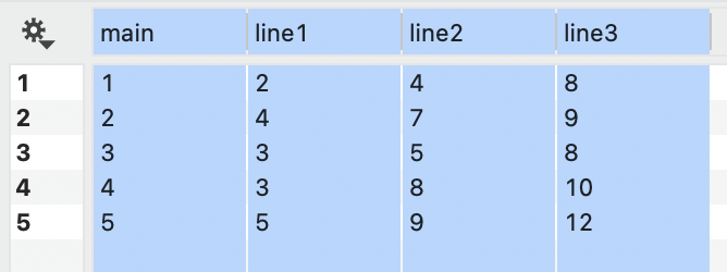
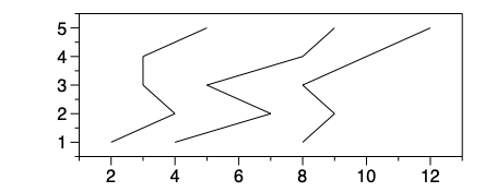
The Use as Mask setting will apply the same mask to all the data. For example, here we masked all the data where main is not 3.
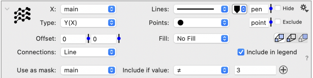
Thus, the line segments that either begin or end with 3 are removed.
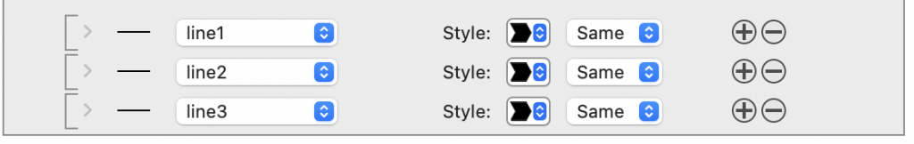
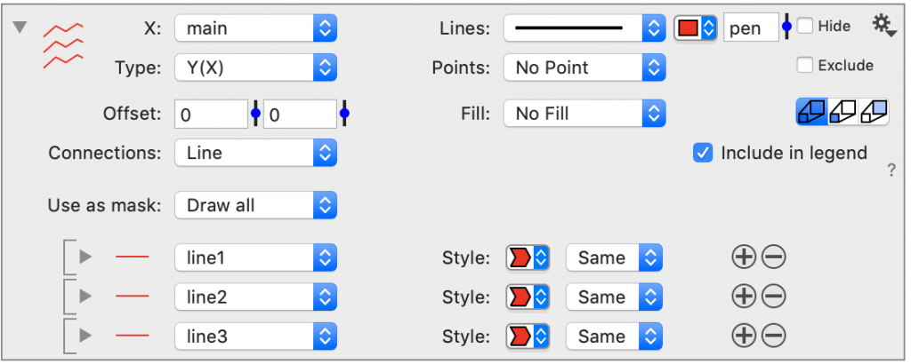
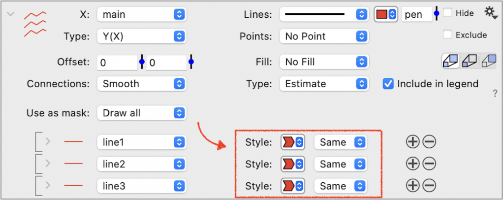
Line Options
Use the Style menu for each line to customize them individually.
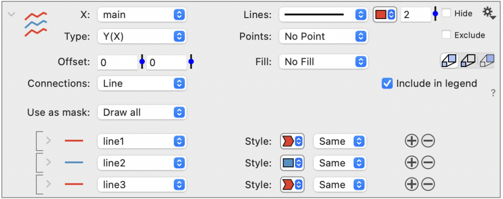
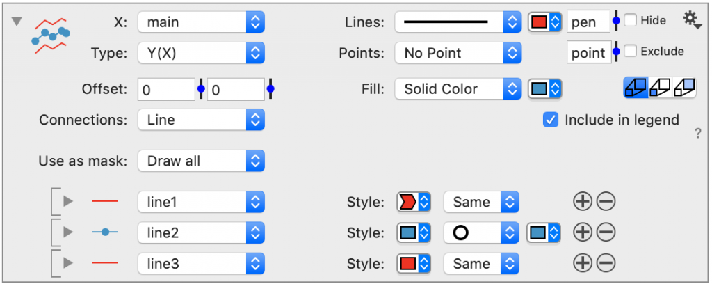
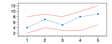
Colors
You can change the color for individual lines.
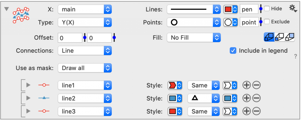
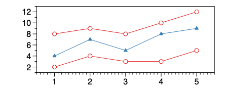
Points
You can add points to individual lines.
Or, you can override the main point style.
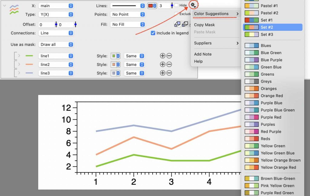
Color Schemes
Click the gear menu in the top right, ⚙︎, for a list of color suggestions from built-in color schemes. The number of colors shown will correspond to the number of lines.
Selecting
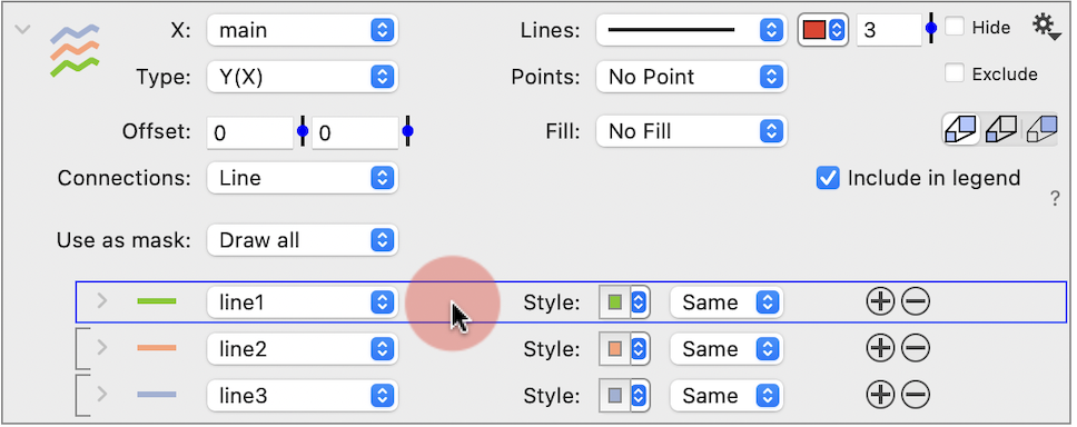
Click on a line entry to select. If you hit the delete key, you will remove the line.
Mask
Each line entry can also be expanded to reveal more options. For example, you can apply a separate Mask for each line.
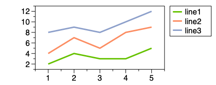
Legend
Add a Legend command to show the column names. Each entry is listed in the legend.
NOTE: If you don’t want these entries in the legend, uncheck the Include in the legend check box. That will ignore the entire command.
Order
The legend order is the same as the order in the command. Click and drag to change the order.
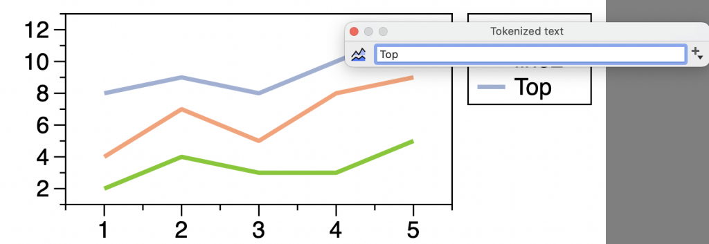
Name
Expand an entry to reveal the Legend text box. By default, this will contain a token, connected to the column name. To customize, delete the token and enter the legend name.
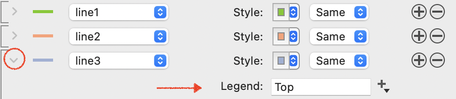
Or double click the legend to edit.