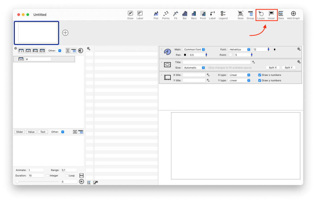
Inspector Tools
The top right corner of the toolbar contains icons for two built-in data inspectors: Loupe and Hover. Click the icon to toggle them on and off. To use, move the cursor mouse over a graph.
Hover mode
When Hover mode is turned on, pop-up boxes display information about your data as you move the mouse across a graph. Activate Hover mode by selecting View > Show Hover Information (⇧⌘H).
You can also click the Hover button in the toolbar. Here the Hover is turned off.

Here the Hover mode is active.

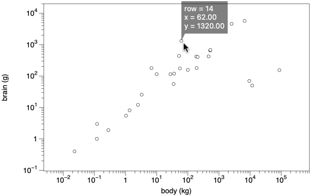
The Hover tool provides information depending on the command used to display the data. The pop-up includes x and y values and the corresponding row in the Data Table for a Plot command or Points command.
For example, here is a Points command with the default pop-up for the Animals data set (Rousseeuw Peter J and Annick M Leroy. 1987. Robust Regression and Outlier Detection. New York: Wiley; also used in the MASS Package in R). Download a copy of the data here.
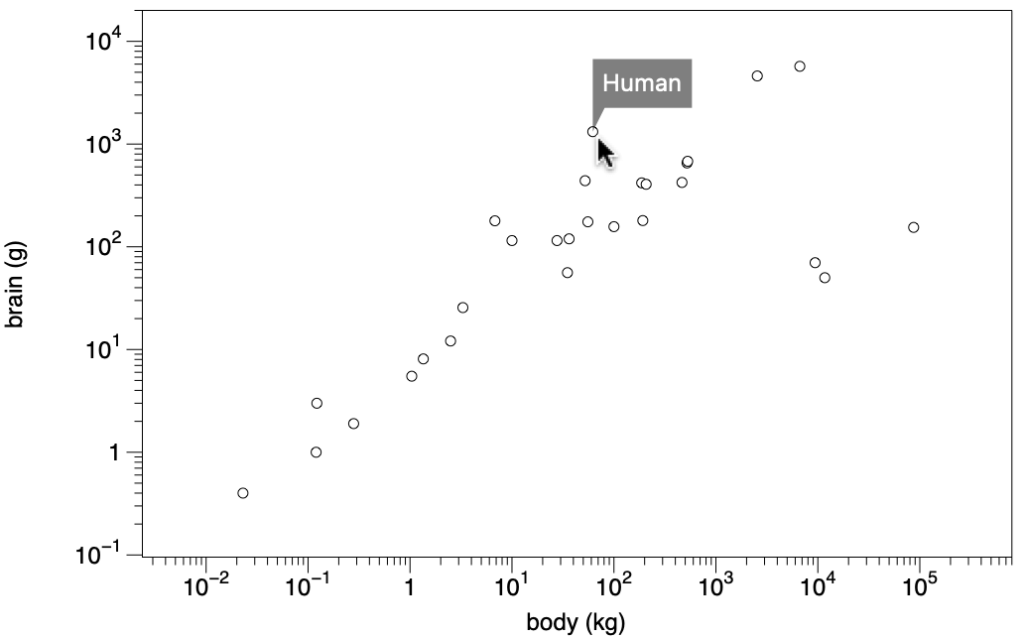
The Points command can also customize the pop-up by selecting a column to display. Here the animal corresponding to a data point is shown.
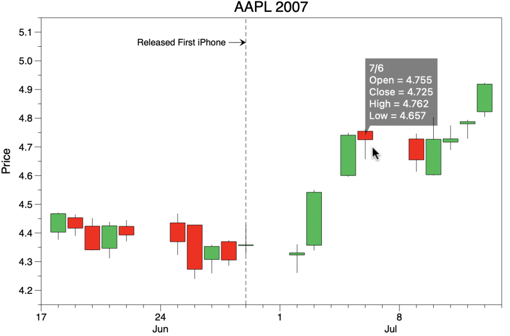
The information displayed varies depending on the command. For example, the Stocks command shows the date, open, close, high, and low (Search ‘Candlestick Graph’ in the example files).
The list of commands that can display hover information includes:
| Plot | x and y location |
| Plots | x and y location |
| Points | x and y location, customizable |
| Bar | value for the bar |
| Pivot | value depending on what is calculated |
| Scalar | value at grid location |
| Stocks | date, open, close, high, and low |
| Histogram | counts |
| Box | statistics, outliers |
| Magnify | hover works in the inset |
| Function | x-y values, roots, critical points |
Loupe tool
When a graph gets very busy, you can explore your data by zooming in on the detail. There are several ways to do this in DataGraph.
You can zoom in by changing the axis ranges, use the Magnify command to draw an inset or use the Loupe tool, accessible in the toolbar. Activate the Loupe tool using the toolbar shortcut or View>Show/Hide Loupe (⇧⌘M).
By default, the loop tool is not activated.

Click the icon in the toolbar to activate the loop.

With the Loupe tool activated, move the mouse over the graph to see the magnified view. The Loupe tool magnifies everything that is inside the smaller circle.
Here you can see the region is the small circle is magnified in the larger circle.
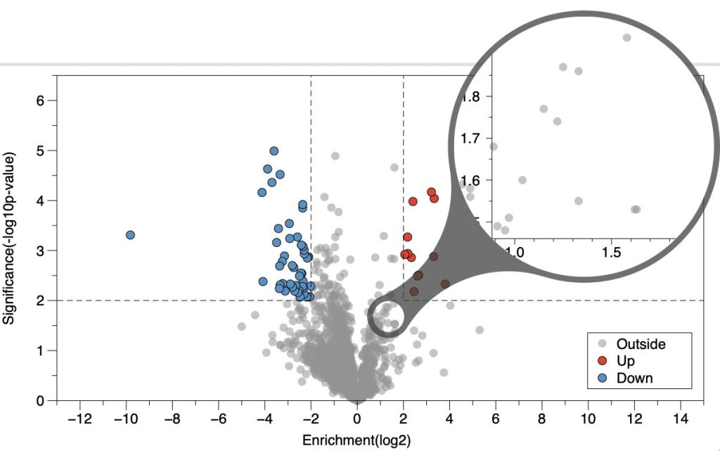
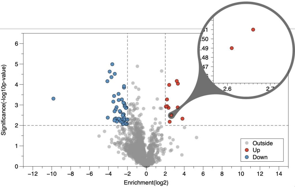
You can interactively adjust the size of either region. Here the region we are viewing is decreased, making it possible to view the two points that are overlapping in the graph.
Change the source and destination sizes by using the scroll wheel/gesture.
- Scroll left/right to vary the size of the source.
- Scroll up/down scrolls to change the size of the destination (zoom).
If you use a touchpad, use two fingers left/right or up/down to adjust. There are also keyboard shortcuts under View > Loupe size.
The Loupe tool magnifies information being drawn; therefore, the line width/point size is the same in the magnified region as the original and not magnified. The magnified portion displays an axis that adapts as the moused is moved to zoom in/out.
Hover & Loupe
When both the Hover mode and the Loupe Tool are activated, the Hover information is shown inside the loop tool instead of over the graph. Another difference is that multiple hover tags are shown at the same time.
Here the Hover mode label is customized to show the gene name.
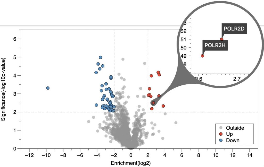
See the “Volcano Plot” Example file.