Region
The Region command allows you to highlight a region of space within a graph. This can be useful for highlighting aspects of a graph, such as drawing shapes around a group of points.

The shapes you add to a graph or not just overlaid on the graph, but are located in x-y coordinates. Thus, if you change the size or aspect ratio of your graph, the same region will be highlighted, but the shape itself may look different.

Click and Drag
You can type in the extent of the region using entry boxes (see below) or interactively by clicking and dragging on an edge or corner to resize.
Click inside the region to drag it to a new location without changing the width or height.
Type
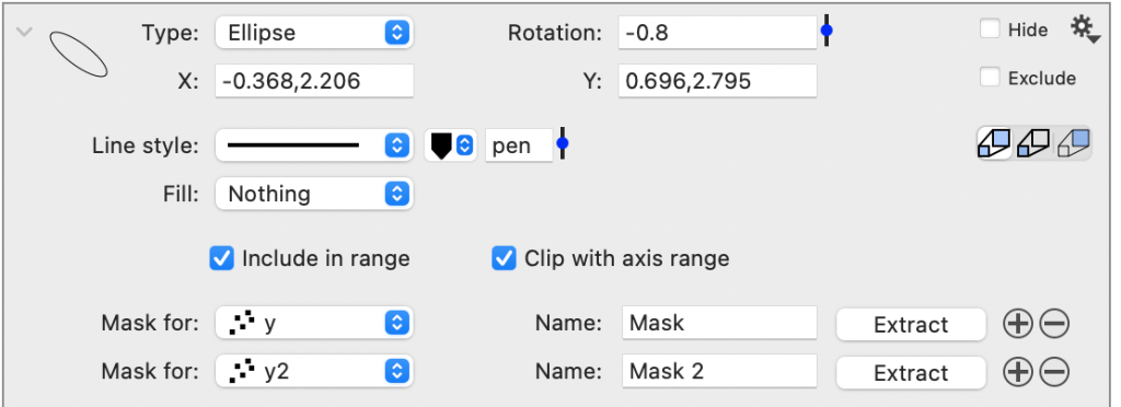
Choose from four object types:

- Oval – can be an oval or circle
- Rectangle – can be a rectangle or a square
- Rounded – a rounded rectangle or square
- Ellipse – an ellipsoid shape
Location
The extent of the region is specified in x and y coordinates, where the X and Y entry boxes show the minimum and maximum in each direction.
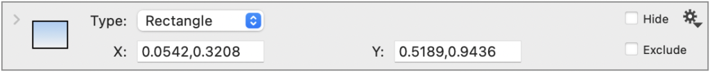
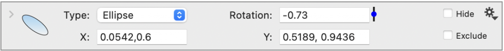
Rectangle Location. When the Type = ‘Rectangle’, the minimum and maximum values define the region’s size. Below the x extent is from 0.0542 to 0.3208, and the y extent is from 0.5189 to 0.9436.

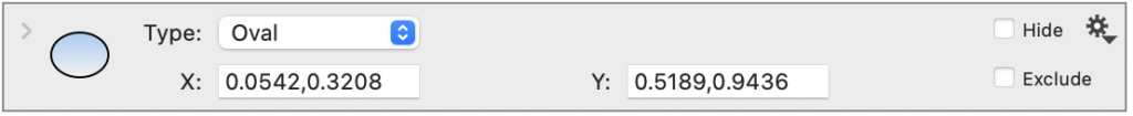
Oval Location. The oval and rounded are also located based on the x and y range, but with smoothed or rounded corners.

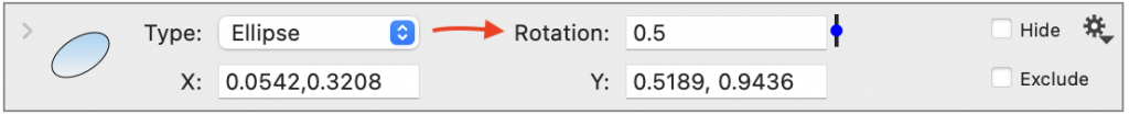
Ellipse Location. When Type = ‘Ellipse,’ the shape stays within the defined x and y region but can be adjusted for the width and slant using the Rotation parameter. When the Rotation is 1, the shape becomes a line; when the Rotation is negative, the highest side is on the top left corner. Enter a value or use the slider to adjust.

Here, you can see what happens when the maximum x value is increased and the Rotation is a negative value.

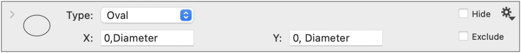
For any of the shapes, you can use global variables (e.g., slider, value) in the interval definition. Here, the variable ‘Diameter’ is used for the maximum x and y extent.
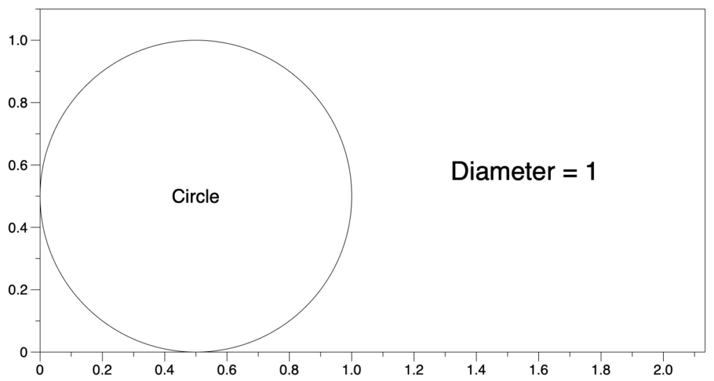
NOTE: For a circle, set the x and y extent equal (as shown above) and set Force aspect ratio to 1 in the Axis settings.
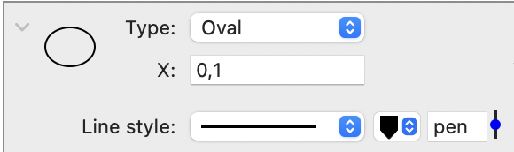
Line style
Expand the command to change the region outline’s type, color, and thickness.
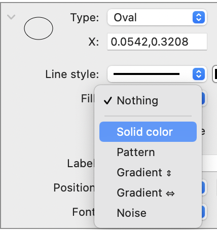
Fill
By default, the Fill is set to ‘Nothing’. Use the menu to change the fill to solid colors, patterns, gradients, or noise.
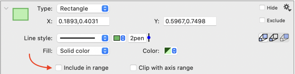
Include in range
Below the Fill options, there is an “Include in range” check box.
By default, Include in range is checked, meaning the extent of the x and y-axis range will include the region. Thus, if you drag the shape out of the current axis range, the axis range will increase to include the range for the object.
Here, the Include in range box is unchecked; thus, shapes can extend beyond the axes box without changing the range.

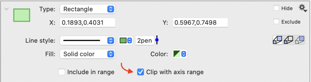
Clip with axis range
The Clip with axis range checkbox specifies whether or not to clip the shape when it goes beyond the axis’s boundary.
Here is the same image as above with the Clip with axis range box checked.

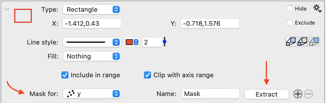
Mask for
The Mask for option allows you to extract a column indicating whether a point is inside or outside of the shape. In the extracted column, each row is assigned a value of 1 or 0, indicating if the point is inside or outside the range. Works with Point and Plot commands.

Select the command using the Mask for menu. Next, click the Extract button to create the column in the data table. Use the “+” button to the right of the Extract button to add more commands.
Use this functionality to identify clusters and perform calculations on a subset of values. For example, here the number of points that are in the region are counted.

You can also have the same region create masks for multiple commands. Click the ‘+’ symbol next to the Extract button to create additional entries.
For more detailed instructions, see the ‘POINTS IN A REGION’ example file.
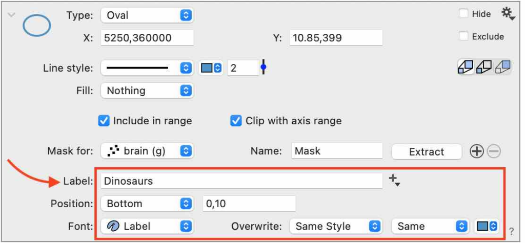
Label
You do not need a separate command (Label command or Text command) to label the highlighted region. Instead, use the Label text box to enter a label for the region.
Use the Position menu to set the location relative to the region: Top, Left, Right, Bottom, or Center. Use the pixel offset (x,y) to the right of the Position to fine-tune the location.
Here are the Label settings are outlined in red.