Basic Structure
DataGraph is an application with a graphical user interface (GUI) that allows you to interact with your data, commands, and images.
Create a new DataGraph file by selecting File > New, the file is empty and contains no data or images.
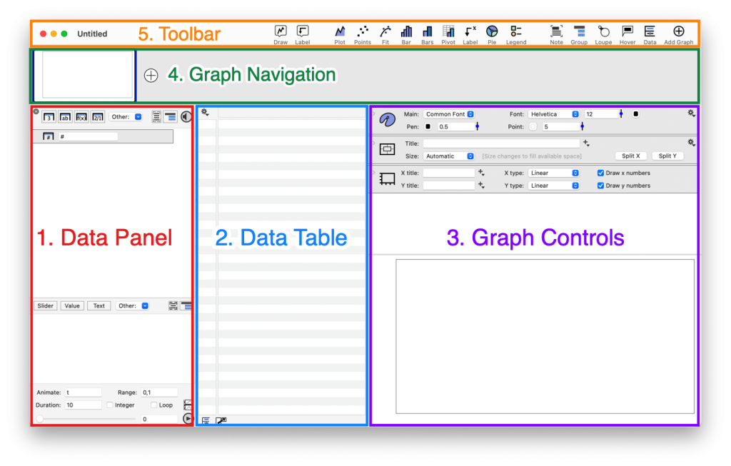
Here, the user interface is divided into five sections.
- Data Panel – Left of the screen
- Data Table – Middle of the screen
- Graph Controls – Right side
- Graph Navigation – Across the top
- Toolbar – Very top of the UI
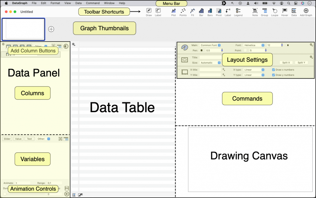
Here is a more detailed view of the user interface.
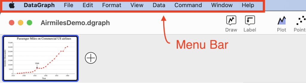
- Menu Bar – Top of the Screen
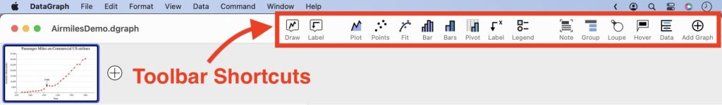
- Toolbar Shortcuts – Across the top of the file
- Thumbnails – Below the toolbar
- Data Panel – Left side
- Data Table – Center of the Panel
- Settings & Commands – Right side
- Drawing Canvas – Bottom Right
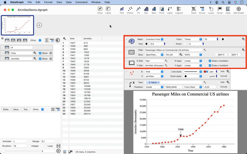
The size of these sections can be adjusted by selecting and dragging the sliding bars between them. The image at the bottom of this page shows each section, and the sliding bars are highlighted with a dashed line.
Two handy shortcuts include:
- Hide/Show the Data Panel (⌘D)
- Swap the Data Table & Commands (⇧⌘D)
1. Data Panel
By default, the left side of the user interface has a side panel that contains a list of all data in the file. This Data Panel can be toggled from view using View > Show Definitions (⌘-D).
You can also close the side panel by clicking the Data icon at the top right of the toolbar or the bottom left of the data table.
Every column will have an entry in the data list. You can also add notes and annotations. Columns can be organized into groups, and you can nest groups inside groups. Click and drag the column objects to rearrange.
The Data Panel has four main sections:
- Add Column Buttons – This is where you can create new columns for entering data. Columns are automatically created when you import data.
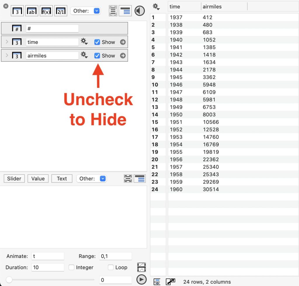
- List of Columns – Each column or column group is shown as an object
- List of Variables – Add slider variables, color schemes, and more
- Animation Controls – Use the animation variable to create movies
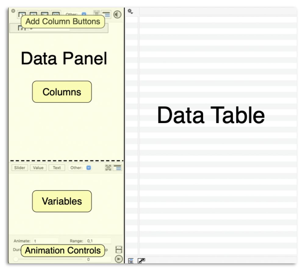
When the data panel is hidden, you can double-click the right side of any column header to open the side panel to that entry in the column list.
2. Data Table
The Data table is used to view the data saved in a file. You can also select columns by clicking the header or rows by clicking one or more rows. To edit entries, double-click a cell.
Hide columns of data using the “Show” checkboxes on the column objects.
3. Graph Controls
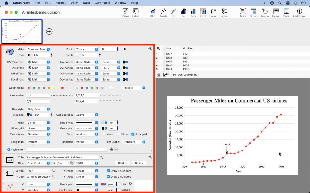
Layout settings
The Layout settings are similar to a style sheet and are divided into three sections: the Style, Canvas, and Axis settings. Using the options in these sections, you can customize overall settings such as the font, image size, and titles.
By default, the Layout settings are located above the graph.
You may want more room to view and edit when you expand the settings and commands. Try to swap the settings and data table using “View > Swap Layout” or use the “shift-command-D” combination.
Drawing Canvas
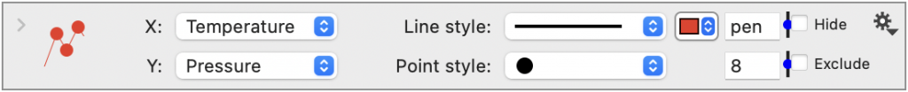
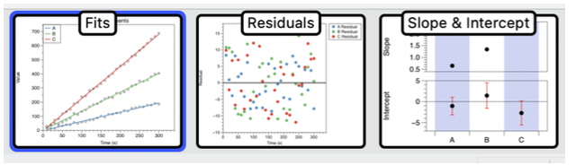
Content is added to the drawing canvas using Drawing Commands. For example, a plot command is added by selecting Command > Add Plot or by clicking the plot command icon in the toolbar.
This adds the drawing command below the layout settings, which is used to specify the data to plot and format the line.
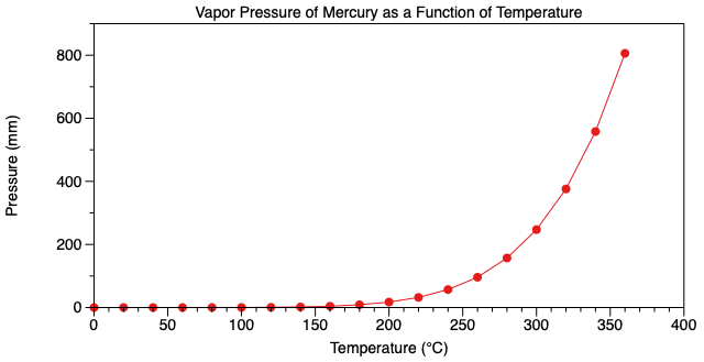
When you add multiple commands, each one is drawn to the graph in the order it is listed. By adding multiple commands, you can create more complex, custom graphics.
Here, only one command is needed to draw the following plot; however, there is no limit on the number of commands you can add to a graph.
4. Graph Navigation
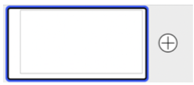
You can have a number of graphs in the same file. This is done by clicking on the Add Graph button in the top right corner of the toolbar or File > New Graph or simply click the plus symbol next to the thumbnail.
When you add multiple graphs, DataGraph adds a thumbnail for each one at the top of the screen. These can be named as shown below.
5. Toolbar Shortcuts
Every icon in the toolbar has a corresponding entry in the menu bar. The toolbar provides shortcuts to the drawing commands and other common actions so that you can rely less on the menu bar for graphing.
Learn how to Customize the Toolbar.
Tip: You can hide the toolbar from view, using “View > Hide Toolbar”.
Menu Bar
It is worth spending some time exploring the menu bar. From here, you can create new files, customize the user interface, import data, and add commands.
Note: The “Format” menu is not used for formatting your graph. These settings will format the text for Notes added to the command list. The note fields can be in rich text format; you can even paste images into these notes.