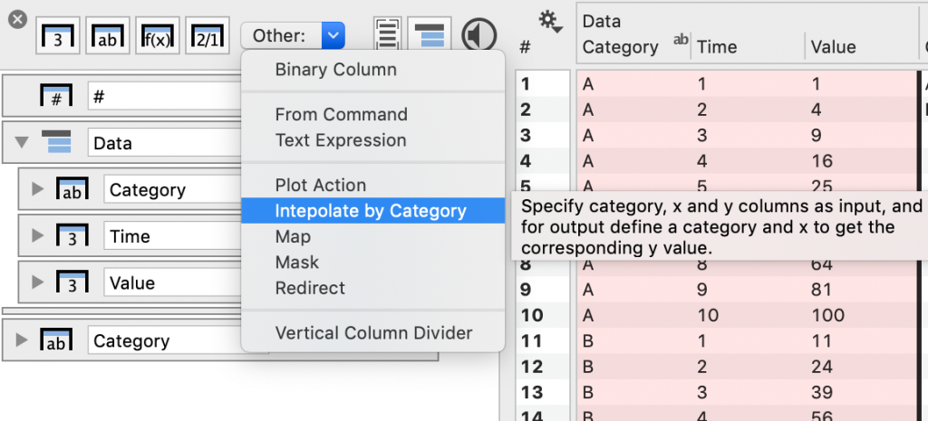
Interpolate by Category
This columns allows you to interpolate data from a larger data set where there are multiple categories in the data.
This column is extremely useful for creating animations, to allow for a smooth transition between values.
Create this column using the Other menu:
Here is a column entry without any data selected.
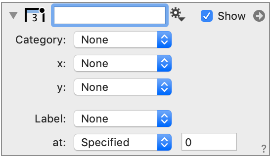
Input values
The top entries define the data that you want to interpolate from. This is your larger data set.
- Category – how the data is grouped (e.g., location)
- x – A variable such as time (e.g., year, day, … )
- y – The output that you want interpolated (e.g., population)
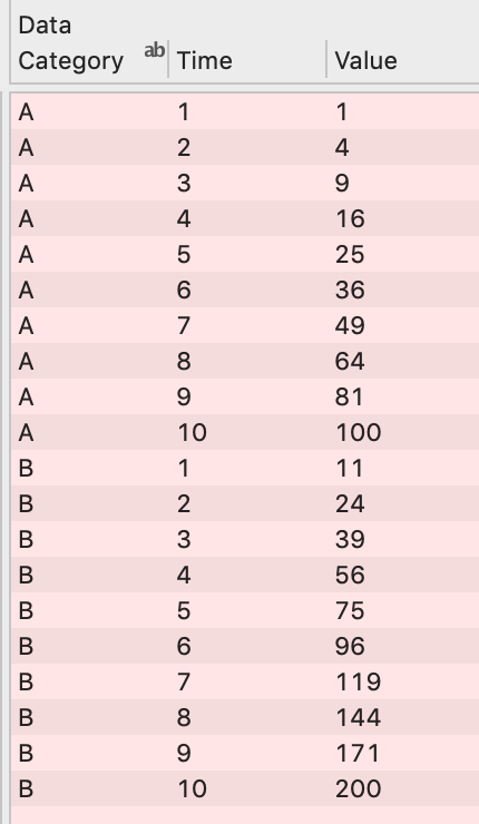
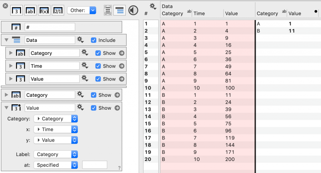
For example, given the following data as input:
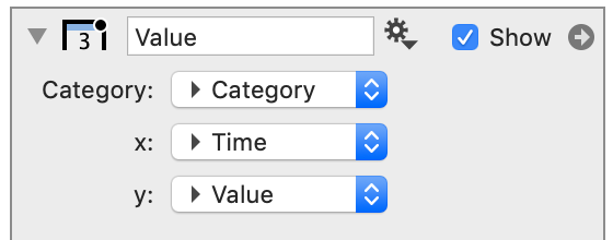
The entries would be specified as follows:
Output
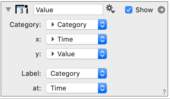
You also have to specify a column that indicates the Categories you want to output.
In this case, we would create another text column, with entries that correspond to the data. Select that column from the Label menu.
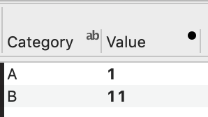
We still have not specified at what x values we want the output. By default, the first values in the data for each category are shown (Value column).
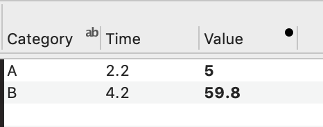
Type in an x value you want to pull from the data. In this case, we chose x = 4.2.
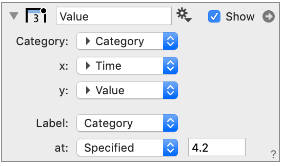
Since x = 4.2 is not in our data, the output is the y value linearly interpolated between x = 4 and x = 5.
You can also specify where you want the value interpolated using a column, such that that output for each category is a different ‘x’.
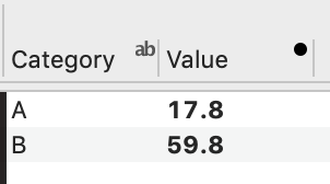
In this example, the output from the column is interpolated at 2.2 for A and 4.2 for B.
Animations
To create animations, enter a variable that you can change, such at ‘t’.
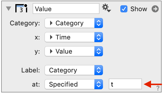
Then, when you plot the interpolated value over time, it will have a smooth transition from one value to the next, as time (i.e., or another animation variable) changes.