How to Add an Axis Break
A graph with an axis-break has two separate regions of the axis shown, often with different scales.
This is not a drawing mode, but rather you get the look of an axis-break by plotting the data on two axis, while zooming and adjusting the axis scales.
Case 1: Two Commands
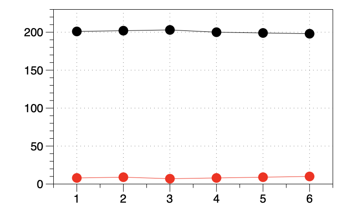
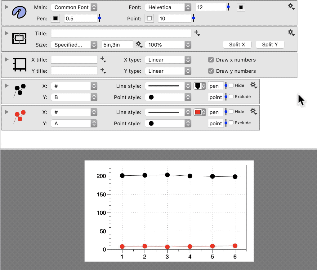
Here are two lines, drawn using two Plot commands.
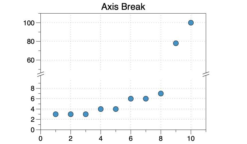
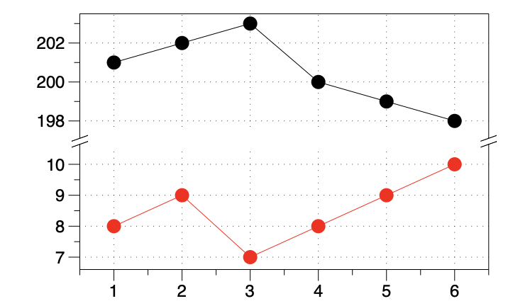
Here is the same data drawn with an axis-break.
Here are the steps to create the break:
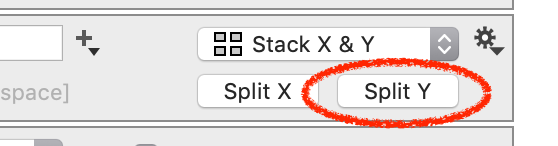
- Click the Split-Y button on the Canvas settings.
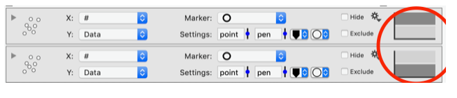
- Using the axis selectors, move one command to the split-axis.
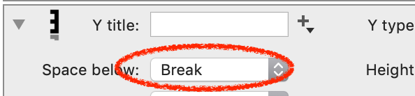
- Expand the new axis object, change the Space below to ‘Break’.
For multiple breaks, repeat the above steps.
Case 2: One Command
Another possibility is that you have data drawn by a single command. For example, a Points command with points on either side of the break you want to add.
Video Demo
The video shows how to create an axis-break in the Y-direction, where you have one Points command, having data that will span the break.
The basic approach is:
- Split the Y-axis
- Add the same command to each axis
- Restrict the range in each axis as needed
NOTE: This is video does not have audio.
Detailed Steps
Here are the steps to take to get the look of an axis-break.
Step 1: On the Canvas settings, click Split Y.
Step 2: Make a copy of the command. Use the axis selectors on the right to place one in each.
Step 3 : On the new axis, change Space below to ‘Break’
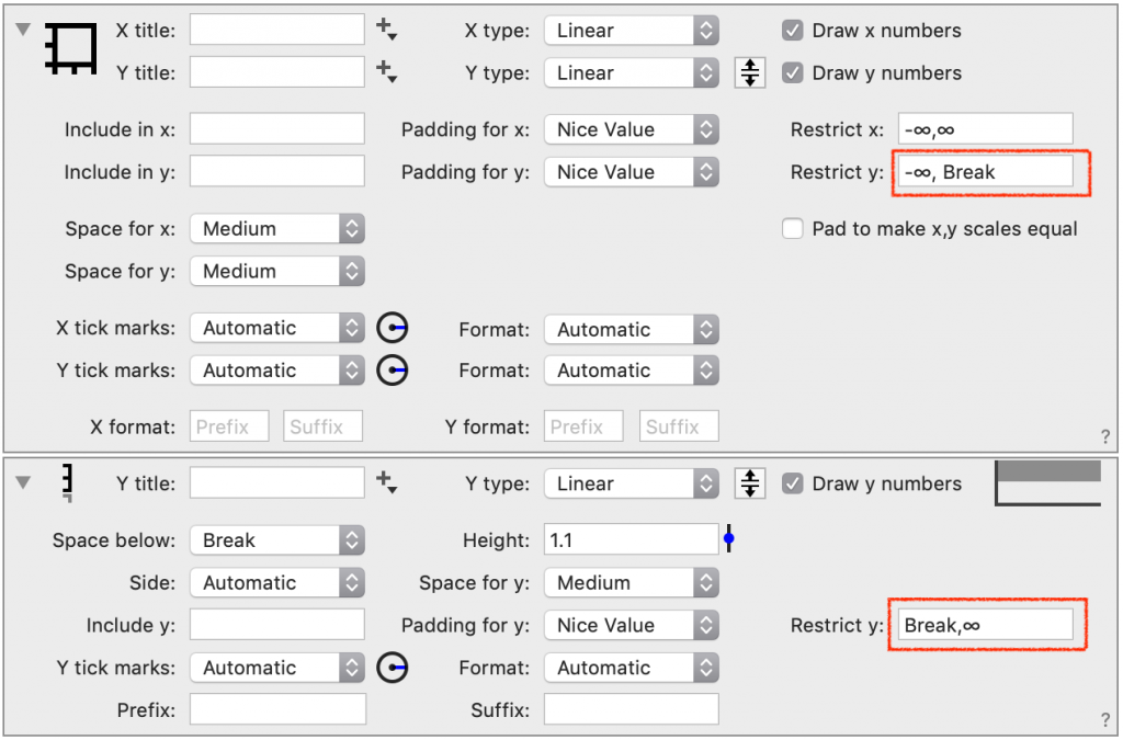
Step 4: Modify the Restrict settings on each axis to get the desired range.
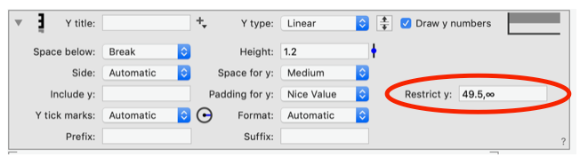
NOTE: The range can also be changed interactively. Click and drag on the graph, as shown in the above video.
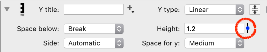
Step 5: Adjust the size of each graph using the Height on the axis settings.
Using a Variable
For the case of one command, care should be taken when using an axis break to avoid omitting data from view.
To ensure that all the data is shown, use a variable or slider to set the end of one axis, and the beginning of the next axis, to the same value.
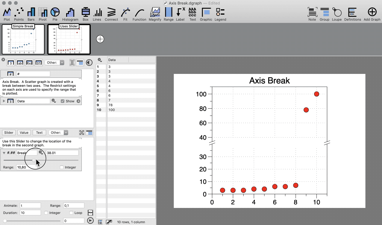
In the above demo, the slider ‘Break’ is used in the Restrict settings of the main axis and split axis settings, as shown below.
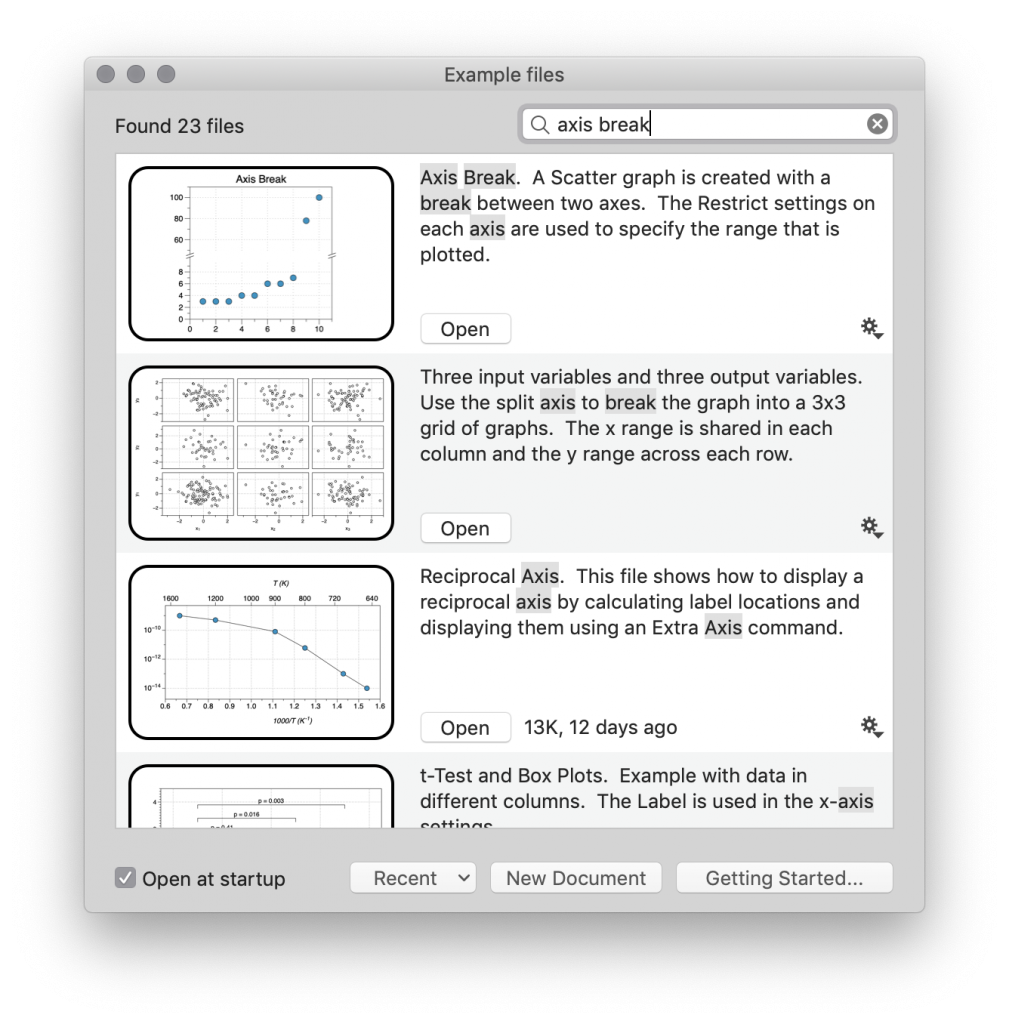
Example Files
In DataGraph, go to File/On-line Examples and search ‘axis break’ to download example files.