Bars
The Bars command creates side-by-side bars, stacked bars, and area graphs. The command has options for different fill types, adding labels, and error bars. The Bars command does not perform any calculations but gives you control over the graphic in terms of where and how the bars are drawn.

NOTE: The Bar command and Pivot command can also make bar graphs. The Bar command is for a single column of numbers where you want to manipulate bar location, color, and width of each bar. The Pivot command is for large data sets in a flattened or long format. For more information, see the How to Make a bar graph demo.
Input
The Bars command works best for small data sets where you have a few columns and the data is in a wide table format.
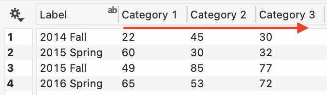
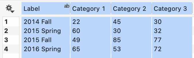
The examples in this file are created using the following data. Copy and paste this data into DataGraph to follow along.
| Label | Category 1 | Category 2 | Category 3 |
|---|---|---|---|
| 2014 Fall | 22 | 45 | 30 |
| 2015 Spring | 60 | 30 | 32 |
| 2015 Fall | 49 | 85 | 77 |
| 2016 Spring | 65 | 53 | 72 |
Note that the labels on the left will correspond to the x-axis labels, and the bars are grouped by row. When preparing your data, you can use Paste Special to transpose the columns and rows, if needed.
Although there is no strict limit to the number of columns, the Bars command can have up to 24 unique colors. If your columns exceed 24, the 25th column will use the same color as the first, and so on.
Single column
The Bar command is one of the few that work best with data in a wide format, meaning the data can span multiple columns. You can also have a column of text labels on the left.
STEP 1: To work through this example, select the data in the table above and copy it to the clipboard (Edit > Copy or Command-C). Then open DataGraph and paste the data into the data table (Edit > Paste or Command-V).
The data will look as follows, where the row headers are automatically detected.
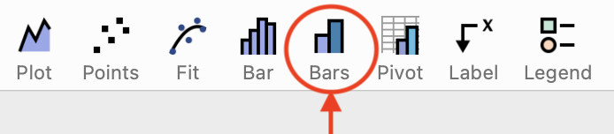
STEP 2: Add a Bars command by clicking the icon in the default toolbar from the Draw pop-up menu or using Command > Add Bars.
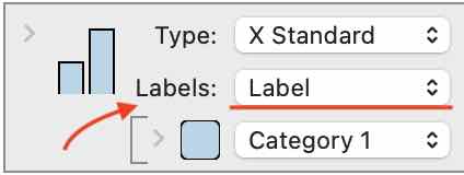
STEP 3: Use the menu to the right of the color tile to select a numerical column of data. Here we select ‘Category 1’, creating a bar graph with the location corresponding to the row number in the data table.
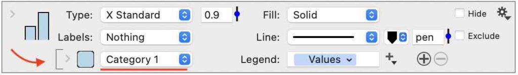

STEP 4: Use the Labels menu to select the ‘Label’ column, replacing the numerical labels with a categorical axis.

Multiple Columns
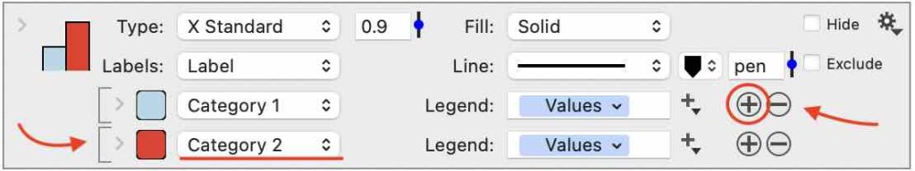
You can manually add multiple columns or drag and drop them to add them as a group.
To add manually, click the plus button on the right side of the column entry. Then you can use the menu to select another column.

Quick Create
Preselect one or more columns to create the bar graph in one click.
STEP 1: Preselect the data with an optional Text column on the left. Hold the shift key and click the column headers to select.
STEP 2: Add a Bars command by clicking the icon in the default toolbar from the Draw pop-up menu or using Command > Add Bars.
This creates the following graph.

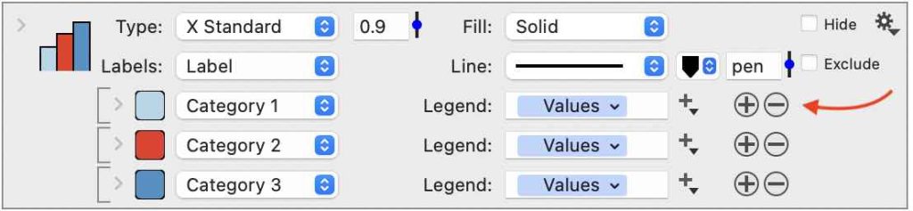
In the command, you can add/remove columns using the +/- buttons on the right side of each entry.
STEP 3 (OPTIONAL): Add a Legend command, the column names are used in the legend labels by default.

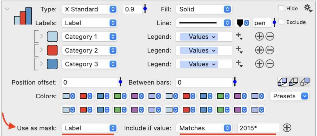
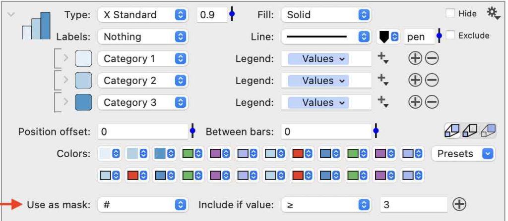
Use a Mask
Limit the input data in your graph by adding a Mask.
Below, a mask has been added such that rows are included where ‘Label‘ matches 2015*. The wildcard character ensures that both Spring and Fall data are included.

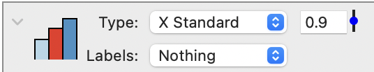
Note that if the rows included based on your mask are not adjacent, you may have a graphic with a gap between them. For example, if we only wanted the ‘Spring’ data, we could set the following mask; however, the resulting graph shows a gap.


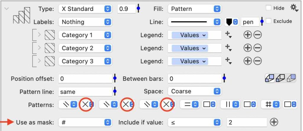
To illustrate where the bars are drawn, set the Labels to ‘Nothing.’ This shows the row numbers for the Spring data.

The advantage of this approach is that the bar locations are predictable, allowing you to combine commands to customize your graph further. For example, if you want a different color scheme for the Fall and Spring Data, you can add two commands.
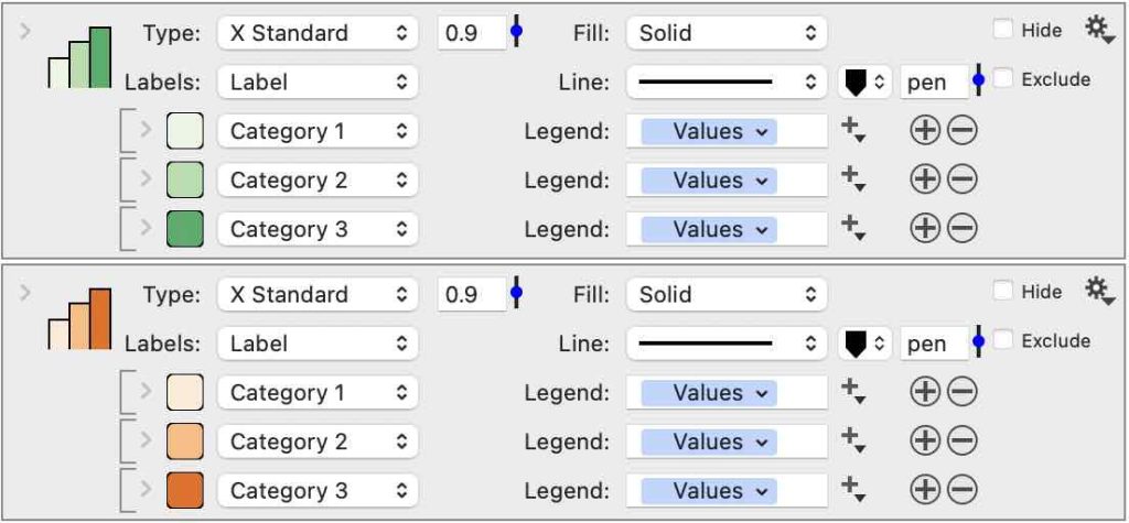
The top command has a Mask to show the bars only when Label matches ‘*Spring,’ and the bottom command has a Mask that only shows data when the Label does not match ‘*Spring.’ Each command has custom fill colors resulting in the following graphic.

You can also add other commands. For example, here, a Lines command has been used to draw an X line at 2.5, placing it right between the 2015 Spring and 2015 Fall data.

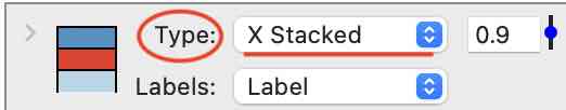
Type
The Type menu is at the top of the command and controls the orientation and configuration of the bar graph:
- Standard (default, side-by-side)
- Stacked
- Stacked %
- Area
- Area %

Each type of graph can be selected for the X or Y direction. Here the graph is modified to the Y direction, stacked, and changed to a % scale, all with one menu change.
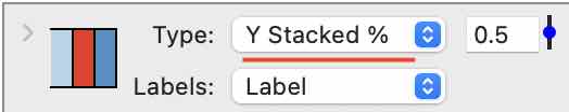

Additional formatting includes, changing the width to 0.5, increasing the space for Y labels, and the padding for the X axis to ‘None’ (see the Axis settings).
The values are summed across the data when the Type is set to an area graph. Here is an example of an area graph where the Box style is set to ‘Offset Axis’ (see the Axis settings).

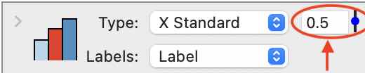
Width
To the right of the Type menu is the width control. Enter a value from zero to 1 or use the slider to change the overall width of the bar or group of bars. This is a relative setting, meaning when the value is set to a ‘1’, the entire space or 100% of the available space is taken up. By default, the value is set to 0.9.
Here the width is set to 0.5, or 50% of the available space, for the group of bars.

Labels
The Labels menu is used to change the axis from showing the numerical location of the bars to a text label. This is equivalent to changing the X/Y tick marks to ‘Categorical’ in the Axis settings.
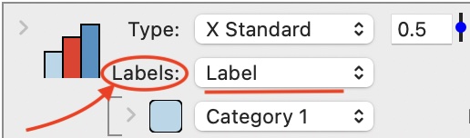
You can select a text, number, or date column. The text in the axis labels will match the formatting in the data table. You can use special characters or text formatting, such as “\n” to indicate a new line.
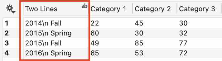
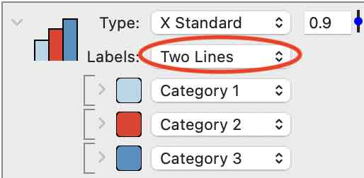
Here is the graph with the column “Two Lines” selected.

NOTE: If you preselect the columns in the data table before adding the Bars command, the leftmost column will populate the Labels menu only when it is a text column.
Fill
Vary the Fill for all the bars at once:
- Solid (default)
- Pattern
- Noise
- Gradient
The choices shown in the expanded view of the command change depending on the selection for the fill. For example, when the Fill is set to ‘Solid,’ the detail shows a series of up to 24 customizable color tiles.
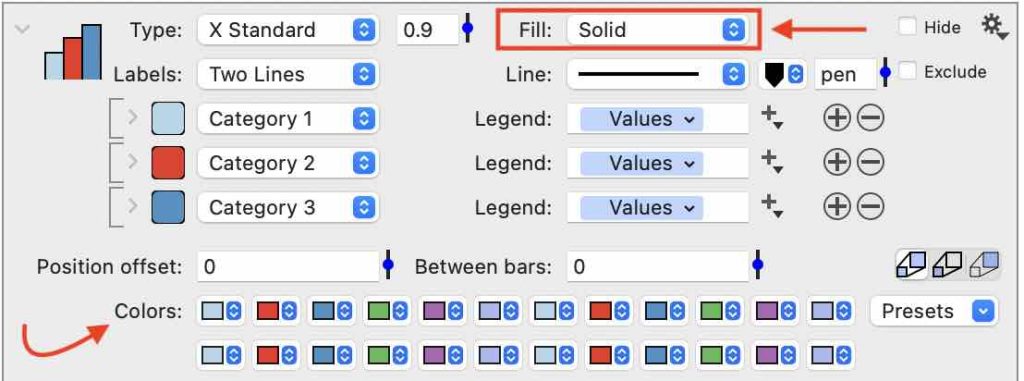
By default, the color tiles repeat the six fill colors variables set in the Style settings. Change the colors in the style settings, or customize each color individually in the command.
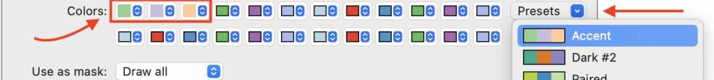
You can also choose from the Presets menu to the right of the color tiles. The number of colors that are replaced with the presets based on the number of columns selected.

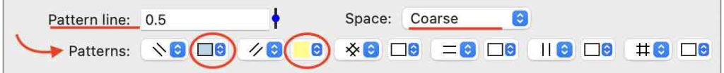
Change Fill to ‘Pattern,’ and the options change accordingly.
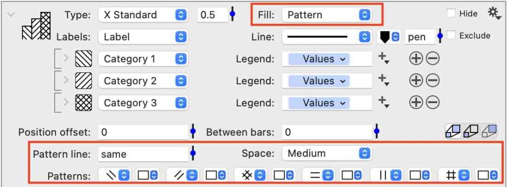

The pattern can be customized to change the line width, the space between lines, and the color behind the lines.

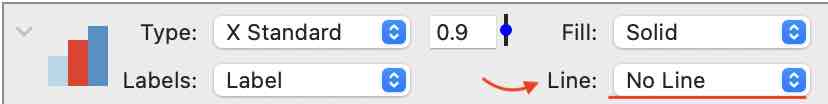
Line
Customize the Line around each bar. Change the line color and width or select ‘No Line.’

Position offset
The Postion Offset setting can be used to move the bar location relative to the main axis. This can be used to overlay bars.
For example, say you would like to overlay the 2014 Fall and 2015 Spring with the 2015 Fall and 2016 Spring. You could start creating two commands.
The first command is drawing solid bars for the 2015 Fall and 2016 Spring data.
The second command is drawing the 2014 Fall and 2015 Spring bars with a Fill pattern. The default settings are changed so there is no fill color.
Before changing the Possition Offset, the bars are drawn according to the row locations in the data table.

Use the Postion Offset to shift the solid bars to the left.
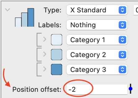
This results in the following graph where the two sets of bars now overlap.

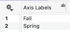
NOTE: The axis labels were added by adding a new text column where the labels are typed as follows. These are selected as a cateogical x-axis in the Axis settings.
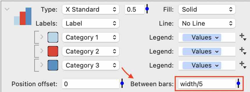
Between Bars
Change the space between bars in the same category. This setting can be typed in, or use the slider to adjust. Here the overall width is set to 0.5, and the Between bars setting is ‘width/5’, resulting in the bar width being equal to the space between.

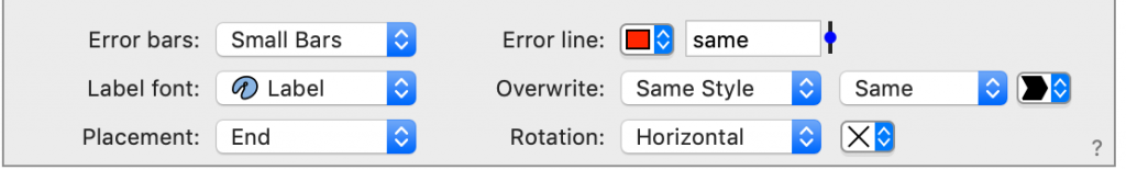
Error Bars
Add a column for the Error bars for each column.
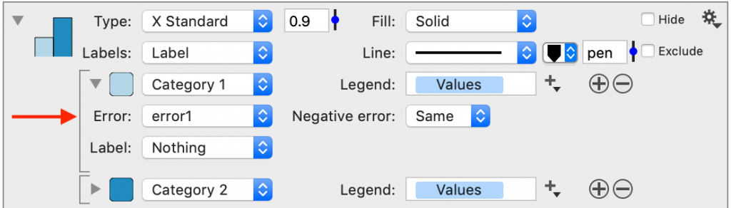
Customize the Error bars at the bottom of the command.
Bar Labels
You can select any column to add a label above each bar. Typically the label will be the same column as the data. If you hold down the Command key, you can click and drag the menu selection to copy the entry, as shown below.
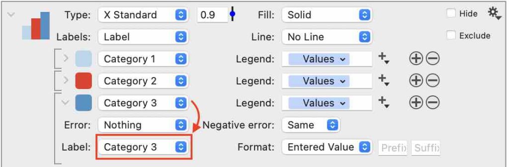

Additional formatting controls for the bar labels are at the bottom of the command. These settings are applied to all the bars with labels. Change the font, the placement, and the rotation.
In this example, the label has been rotated, and the font size has been reduced relative to the main font in the Style settings.


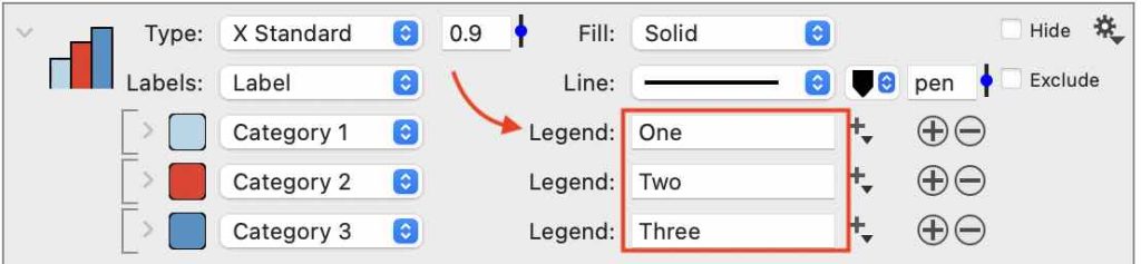
Legend
To the right of the column selectors is a Legend entry box. By default, the box contains tokens that use the column headers. You can customize the names by either changing the names in the columns or deleting the blue token and directly typing in a name as shown.