Extra Axis
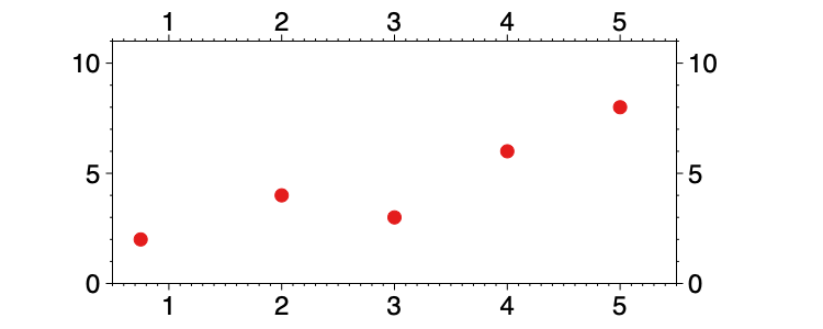
By default, graphs contain an x and y axis with tick marks and ranges that are automatically generated based on the data selected in the drawing command.
The Axis settings have a number of ways to customize the axes, but when you need more customization, add an Extra axis command.
Add an Extra Axis
You can add an extra axis drawing command using the Command menu.
The Extra Axis can be placed anywhere on the graph. Use this command to:
- Customize the look and location of the axis,
- Convert the axis units without modifying data, or
- Add a second axis.
Replace the Axis
You can use the extra axis to replace the default scale on the x or y-axis. In the Axis commands, hide the default axis by unchecking ‘Draw x/y numbers’.

NOTE: You don’t have to remove the default axis. You can combine several Extra Axis commands, and continue to show the default.
Type
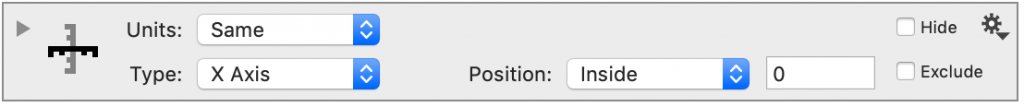
You can move the extra axis to the y-axis by using the Type drop-down box.
Units
By default, the Extra axis assumes the units for the new axis are the same as the default, such that the Units menu is set to ‘Same’. There are several convenient ways to display different units on the axes, without having to change the data.
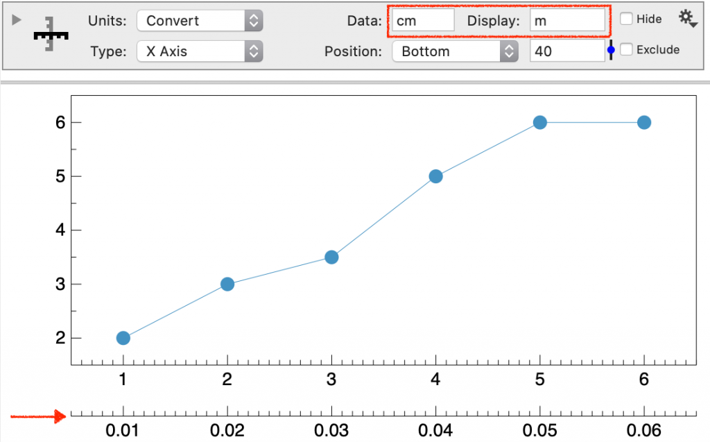
Convert
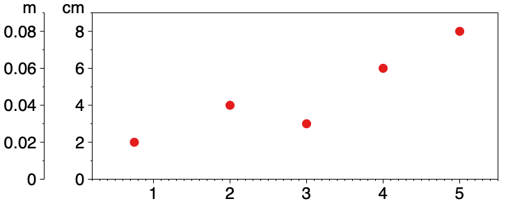
Set Units to ‘Convert’ and you will see two new entry boxes: Data and Display. For example, here is an Extra Axis command set to convert from centimeters to meters.
- Change the Units drop-down box to ‘Convert’.
- Enter the units of your data (Data)
- Enter the units you want to show (Display)
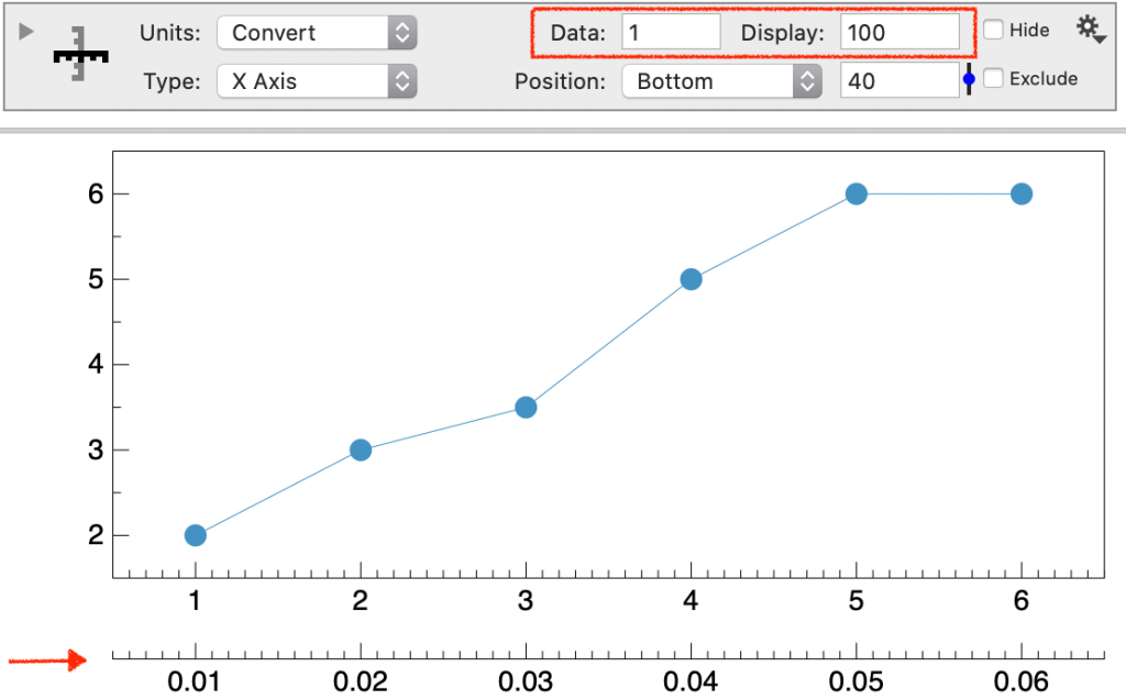
To have a custom conversion, enter numerical values directly into the Data and Display entry boxes. The scale is adjusted by multiplying by Data/Display.
DataGraph contains a large number of built-in units to allow you to convert between units symbolically. See the following reference section for the full list of built-in conversion factors.
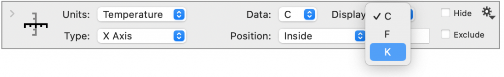
Temperature
Set Units to ‘Temperature’ to convert between temperature scales.
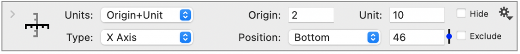
Origin+Unit
Set Units to ‘Origin+Unit’ and you can both shift and scale the axis units.
In the Origin entry box, enter the axis value for the origin or zero value. The value you enter in Unit will scale the current axis units by division.

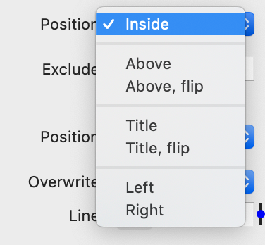
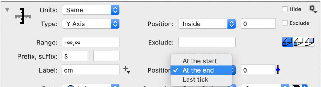
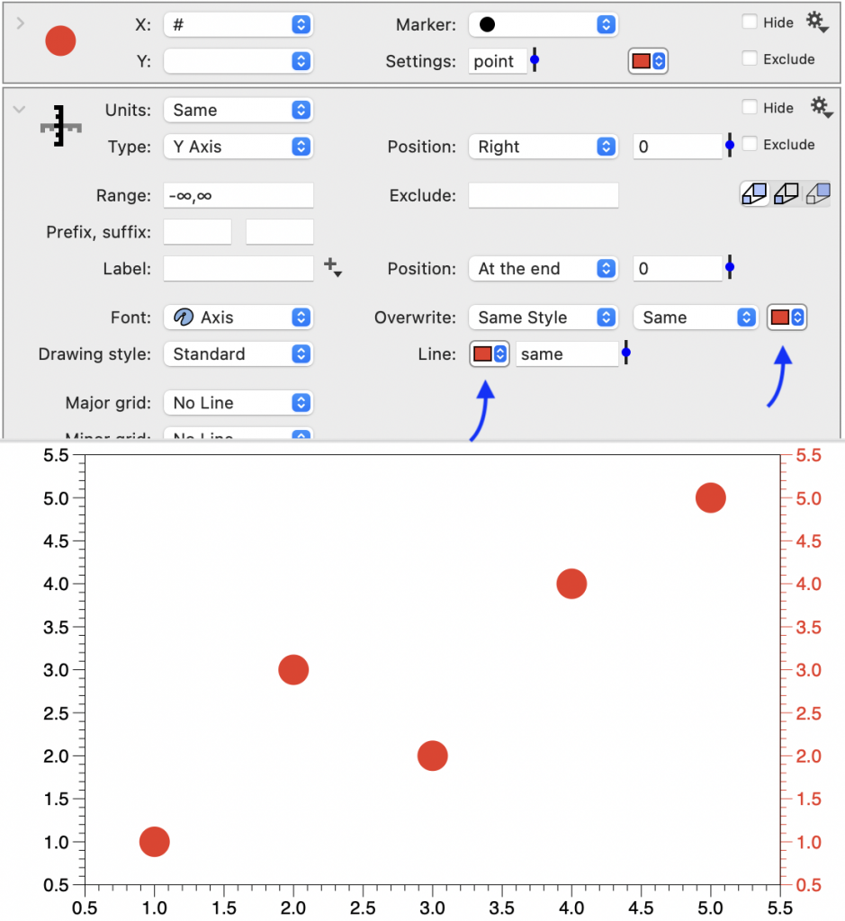
Position
You can also set up multiple scales on the same axis using the position offset.
Change the location of the axis using the Position menu.
You can also offset the axis, using the entry box to the right of the menu.
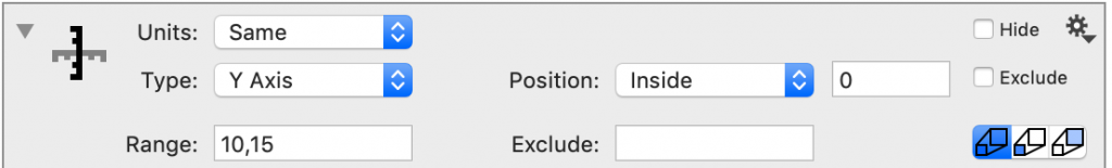
Range
The Range limits the section of the axis that is drawn.
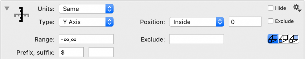
By default, the range is unlimited (-∞, ∞).
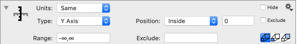
You can limit the lower bound (10, ∞), upper bound (-∞, 15), or limit both.
If you delete the infinity symbol (∞) and later decide you would like to use that setting, type Option-5 on the keyboard.
NOTE: This setting does not change the range that is included in the graph (that is controlled in the Axis settings).
Exclude
Exclude the tick mark label being drawn at a value or a comma-separated list of values.
Prefix, Suffix
Add a prefix or suffix to all the tick mark labels.
Labels
Labels for the y-axis are added above the axis.
Font & Line
You can control the font style and color, as well as, the color of the axis line.
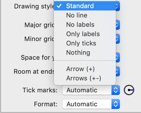
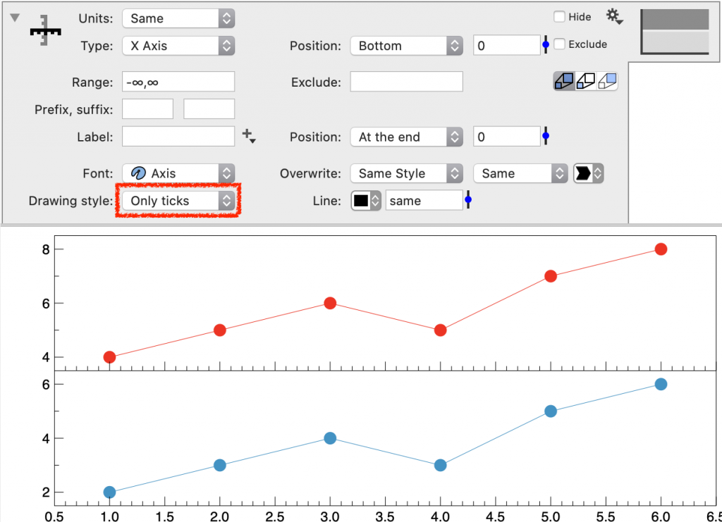
Drawing Style
You can customize how the axis is drawn.
For example, here the Extra axis command is used to add tick marks to a graph with a Split Y Axis, where the Drawing style is ‘Only ticks’.
Major Grid & Minor Grid
Add a grid that corresponds to the extra axis tick marks.
Space for y
Changes the amount of space reserved for the tick mark labels. If these numbers are long, you may need to increase them.
Room at ends
Moves the tick mark labels at the end of the axis.