Box
The Box command contains a wide variety of drawing techniques for representing distributions or data, including: box plots, point distributions, sideways histograms, and violin plots. These are non-parametric approaches (i.e., do not make any assumption about the underlying shape of a distribution of data).
New in Version 5.1 is the Point + Interval option. Show the mean or median along with percentile values, confidence intervals, or prediction intervals.
New Version 5.2: Extract outlier column.
Input Data
The Box command has a Values menu where you select a single number column containing the data to visualize. To the right of the Values menu is a Position menu. The Position menu is described more fully below but allows you to specify where on the x-axis the box is drawn or how to group the data when drawing multiple boxes.
Download the example file: Penguins.csv.
One Column
To quickly set up a Box command, you can preselect data in the data table.
Click the header to select a single number column. Then add the Box command. Here the Palmer Penguins dataset is used to illustrate, where the selected column is ‘Body Mass’.
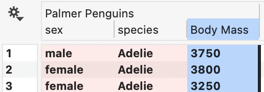
The command will output a single box plot where Values = ‘Body Mass’ and the box is located at x = 1.

Multiple Columns
The approach to creating multiple boxes depends on the format of your data. If you have data that spans multiple columns, you can create multiple box commands and position them manually on the x-axis.
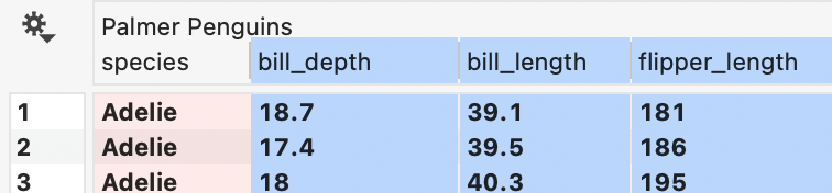
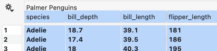
For example, here we have three columns of data to compare, bill depth, bill length, and flipper length. To quickly populate the commands, highlight all three number columns at once.
Then add three box commands. This creates one command for each column. Use the Position entry box to manually place the commands along the x-axis, or leave them at x=1.
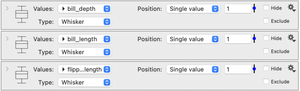
In this graph, the x-axis is hidden using the Axis settings, and a Label is added for each box.

Group by Text
Another option is to use a text column to group your data automatically. To quickly create, you can preselect one text column and one number column at the same time.
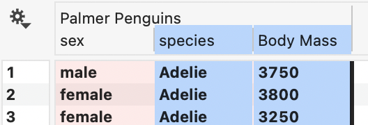
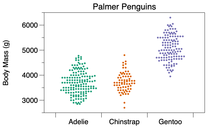
For example, the Palmer Penguin data has a text column that provides the species for each row of data. Select the species and Body Mass columns.
Then add the Box command. Here is the result, where Values = ‘Body Mass’ and Position = ‘species’.
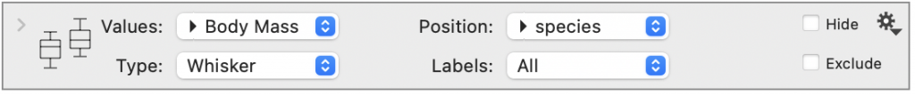
In the resulting graph, the data are grouped according to each unique entry in the text column, in this case, the three species. By default, they are ordered alphabetically at integer values along the x-axis. Also, the x-axis automatically shows each category, instead of the numeric value.

Group Multiple
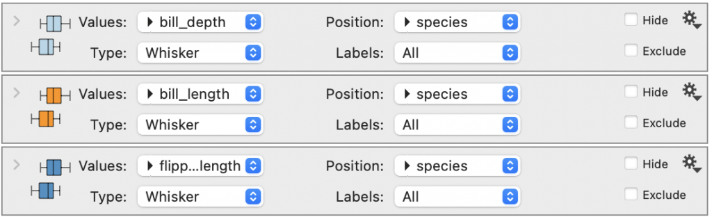
You can also group multiple columns at once by selecting one text column and multiple number columns. For example, here the columns for bill depth, bill length, and flipper length are all selected along with the species column.
Add three box commands. Each one will use the species column to group the entries, resulting in nine box plots being drawn in the graph, three from each command. Here are the resulting commands where the Direction is set to ‘Y’ for each command and fill has been added.
Here is the resulting graph where the x-axis is set to logarithmic and the y-axis is reversed (Axis settings).
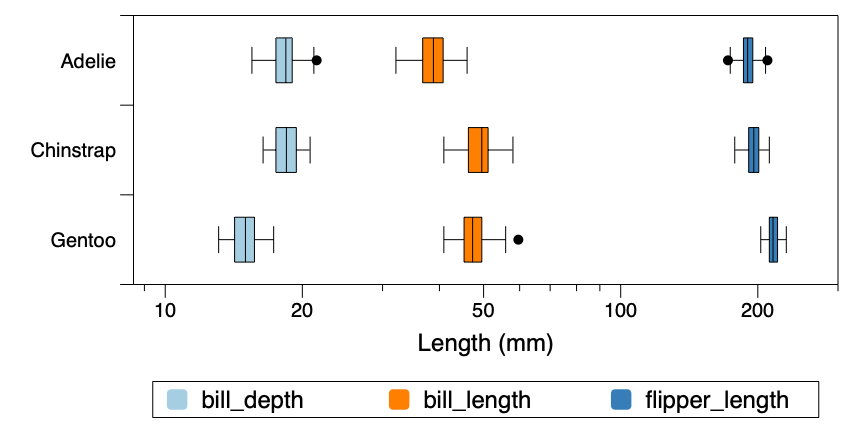
To add a legend as shown above, you can use the Custom Legend command.
To reorder the categories on the axis, use the Labels menu to select a column that shows the categories in the preferred order. To group your entries based on a number column, the Position menu can also accept a number column.
The Labels and Position options are described more in the corresponding sections below.
Type Options
In addition to the standard Box and Whisker, there are several other types of graphs you can create using a Box command. Each option is described in more detail below.
Whisker
By default, the Type is set to ‘Whisker’ and the command outputs a Box and Whisker diagram (See Wikipedia).
In this type of graphic, the box is drawn around the Inner Quartile Range (IQR), where the IQR is the difference between the first (Q1) and third (Q3) quartiles.
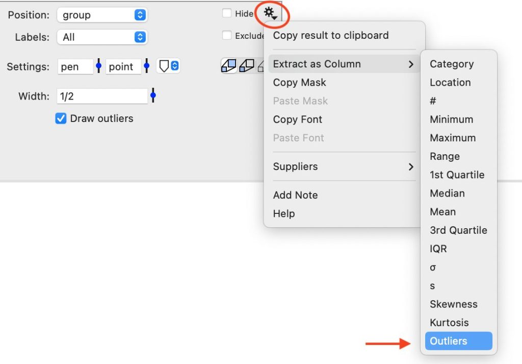
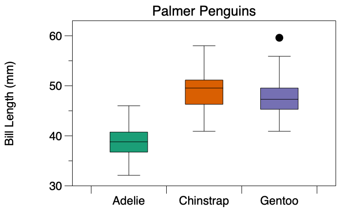
The whiskers are drawn to the smallest/largest non-outlier. Outliers are defined as either Q1-1.5 IQR or Q3+1.5 IQR. Extreme outliers are are defined as either Q1-3 IQR or Q3+3 IQR. Outliers are drawn as filled-in circles and extreme outliers are open circles. Use the Gear menu to extract a column to indicate when a row contains an outlier (Value=1) or extreme outlier (Value=2).
For example, this graph contains two outliers in the Chinstrap data and no extreme outliers.
Expand the command, and you will have the option to change the Whiskers to ‘Min/Max’ or ‘Percentages’. Other options include: not drawing outliers, changing the width of the box, changing the direction of the box, or adding a fill.
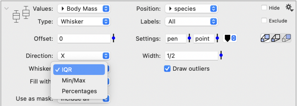
Here is the same data as shown above but now with the Min/Max option.

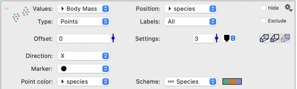
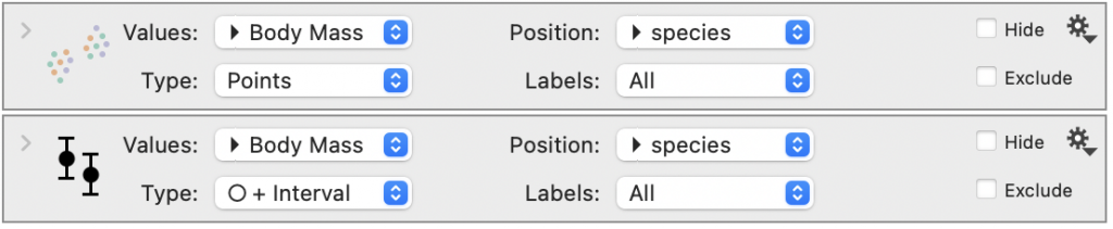
Points
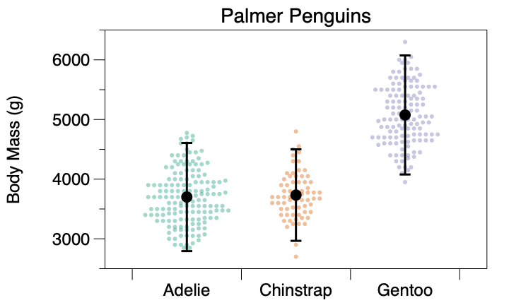
The Box command can draw a point cloud. You can change the Maker type and change the Point color to use a color scheme. Here is the same example drawn with Type = ‘Points’ and the Point Color is using a color scheme.
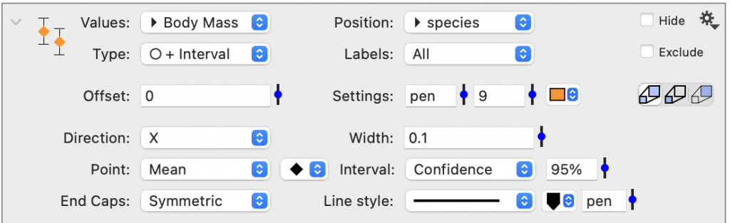
Point + Interval
New in version 5.1. The Point plus interval option allows you to display the mean or median along with different intervals, such as the min/max, percentiles around the median, or prediction/confidence intervals around a mean.
Note that you can toggle between the mean and median, or the intervals from confidence intervals to percentiles. This is helpful for exploring data but, when you select a combination where the point may be outside the interval, you will get a warning:
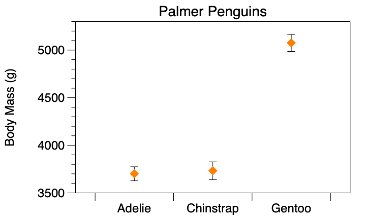
This option can be combined with other box commands to create more complete representations of data. In the following image, the Point + Interval option is showing the median value and the interval is the 95th middle percentile around the median. In a separate command, the same data is illustrated using the Points option with transparency in the color scheme to lighten the colors.
Sideways Histograms
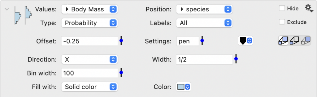
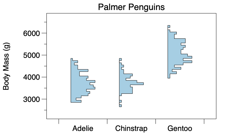
The Probability/Histogram options are used to draw sideways histograms. You can control the width of the Bin width or add an Offset. Probability scales the height individually for each category. Thus, categories with a varying number of entries will have the same width. Histogram scales the height relative to the entire dataset, so differences in the number of points in a category can be represented.
Here the Penguins data is used with the Type = ‘Probability’. Note the bin width was increased to 100 and an offset was added to shift the histograms to the left.
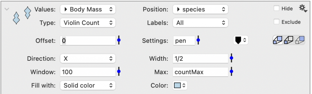
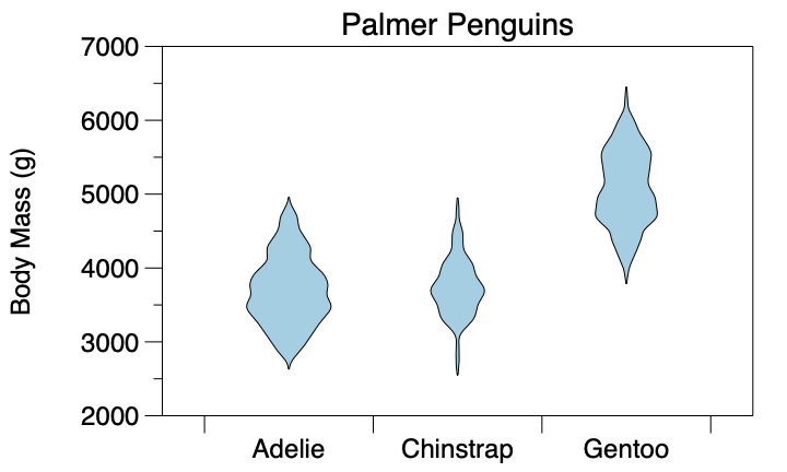
Violin Plots
There are two options for violin plots, Violin PDF (scales each individually) and Violin Count (scales based on the number of points across the dataset). When you have the same number of data points in each group, Violin PDF and Violin Count produce similar results.
Here the data is shown using Type = ‘Violin Count’. Thus, the lesser number of individuals in the Chinstrap group is reflected in the graphic. Note the Window here is similar to the Bin width for the sideways histograms, and set to the same value as before.
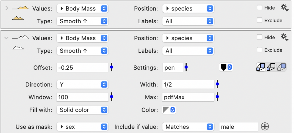
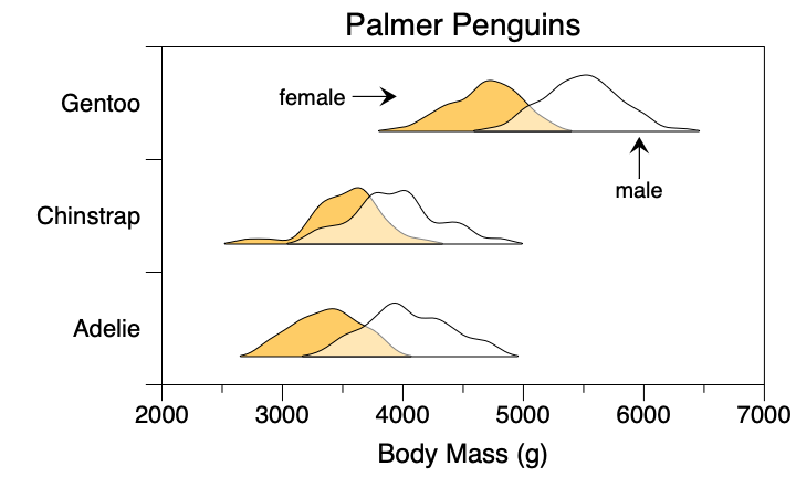
Smooth
The Smooth option draws smooth sideways histograms. They can be drawn left or right. These also have the option of being drawn so they reflect the number of entries (Smooth #). Thus there are a total of four Smooth options.
Similar to the other options, you can set Direction to ‘Y’. Here we overlay two commands where the data is masked based on sex.
Position
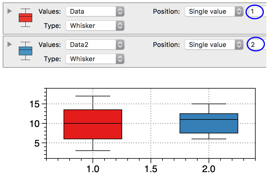
The Position indicates the location of the box on the X-axis.
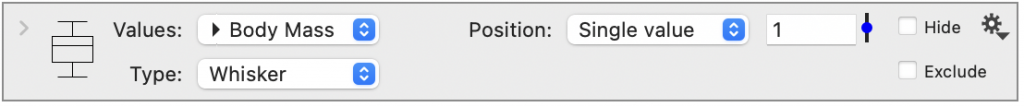
When the Position is set to the default of ‘Single value’, the number to the right indicates the numerical location on the X-axis, and each command draws one box.
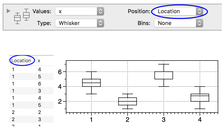
When the Position is set to a numerical column, the value of the column can be used to specify multiple locations.
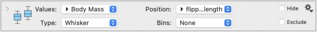
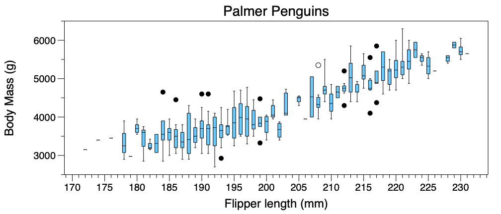
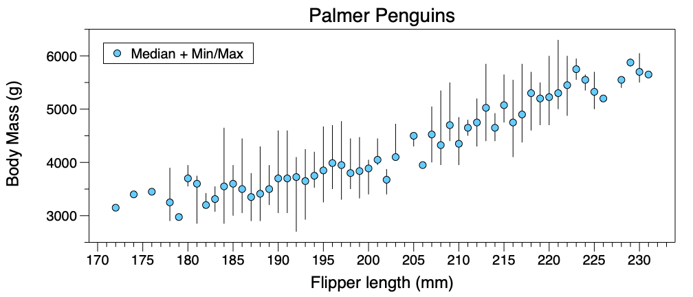
Here is the first example on this page where Position is set to flipper length and a Fill has been added. The data is grouped by each unique flipper length. The box plots are now positioned at each unique value for flipper length.
Here is the same graph using Type = ‘Point + Interval’.
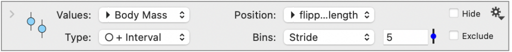
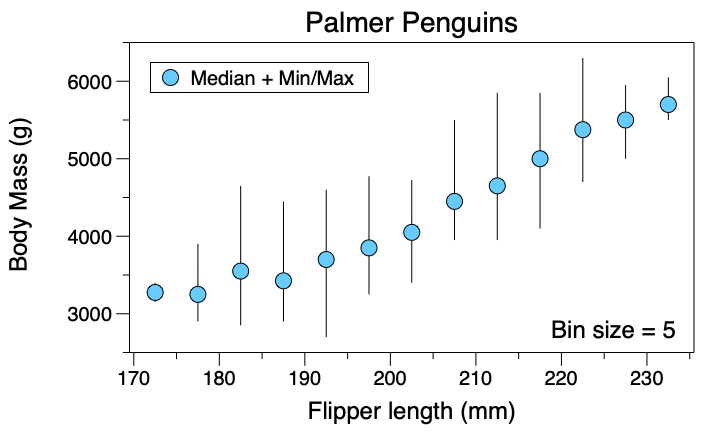
Bins
When the Position is set to a numerical column, you have the option of binning the data, using the Bins menu. By default Bins is set to ‘None’. Change Bins to ‘Stride’. An entry box with a slider appears.
Binning the values may illustrate trends more clearly. For example, here is the same graph as above where the data has been binned with a stride of 5.
Labels
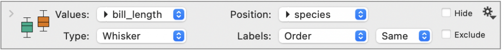
The Labels menu appears below the Position menu when the Position is set to a text column. Using the Labels menu, you can specify the order of the categories on the x-axis.
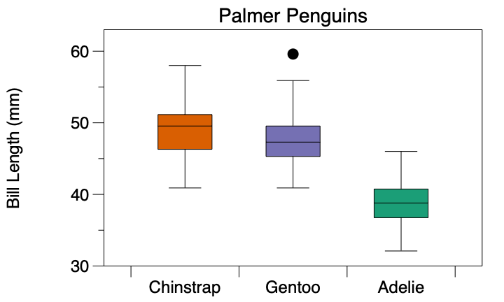
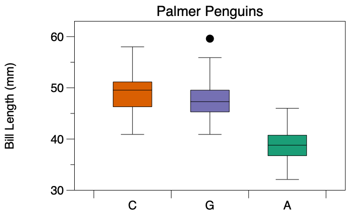
For example, here is a box plot for the Palmer Penguins for bill length. The Fill is set to a color scheme based on the species.
To change the order, create a column with the same names in the preferred order.
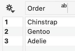
Then select that column from the Labels menu.
To the right of the Labels menu, there is a second menu that allows you to change the name of the category. First, you need a column in your data table that shows the corresponding name. Here we called the column ‘New’.
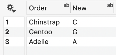
Select the column you created, in this case, the ‘New’ column.
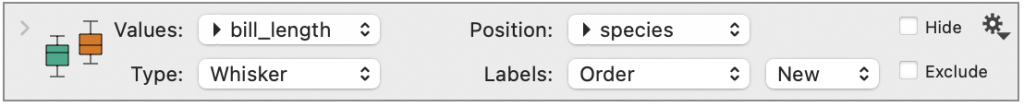
The labels on the graph will show those values.
Output
The Box command has a scrollable table is shown that provides a list of summary statistics. If you have a single box (one bin of data), the statistics will be in a single scrollable column. If you have multiple boxes drawn by a command, each box is listed as a row in the table.
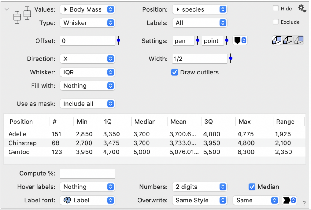
Directly below this table, you can specify additional percentages that you would like to compute. There is also a check box that will add a label with the numerical value of the median to the box plot.
Click the gear menu to extract computed values back to the data table. For example, you can output a column containing the outlier status of each row where 1 = outlier and 2 = extreme outlier.