Style settings
At the top of the settings is the Style settings, with an icon that looks like an artist palette.

Overview
In the style settings, you can set the font, line, and point styles, in terms of both size and colors. This is a top-down or style sheet approach. For example, change the line width in one place and all lines in the graph will update. By default, other settings and drawing commands will refer to these settings, but each one can be overwritten as you customize your graph.
Fonts
Common
To edit the font, start with the Font menu. To the right of the menu, adjust the font size and color.

Choose from a list of common font families including: one slab serif (monospaced), five sans serif, and two serif fonts. By default, all the text in your graph will be set by the font you select.

System
To select a font not found in the Font menu, change the Main menu to ‘Specify…’ This will change the font menu to a selection area. Hover the cursor over that area. Click to choose from the full list of system fonts.

LaTex
The Main menu can also be set to ‘LaTeX’. To learn more see LaTeX fonts.
Groups
Click the top left corner to see the expanded view. Here you can control the font style based on four font groups.
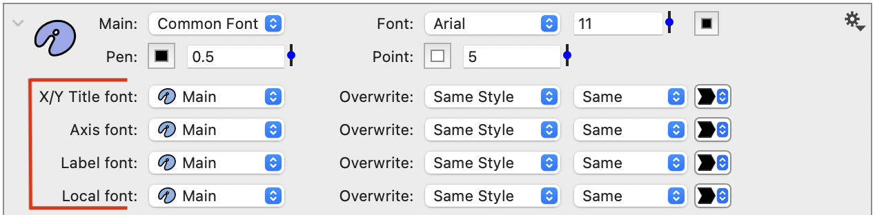
All the text elements in a graph are assigned to one of the first three groups.
- X/Y Title font – The titles in the Axis settings.
- Axis font – The tick mark labels.
- Label font – Several commands (e.g., Text, Label) and data labels in drawing commands.
- Local font – Custom font style that is not used by default.
By default, each group is set to the Main font defined above. For example, here is a graph with multiple text elements all set to the same font, size, and style.

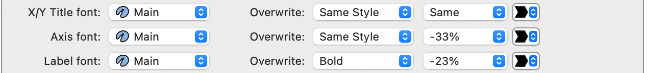
Here is the same graph with the Axis font and Label font scaled down relative to the main font size. Also, the Label font is set to ‘Bold’. Notice that not only are the fonts smaller, but also the graph has more major tick marks, as there is more room along the axis.

If you change the Main font to Palatino, all the text elements change.

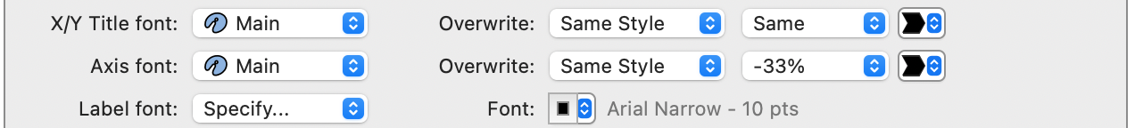
You can also specify a different font for each category. For example, here the Label font is set to Arial Narrow, while all the other elements are still set to the Main font, which is Arial.

Pen
The ‘pen’ variable sets the line width in pixels.

When you change the pen variable, you change the line thickness across the entire graph in one place. In the pen entry box, you can type in a different number, use the slider to adjust the value, or enter a different variable name that you create.
Point
The ‘point‘ variable is the size of the points in pixels.

This point is similar to the pen in that it is a variable. Rather than change the point size in each command, change the size in one place.
Colors
Below the fonts, you set the color theme.

You can use the built in colors or you can overwrite the colors freely. The colors that are selected in the style settings are then accessible to the drawing commands. The drawing commands can pick those colors from a menu rather than having to pick every color separately. The intent is to make it easy to limit the number of colors you use and change the color of several objects at once. By defining them here you can quickly change the color scheme of the entire graph.
Lines
In the next section, the options for line styles, axis lines, grid lines, and tick marks are explained. Notice that the entry box for line width is set to ‘pen‘ by default. In these entry boxes, you can type in a different number, use the slider to adjust the value, or enter a different variable name that you create.
NOTE: Since pen is a variable, you can also use it to create expressions for other settings. For example, you can set the axis line to be pen*2 to make it twice as wide as the pen.
Line Styles
Every command that draws lines will have a Line style menu. This includes the Plot, Plots, Lines, and Connect commands. There are nine default styles in this menu. At the bottom of the menu, there is a section called ‘From Style’. For example, here is the Line Styles menu in the Plot command with the first custom line style highlighted.
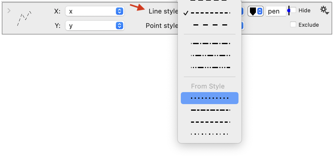
These bottom four styles can be customized in this Style settings. The four line styles are specified using numerical values. The first number is the pixel width of the line segment and the second number is the width of the gap.

Box Style
Change how lines are drawn around the axis and customize the axis line.

Options include:
- One Box (Default) – Draws a line around the entire axis.
- Axis Box – Draws a line around each axis. If the axis is split, there will be multiple boxes.
- Axis Only – Only draws the x and y axis, unless these are hidden on the Axis settings.
- Offset Axis – Creates an offset between the data and the axis lines. The size of the offset can be customized.
Axis Line
Customize the color and thickness of the axis lines and tick mark lines.

Set the drawing order of the axis box using the Axis position setting. By default, the axis lines are drawn ‘Above’ all other objects on the graph, but you can change this setting to draw the axis lines ‘Below’ all other objects.
Gridlines
Set the grid style and the drawing style for the tick marks.
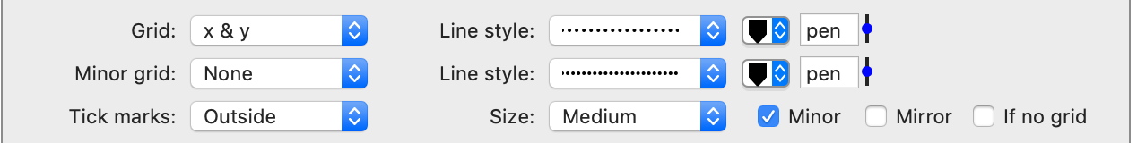
Tick marks
By default the tick marks are outside the graph to avoid overlapping the data. If you prefer to have the tick marks inside the graph you can edit that here.
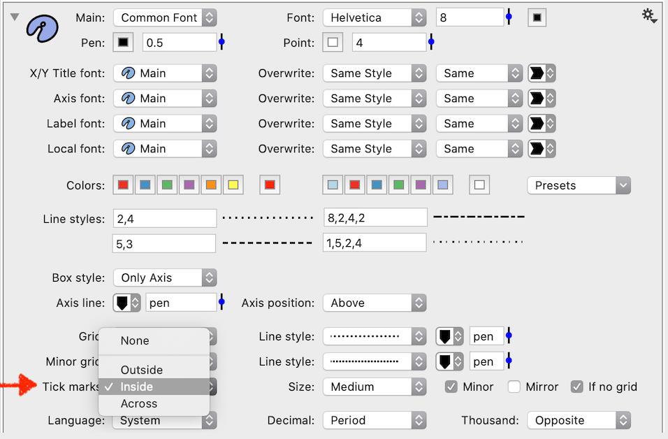
You can also change the tick mark Size, remove Minor tick marks, or Mirror the tick marks to both sides of the graph.
NOTE: The position of tick marks is controlled by the Axis settings or by using the Extra Axis drawing command.
Language & Numbers
Customize the language and localization settings.

The date tick marks use names such as Jan, Feb, and date formatters allow you to use week day names as well. The default option is to use the settings in the system, but if you want to share a file with someone in a different country or use a different language for other reasons, you can select that here.
Here you can also specify whether or not numbers should be formatted with a decimal or a period.
Copy Settings
The gear menu on the Style settings contains shortcuts to transfer settings from one graph to another. You can copy the all the settings by selecting the object (click the icon) and select Edit > Copy (or ⌘-C), or click the gear menu and select ‘Copy style’. You can also use the gear menu to copy only the fonts, as shown below.
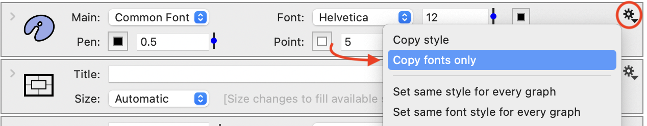
To apply to a graph in the same or another file, click a graph thumbnail use Edit > Paste (or ⌘-V) to apply the settings. You can also use ‘Set same style for every graph’ to apply the settings across every graph in a file.
Style set

You can save the settings by using the style set and quickly switch between styles. For example, you can set up a grayscale vs color theme or thick presentation theme vs thin scheme for printing.
You can copy a style and paste it into a style setting in a different graph. You do that by selecting the style setting entry (thick blue border) and select Copy. Then go to the graph you want to change and select Paste. You don’t have to select anything.