Axis settings
The Axis settings are the third object in the layout settings, under the Style settings and the Canvas settings. Using this object, you can add labels, control the type, change the axis range, and customize the tick marks.

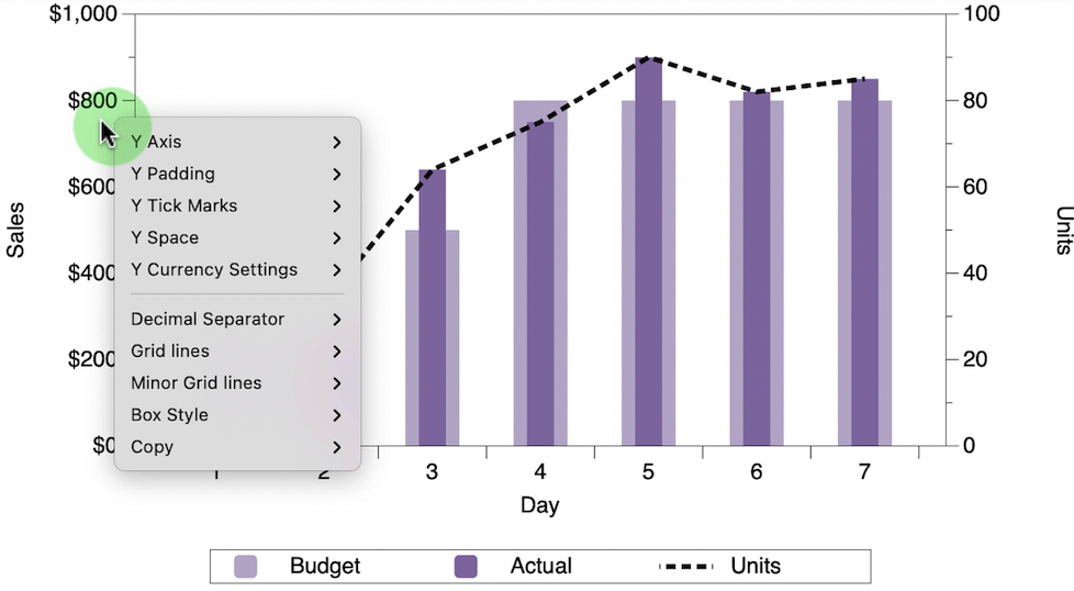
Note that several of the axis settings can be modified directly from the graph window by control-clicking just outside of the graph (left or below). Otherwise, they can be changed directly, as shown below.
X-Y Title
Label the X or Y axis.

- Enter text directly
- Use a token to refer to a column name or text variable
To use a token type the plus symbol to the right of the text entry box.
Type
The axis Type determines how a coordinate is mapped.

| Linear (default) | each unit on the axis has the same length in the output |
| Reversed | the data and scale are flipped |
| Logarithmic | computes the logarithm of the data and draws the result linearly |
| Reversed Log | the data and scale are flipped on the log axis |
The most common is Linear. Logarithmic is better when you draw stock prices and other data where relative growth/reduction is more important than absolute size.
Draw x/y numbers
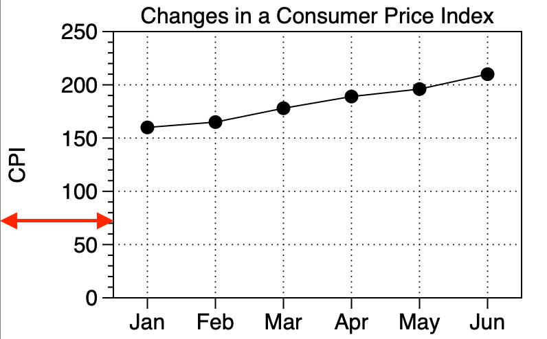
Does not change the scale, only hides it from being drawn. This can be useful when you want to customize the axis with an extra axis command, or for creating schematic drawings/graphics.

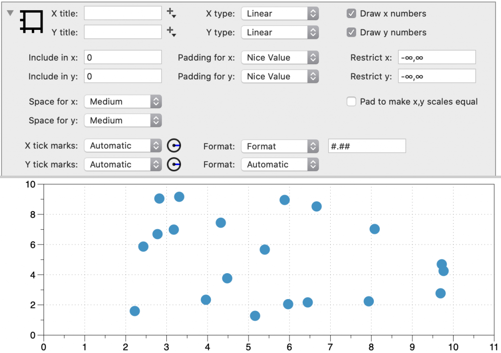
Axis Range
Three settings allow you to modify the axis ranges: (1) Include, (2) Padding, and (3) Restrict. These settings are directly below the main options when you expand the object (click the top left corner).
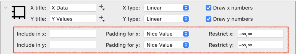
Include
In the Include field, you can enter values that you want to make sure are included in the axis range. For example, if you wanted a graph to span, at a minimum, from -10 to 10, you would set Include to “-10,10”.
Padding
The Padding is set to avoid points lying directly on the axis box.
- None — combine with Include to set an exact range
- Snap to ‘0’ — no padding unless the scale is close to ‘0’
- Nice value (default) — automatic, try to make sure the axis ends at a tick mark (major or minor)
- 5% — padding is 5% on both ends of the interval
- 10% — padding is 10% on both ends of the interval
When this is set to “Nice Value”, DataGraph will increase the range by a small amount beyond the minimum and maximum values in the data, and then pick the nearest tick mark.
Restrict
In the Restrict field, you can enter values that you want to make sure your graph does not go beyond. For example, if you are certain you don’t want your graph to exceed a 1000, set Restrict to (-∞, 1000) .
Restrict ensures the axis does not go beyond a particular range, and requires a minimum and a maximum value. By default, Restrict is set to (-∞, ∞) or all values. The Restrict setting overrides all other settings, and might therefore overwrite the range specified in the Include field.
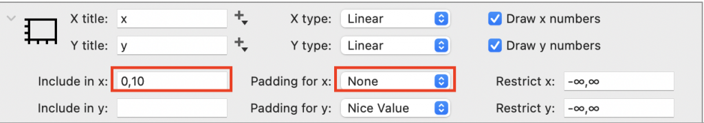
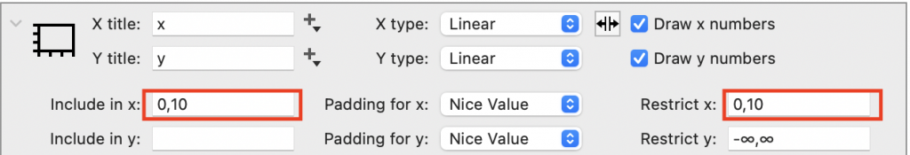
Axis Limits
By design, DataGraph does not have one setting for a min/max value on the scale. Instead, you have more control using the Include, Padding, and Restrict settings discussed above. In cases where you would like to force minimum and maximum values, there are two options:
1 – Add the min and max values to Include and set the Padding to none. This approach allows the range to adjust when new data is added beyond the range.
2 – If you want to ensure your graph will never extend beyond a specific range, then set the Include and Restrict to the same values.
Force Aspect Ratio
The Force Aspect Ratio check box allows you to control the data aspect ratio, the relative length of the data units along the x and y axes.
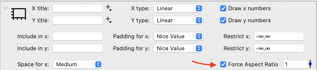
For example, here is a plot of the line x=y using the default settings.

Checking the Force Aspect Ratio box adds padding to the x or y scale to force the graph to match the numerical value to the right of the box.
Here the same data is plotted with the ‘Force Aspect Ratio’ box checked. Thus, padding is added to the x-axis to force the ratio of x-unit / y-unit = 1.

The value of the data aspect ratio can be specified. Here the ratio is set to 2, such that there are 2 x-units for every y-unit.
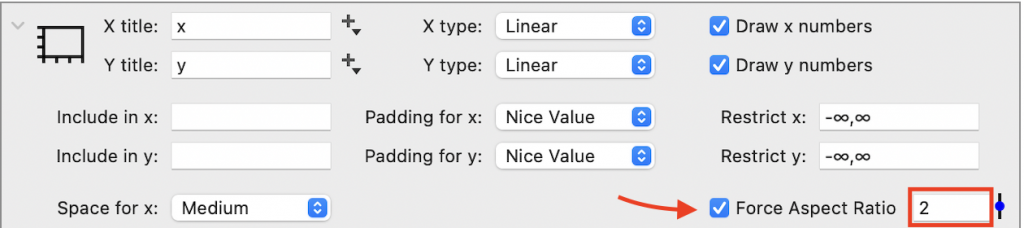

When the ratio is less than 1, the number of y units for a given length is greater than the number of x units.

NOTE: To control the aspect ratio of the graph itself, use the Canvas settings to set the size and margins.
Space
Space between the x-axis or y-axis and edge of the graph.
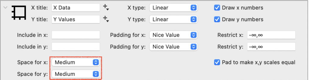
There are several built-in settings that will scale with changes in the font size (Narrow, Medium, High, … ).
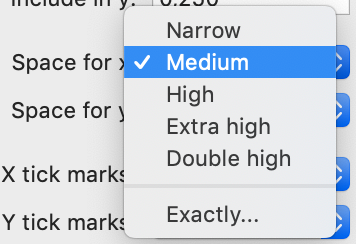
You can also set the Space to an ‘Exact’ distance in pixels.
Tick marks
Set the Tick mark options.
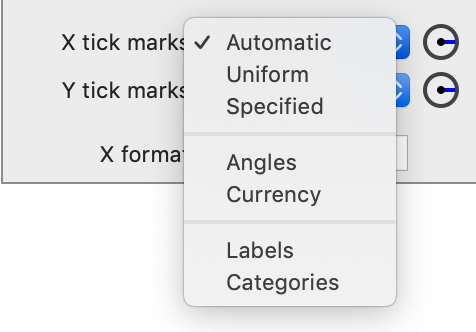
Automatic
By default, the tick mark locations are set to ‘Automatic’ and they scale with the size of the graph.
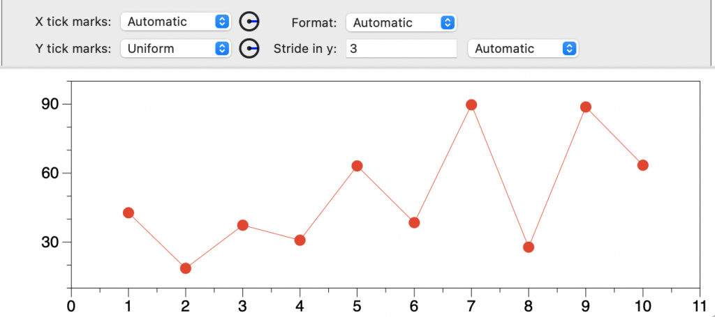
Uniform
This setting is similar to ‘Automatic’ but gives you more control over the location of the major tick marks. When you select Uniform, you can specify the Stride, or the increment between the major tick marks.
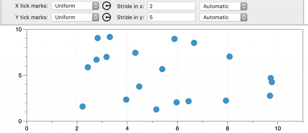
The program will either use that stride, or a multiple of the entered stride. If you enter ‘3’, then ‘3’, or ’30’, or ‘300’, are all possible strides depending on the scale and size of the graph. Thus, the actual stride applied to the graph may be larger than the entered value when the number of tick marks will not fit using the entered value.
For example, here the stride in y is ‘3’, but given the range of the data, the applied stride is ’30’.
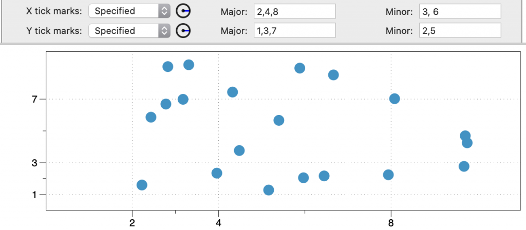
Specify
With the ‘Specify’ setting, locations for major and minor tick marks can be specified.
Labels
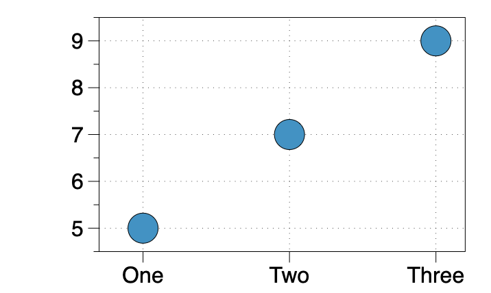
If you have a graph that has a numerical axis, like the following:
The ‘Labels’ setting can be used to change the numeric values to labels.
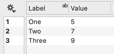
For example, consider this data with a text column we want to use as labels:
- Change X tick marks to ‘Labels’
- Change Locations to a numerical column or the row number (#)
- Select a text column for the Labels

Here is the resulting graph.
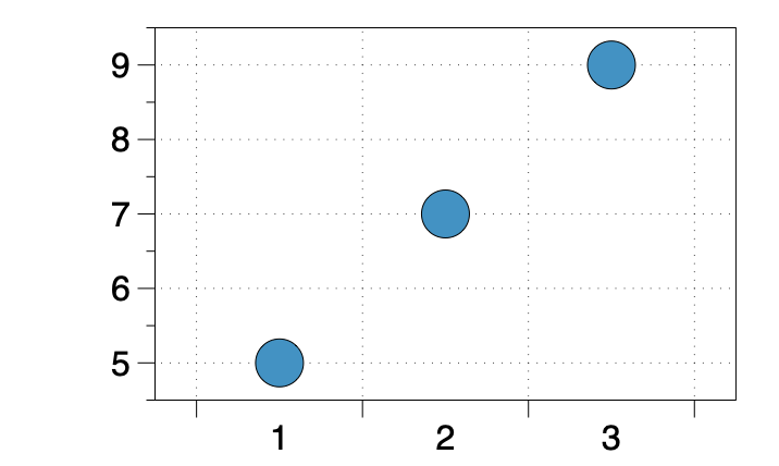
Categories
The ‘Categories’ setting is similar to ‘Labels’ (see above) but the axes are shown in a categorical format, with tick marks between the labels.

Here are the categorical labels.
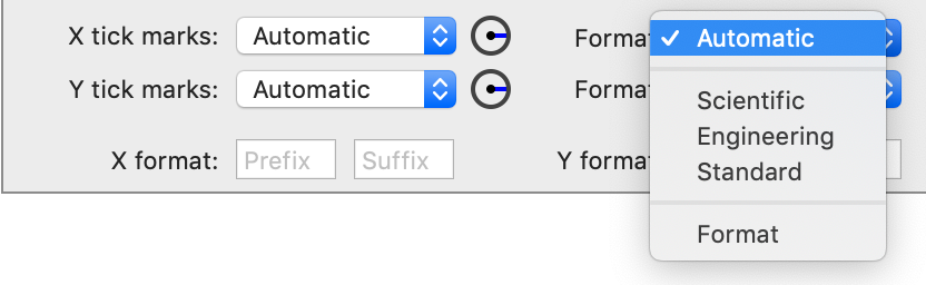
Format
The Format of the axis label.
Prefix & Suffix
The Prefix is added before every axis label. The Suffix is added after every axis label. For example, if you want to show a ‘$’ symbol for currency, use that for the Prefix.
