-
Getting Started
-
User Interface
-
Data
-
Columns
-
Variables
-
Commands
-
Layout settings
-
Customize
-
Functions
-
Exporting
-
Scripting
-
Beta
-
Versions
-
Join the Community
Pie
The Pie command can be used to make pie charts, donut charts, and has a lot of customization options.
For a quick demo see ‘How to make a Pie Chart’.
Input
Values
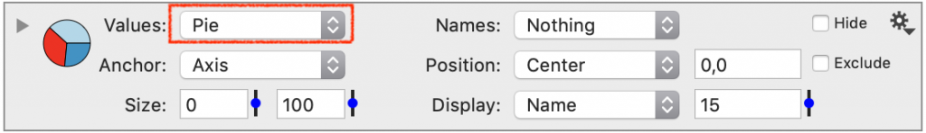
The Pie command uses a single numerical column as input.
The input column is specified in the Values menu.
Names
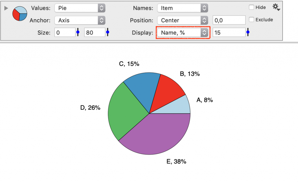
The Names menu is optional input, that can be used to add a label to each slice of the pie.
The Names menu can be used to:
- Specify a label to use in the Legend.
- Display on the pie chart next to each slice.
NOTE: Further customize the labels on the graph using the Display menu.
Anchor & Position
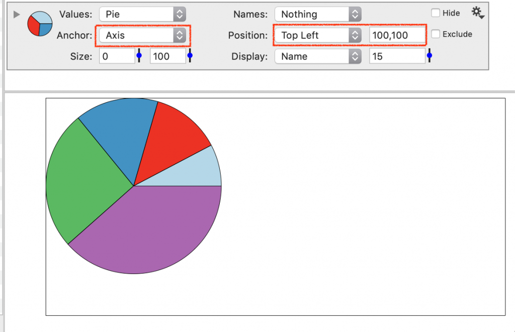
The Anchor and Position settings work together to control the location of the chart.
Anchor the Pie chart in three different ways.
- Axis (default) – within the x-y axis range
- Figure – anywhere on the drawing canvas
- Coordinate – specify an x-y coordinate location
When Anchor is set to ‘Axis’ or ‘Figure’, the Position specifies where the center of the pie is anchored.
An offset can be entered in pixels (horizontal, vertical).
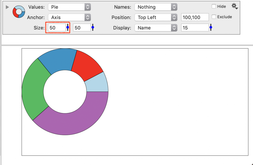
Size
The Size has two settings. One controls the radius of the pie.
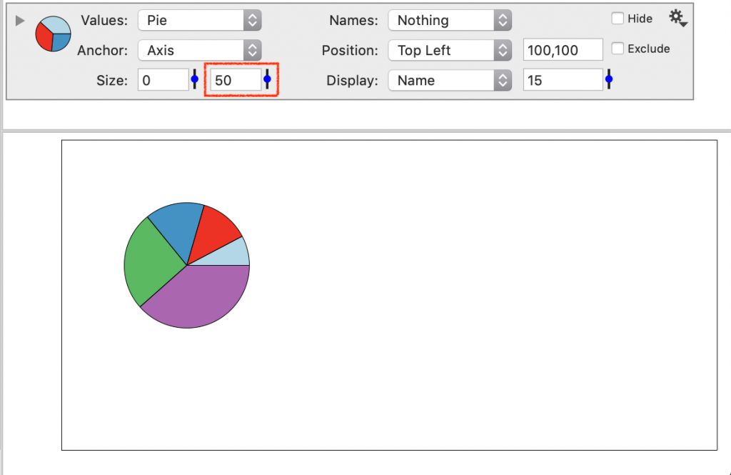
The other controls the size of the center. When this is > 0, the shape is an annulus or ‘donut’ graph.
Display
By default, the pie slices are be labeled using the Names column.
You can change the display to show the name, the value or the percentage.