How to make a Bar Graph
Here we refer to two types of bar graphs.
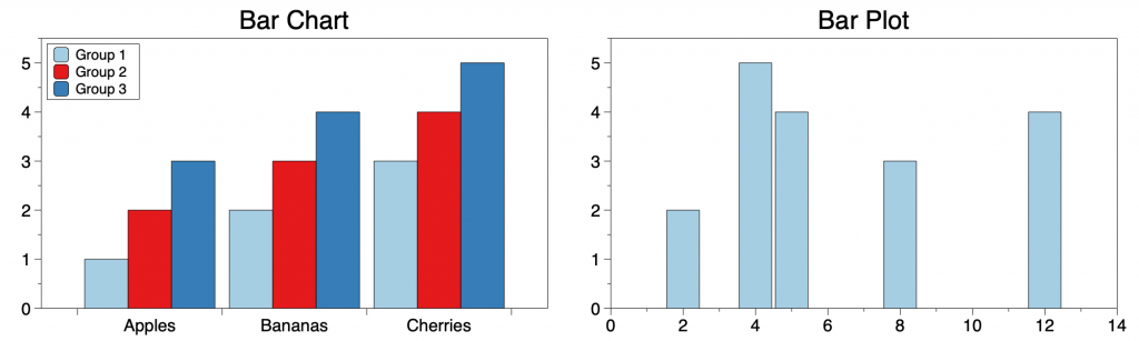
- Bar Charts — bars are grouped according to categories
- Bar Plots — bars are located at numerical locations
Here is an example of each.
In DataGraph, there are three commands that create bar graphs: Bar, Bars, and Pivot commands.
The command you use depends on the format of your data and the type of bar graph you want to create.
NOTE: The terms bar graph, bar chart, and bar plot are often used interchangeably. Typically, these terms refer to a bar graph where the bars are grouped according to a category, referred to here as a ‘bar chart’. In DataGraph, you can specify the location of the bar on the axis. To make this distinction, we use the term ‘bar plots’ for graphs where the bar location is specified.
Bar Charts
Create side-by-side bar charts using the Bars or the Pivot command.
Bars Command
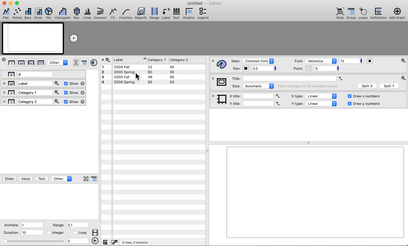
The Bars command is used for data in a table type of format, where each bar category has its own column.
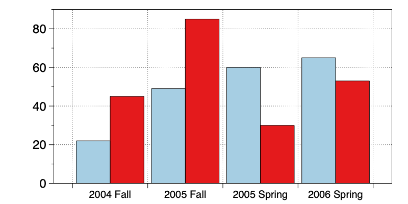
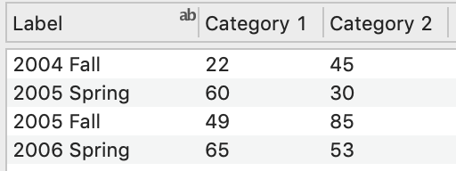
Here the values are grouped using two columns.
- Highlight the columns with the text column on the left
- Click the Bars command shortcut on the tool bar
More: See the Bars command documentation.
Pivot command
The Pivot command uses a more general data format.
Here we have ‘flattened’ the previous data set, such that the labels, categories, and values are each in a single column.
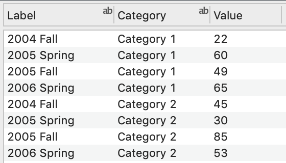
- Highlight the columns with the categories on the left
- Click the Pivot command shortcut
- Click the Legend command shortcut
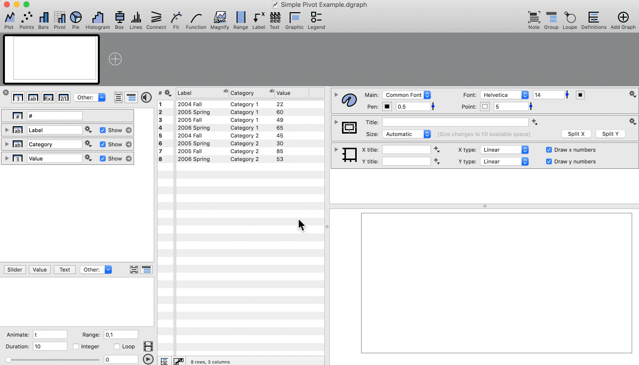
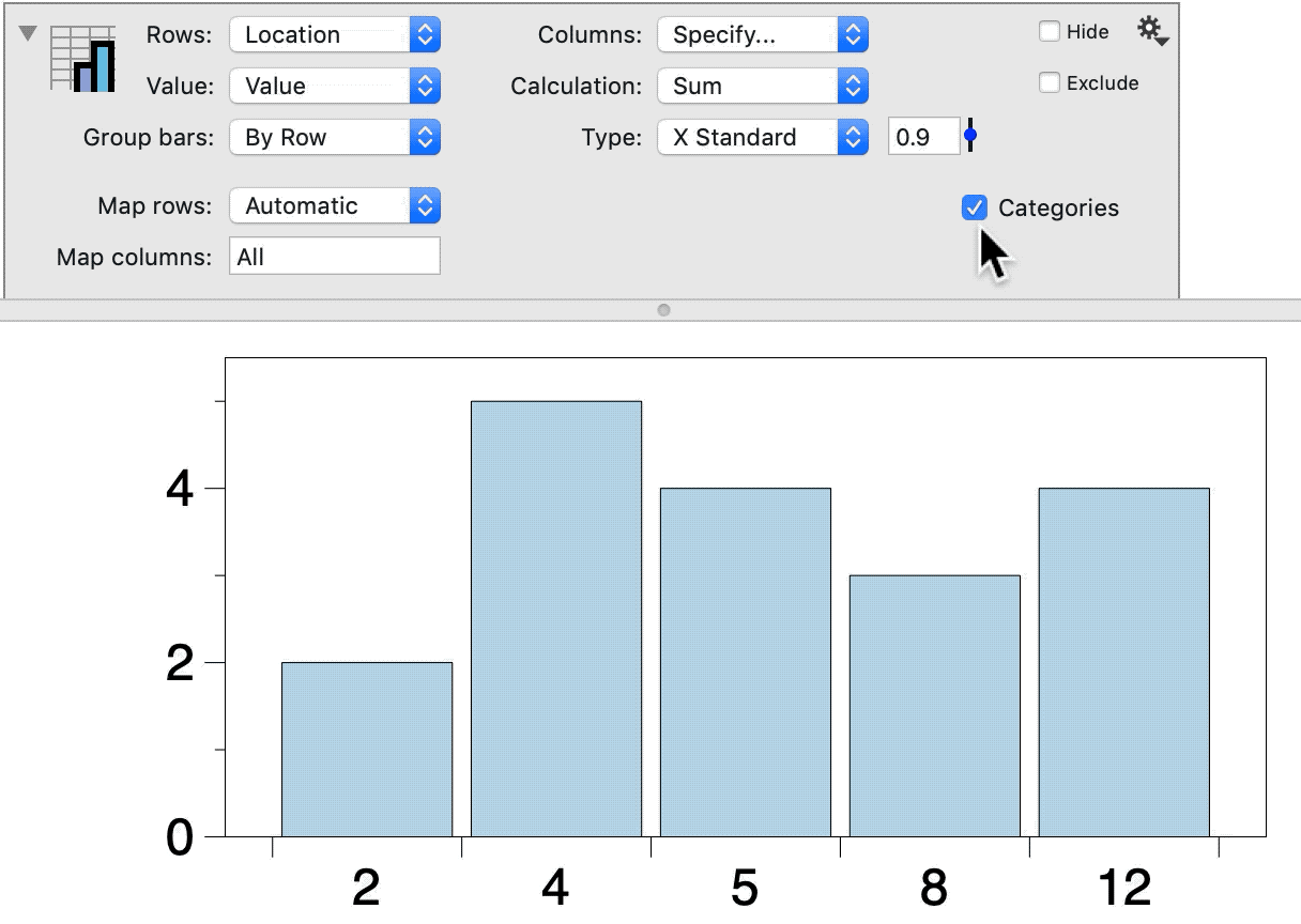
Click the top left corner of the Pivot command to view the pivoted data.
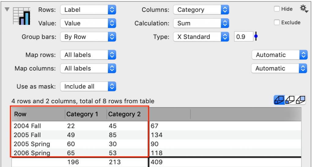
Use the Group bars menu to quickly switch the axis labels.
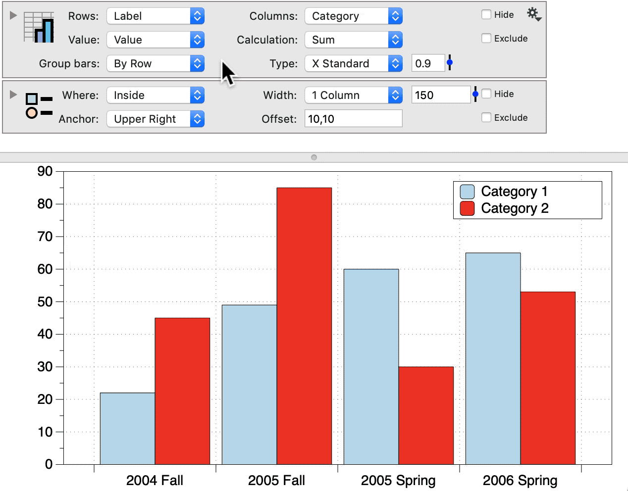
NOTE: The Pivot command is also a tool for analyzing data and performing calculations. In this example, the command is set to ‘Sum’ the values (default setting). Since there is only one value per each bin (each combination of Label and Category), the resulting bar chart simply shows the value for each combination.
More: See the Pivot command documentation.
Bar Plots
Create bar plots using the Bar or the Pivot command.
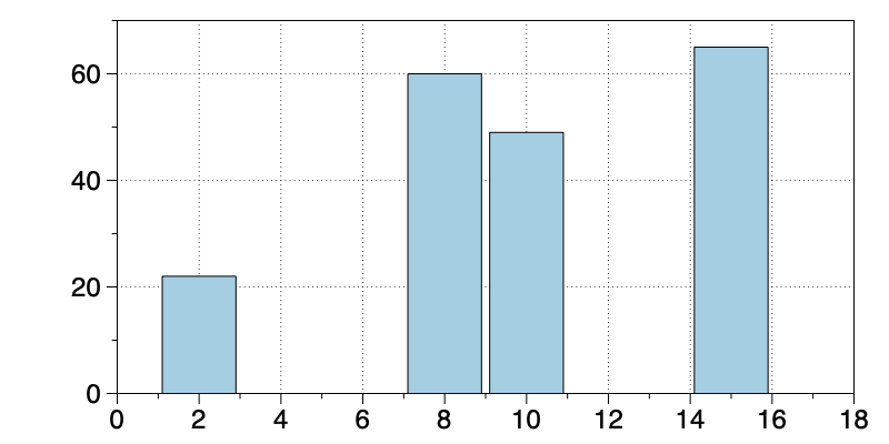
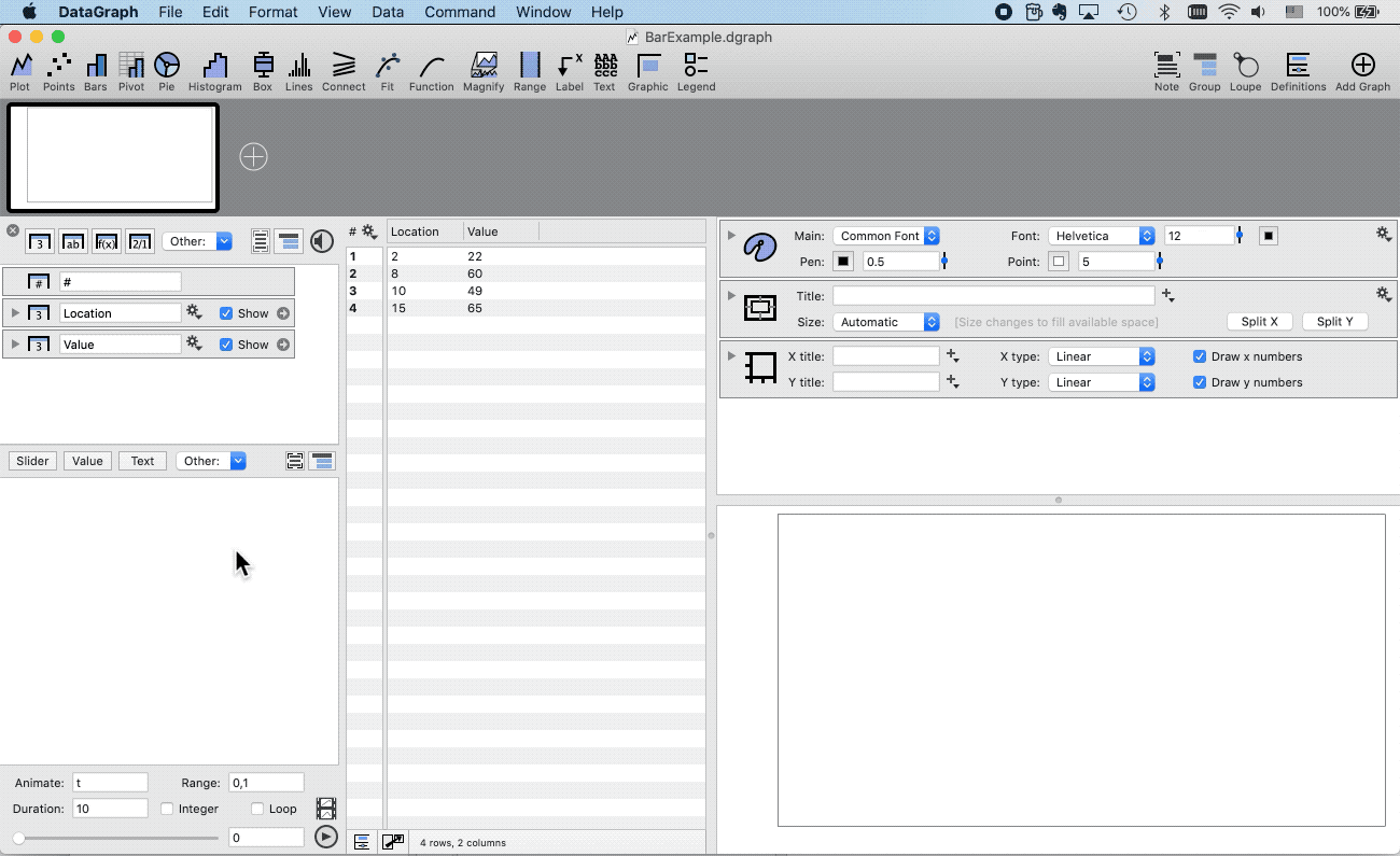
Bar command
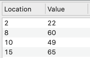
The bar location and data values are each specified in a single column.
- Highlight data columns
- Click Command menu
- Select Add Bar
- Open the command to add a Fill color
The Bar command has a lot of customization options such as varying the width, color, and start location, for each individual bar.
More: See the Bar command documentation.
Pivot Command
By default, the Pivot command will create a ‘bar chart’, grouping the data into categories.
When the Rows or Columns are set to a number column, you have the option of switching from a ‘bar chart’ to a ‘bar plot’.
Convert to a ‘bar plot’ by unchecking the Categories option.