DataGraph
-
Getting Started
-
User Interface
-
Data
-
Columns
-
Variables
-
Commands
-
Layout settings
-
Customize
-
Functions
-
Exporting
-
Scripting
-
Beta
-
Versions
-
Join the Community
Print
How to make a Scatter Graph
Updated
You can make a scatter graph using a Points command.
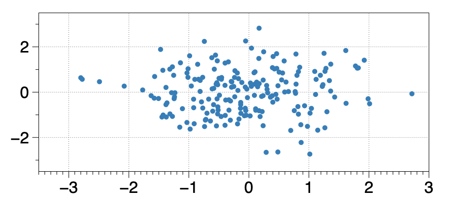
The Points command has a lot of flexibility to change the point size, color, and shape based on numerical or categorical data.
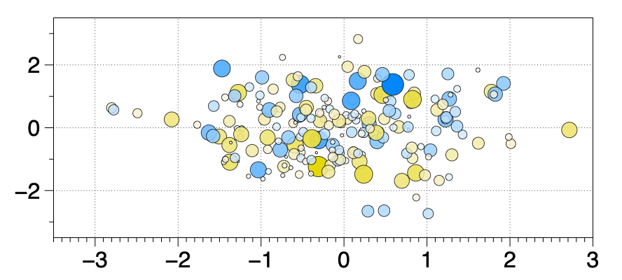
How to Fill Points with a Color Scheme
You can automatically generate a color scheme.
- Select the x-y columns — Click Plot toolbar shortcut
- Select the x-y columns — Click Points toolbar shortcut
- Open the Points command
- Set Fill to a Column (here called ‘Category’)
- Set Scheme to ‘Create Color Scheme’
Updated
On This Page