Points
The Points command draws the markers at x,y locations and has options for customizing the marker color, style, and size. Use the Points command to specify a marker at a single location or draw millions of points. The Points command is useful for creating scatter graphs, bubble graphs, or combining with the Fit command.

Single points
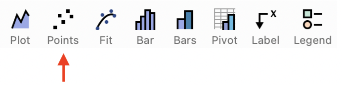
Add a Points command from the toolbar shortcut, in the Draw menu group, or use Command > Add Points.
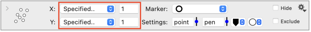
If you add a new Points command without preselecting any data, the command will draw one point at the specified (x,y) location (1,1).

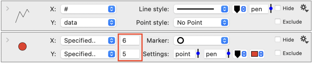
The Points command can be combined with other commands to highlight individual points. For example, here is a graph with a Plot command to draw a line. The Point command has been edited to draw a marker at (6,5).

Multiple points
Use the X and Y menu selectors to specify input data coming from columns. Here the X is set to the row number, #, and Y is a numerical column called ‘data’. This graph combines the Plot command with the Points command.
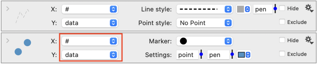

NOTE: The Plot command has the option of drawing points, but the point outline must match the line color. If you want a line plot where the color of the line and points are different, combine the Plot and Point commands as shown here.
There is no limit to the number of (x,y) locations you can include in the Points command, but there is a limit to the number that will be drawn as symbols. For example, here is a point cloud with 100,000 values, where each location is drawn as a pixel.

This limit is specified in DataGraph > Settings > Drawing Options and is set to 100,000 by default. When this limit is exceeded, the command will represent the points as pixels. If you increase this limit, the program may become sluggish when trying to draw more then 100,000 points.
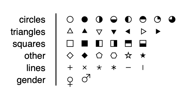
Marker
Use the Marker menu to choose from over 30 different built-in marker styles.
Settings
Size
The marker size and is set to the point variable. The line thickness and is set to the pen variable.
To change the sizes, you can:
- edit the point/pen value in the Style settings (recommended)
- enter a number directly
- enter a different variable name
- use the slider to change the value interactively
Colors
There are two color tiles for selecting the outline and the fill color, when you have a marker with a separate fill.
Variable formating
You can format the points to vary based on numerical or categorical data.

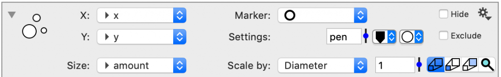
Size
The size can be scaled based on a numerical column of data. You can scale based on the X column, Y column, or you can choose a third column.
The size can be scaled by diameter or area. The pixel size for each point is calculated by multiplying the values in the Size column by a scaling factor (set to 1 by default).
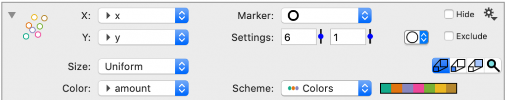
Color
The Color can be set to a color scheme. When the Marker is a solid, the Color is for the entire marker.

For markers with a separate fill, the Color setting will correspond to the outline.
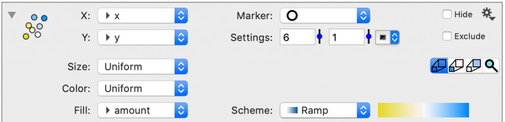
Fill
The Fill can be set to a color scheme or a color ramp.
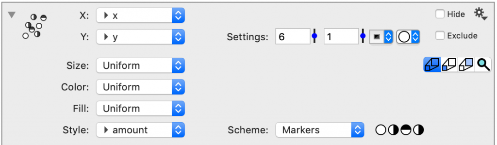
Style
The Style of the marker can be set using a marker scheme.
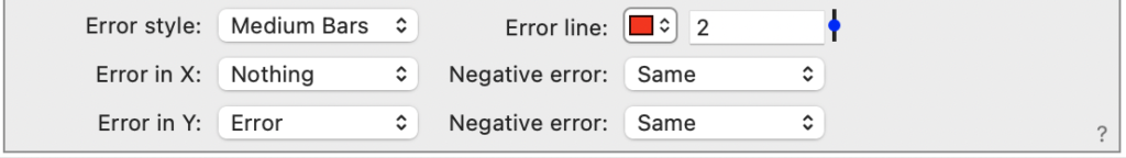
Error style
At the bottom of the command is an option for Error style that is set to ‘No Error’ by default.

After you select an Error style, the menu options for Error in X and Error in Y appear.
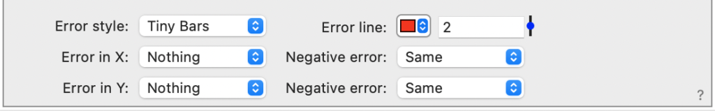
Use the Error in X and Error in Y menus to specify the extent of the error bars in either direction. By default, the error is the same is the positive and negative direction, but you can also chose different columns for each of these.
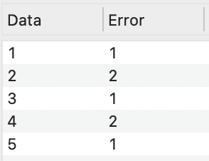
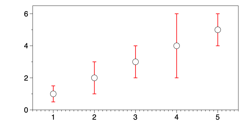
For example, here is a simple dataset with the error plotted in the Y direction.