How to add Error Bars
Several plotting commands have the option of adding error bars including: Plot, Points, Bar, and Bars.
Key Features:
- Control the style of the error bars.
- Control the direction of the error bars.
- Vary the magnitude of the bars in any direction.
NOTE: These examples assume you have the value for the error as a column in the data table. If you have raw data, calculate the mean, standard deviation or standard error of the mean (SEM) using the Pivot command or the Box command. From these commands, extract the summary statistics into the data table (use the gear menu top right). In the Pivot command, the error bar can be displayed in the graphic, without having to extract to the data table.
Bar Style
The first step to adding error bars is to select the style. At the very bottom of the Plot, Points, Bar, and Bars commands, Error Bar is set to ‘No Error’ by default.
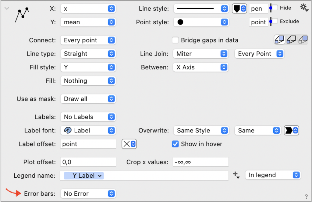
Changing this setting to select the type of bar, expands the command to show the error bar options.
NOTE: The Bar and Bars commands only have the error in the y direction (or x direction if the bars are oriented horizontally). For the Bars command, each data column will have a place to specify the error column.
One Direction
The simplest case is to have error bars in one direction where the error is uniform around the point.
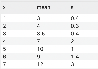
For example, consider data where you have a mean and standard deviation in the data table.
- Highlight the first two columns and add a Plot command. This will give you the following graph, where the point style has also been changed to a solid point.

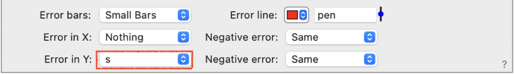
- Expand the Plot command and navigate to the bottom of the command.
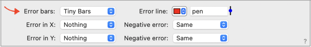
- Change Error bars from ‘No Bars’ to ‘Small Bars’.
- Change Error in Y from ‘Nothing’ to ‘s’.

Two Directions
Error Bars can also be represented in the x and y direction. These can be the same values or chose a separate column for each.
For example, here is a dataset with the error in x and y.
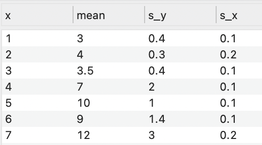
Each can be specified separately.
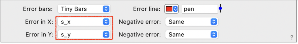
Now you will have error bars in both directions.

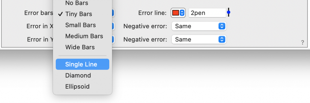
In addition to having several the bar size options, the error bars can be represented as a single line, diamond, or ellipsoid.


Non-uniform
By default, the error is assumed to be uniform in the negative and positive direction. You can also represent errors the vary in each direction.
For example, here are data where the error varies in every direction.
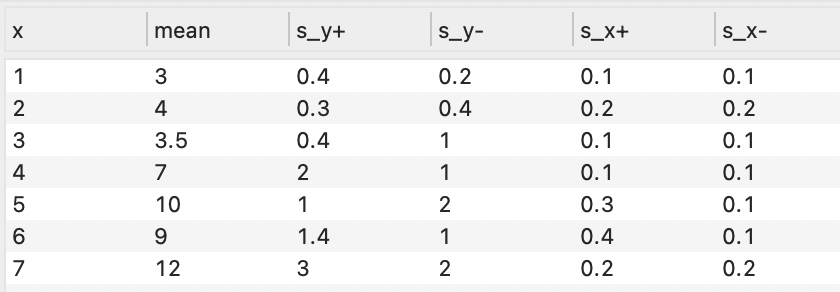
Change the negative error to ‘Different’. Then specify a column for the negative error.
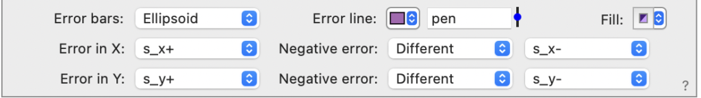
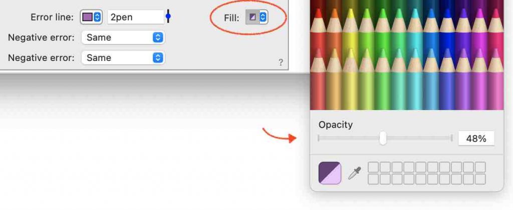
In this example, the error line color and fill have also been customized.
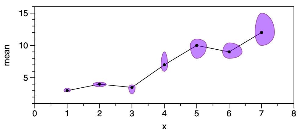
Note that when you chose the ellipsoid or the diamond a Fill color tile will appear in the bottom right. Use the Fill color tile to remove the fill, change the color, or add an opacity.