Scalar Field
A scalar field is a representation of a 2-D array of numbers, using colors to represent the numerical values, sometimes referred to as a heat map. The values can be represented using discrete colors as a continuous, smoothed surface (i.e, 2D interpolation).
Input Data
To create a scalar field, you need to provide data that corresponds to a two-dimensional regular grid. There are three types of grids that you can represent:
- Cartesian Grid – Uniform spacing, rectangular shapes
- Rectilinear Grid – Non-uniform, rectangular shapes
- Curvilinear Grid – Comprised of four-sided polygons
Here is an example of each type of grid. Despite the different shapes, each grid contains the same number of cells.

Values
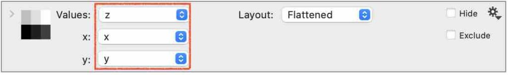
Create the command under the Draw menu in the toolbar, or from Command > Add Scalar field.
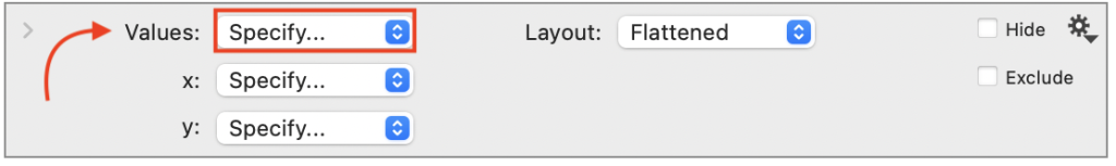
The command will look as follows, where the Values entry box is used to specify a column containing the values you want to represent at grid locations.
All the Values will be in one column and must be numbers.
To draw a scalar field, you have the specify both the Values and the Grid Layout, (ie., the X, Y coordinate corresponding to each value).
The grid location for each value can be specified in different ways as discussed in the Layout section below.
Grid Layout
The Layout menu has several options for specifying the (x, y) locations.
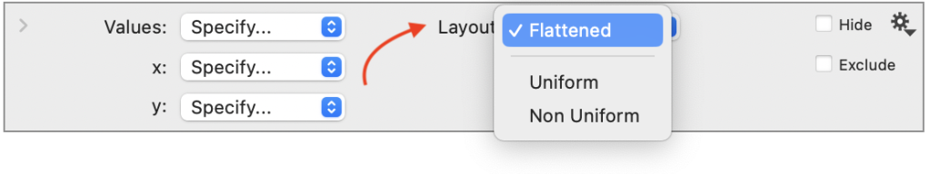
- Flattened (default)
- Uniform
- Non-Uniform
Layout = ‘Flattened’
By default, the Layout is set to ‘Flattened’ or long format, requiring columns to specify the x and y grid locations.
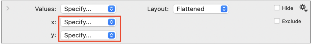
- Columns specify the grid locations for each value.
- Grid locations can be a Number, Text, or Date columns.
- Cartesian or Rectilinear grid types.
Note: If your data is not already in a long format, see: How to ‘Flatten’ Data.
Numerical Axes
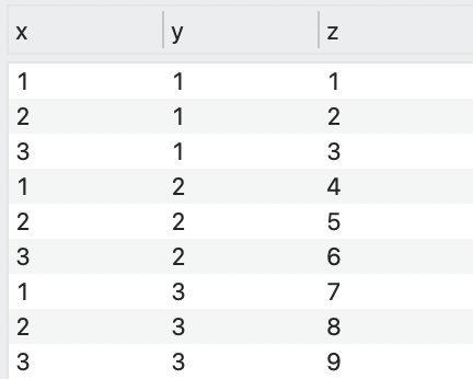
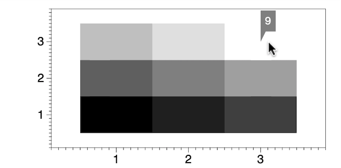
For example, consider a data set with three columns, x, y, and z. The values for x and y form a 3 by 3 uniform grid.
This creates a simple scalar field, where the color of each square is based on the value of z. By default, the colors are set to a continuous color ramp, from black to white. Turn on the hover (⇧⌘H) to view the corresponding value for each square.
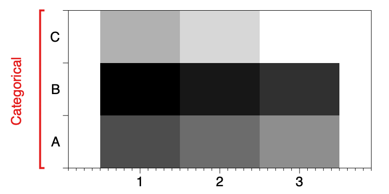
Categorical Axes
When a Text column is used for x or y, the data are grouped according to each unique entry and ordered alphabetically.
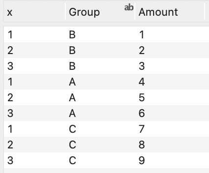
Here the y direction is set to a text column.
The axis style now shows as categorical (tick marks between categories) and the ‘A’ data is in the first y location.
Layout = ‘Uniform’
When the Layout is set to ‘Uniform’, you can specify the grid format on the command itself. This option is only for Cartesian grids.
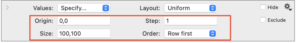
- Origin – The bottom left corner of the grid (x, y).
- Size – The dimensions of the grid (m, n).
- Step – The distance between each grid point.
- Order – Row or column first.
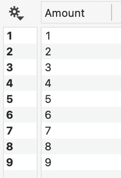
As before, the Values must be in one column.
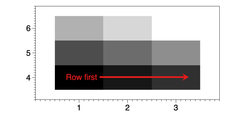
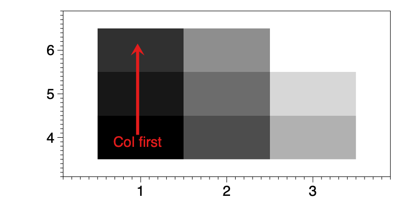
Here we set the origin to x = 1 and y = 4. The step size is 1 and the grid is 3 by 3.
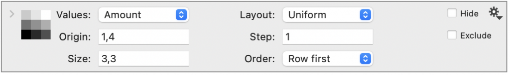
When the Order is set to ‘Row first’ the cells are filled horizontally (x-direction).
When the Order is set to ‘Col first’ the cells are filled vertically (y-direction).
Layout = ‘Non Uniform’
When you set Layout to ‘Non Uniform’, you can specify uniform, rectilinear, or curvilinear grids.
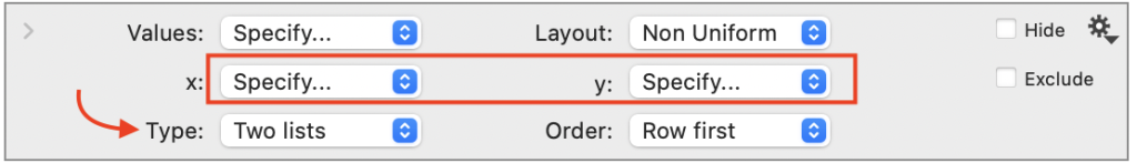
Type = ‘Two Lists’
By default, the ‘Non Uniform’ option expects two lists of x and y values.
These are the unique values of each that make up the grid. Rather than having to list them all out, you can specify the unique values of each. Using the Order, you can vary the order of the values (Row or Column first).
For example, you can specify a rectilinear grid with the following data.
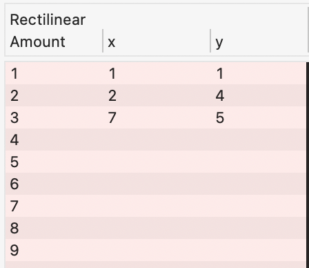
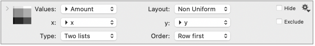
Here is the resulting graph.
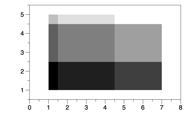
If the lists of x and y values were evenly spaced, the grid would be uniform.
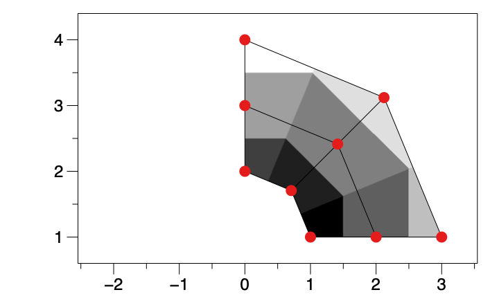
Type = ‘Array’
When you have all of the values for x and y in a column, you can change the Type to ‘Array’. For example, curvilinear grids will not have the repeating x and y values and would need to be drawn using this approach.
For example, here we have calculated an x and y value given a radius r and angle theta.
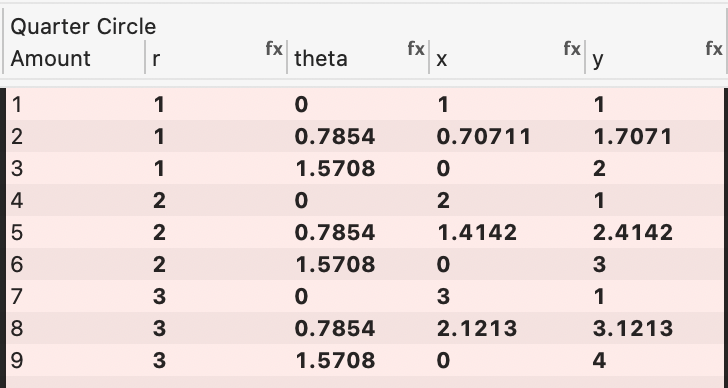
The above columns are calculated using:
- theta = π/4* mod(#-1,3)
- x = r*cos(theta)
- y = r*sin(theta)+1
In the command, the x and y columns are input as before, but here you must change the Type to ‘Arrays’ and also provide the grid size.
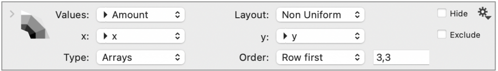
See the resulting graphic below where the grid locations are located at the red points.
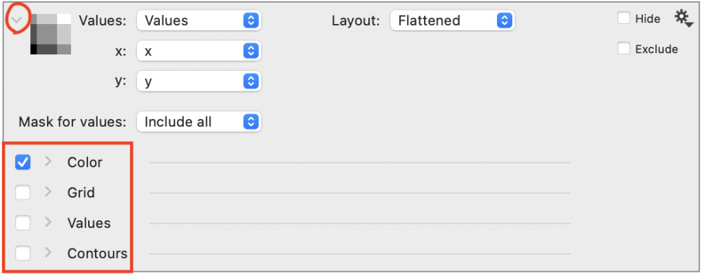
Options
Expanding the command to see options for Masking, Color, Grid, Values, Contours.
A check mark is in front of Color, Grid, Values, Contours, and each of these sections can be expanded. Check the box for these to show. Only Color is shown be default.
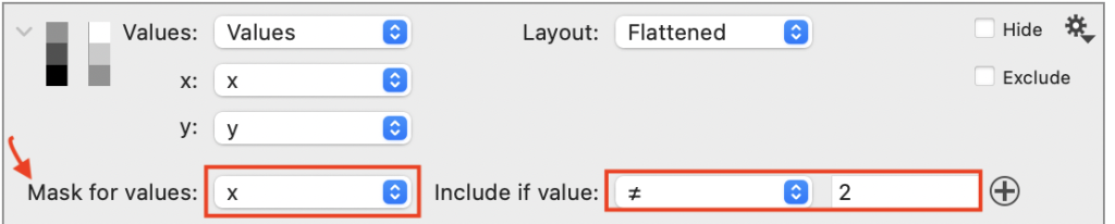
Mask
The Mask option allows you to specify data in the input, that you don’t want to show. Here we add a mask to only include data when x is not 2.

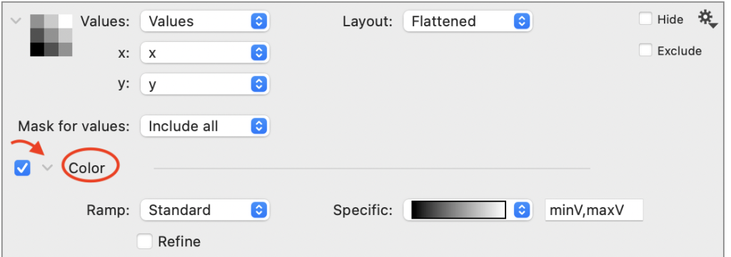
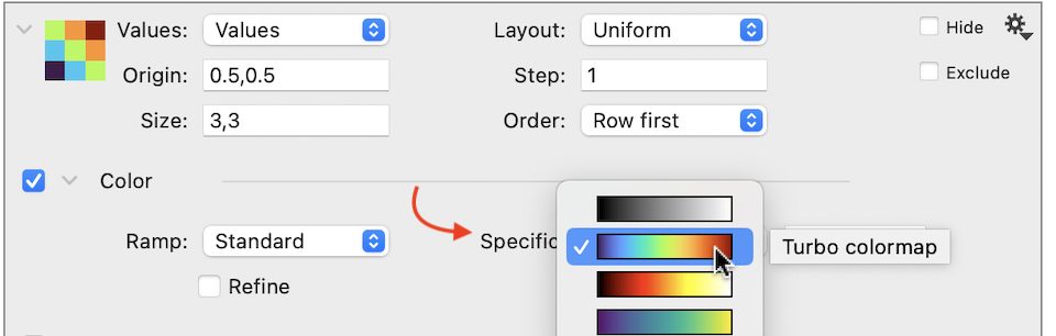
Color
There are several built-in color ramps to choose from or you can create your own custom Color ramp.
Built-in Color Ramps
By default, the color ramp is set to a grey scale but there are several standard color ramps to choose from.

Use the Specific menu to choose a different built-in ramp. Hover your mouse over a selection to see the name of the color ramp.

Refine Check Box
There is Refine below the Ramp menu.
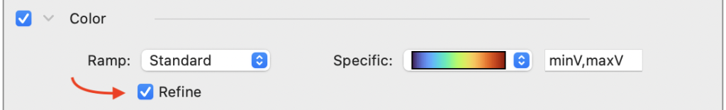
By checking this box, the values will be interpolated between each grid point. The technique used is a 2D linear interpolation, sometimes called Bilinear interpolation.

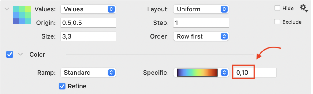
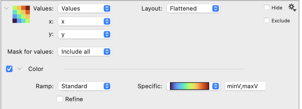
Color Ramp Range
When you select one of the built-in color ramps, the range of the ramp will be set to the range of the data in the Values (minV, maxV), but you can type in your own values.
For example, here the the minimum and maximum values are set to 0 and 10.
Here the scalar field is shown with the color ramp legend, which is explained in the following section.

Custom Color Ramps
Use the Ramp menu to select a custom color ramp. If there are no color ramps created in the file, you can select ‘Create Color Ramp’.
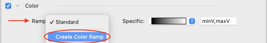
This will create a Color Ramp Variable that you can customize.
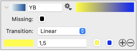

Learn about creating your own Color Ramps.
Color ramp Legend
To display the color ramp, add a Color Ramp Legend to your graphic.
A quick way is to click the gear menu on the Scalar Field and select ‘Add Color Ramp’.
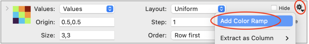
This will add the Color Ramp Legend control object, where the Source of the legend is a ‘Scalar Field’ command.
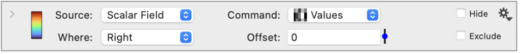
By default, the color ramp will be shown on the right side of the graph.

Using this approach ensures that the color ramp in the graph will update when you change the color ramp used in the command.
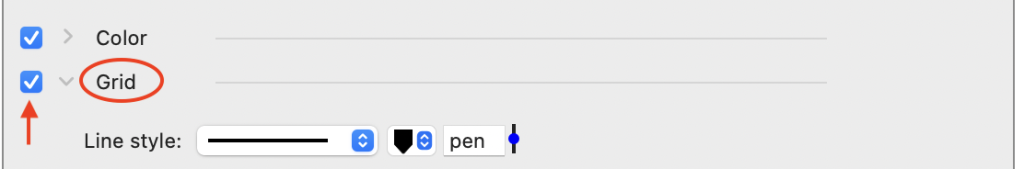
Grid
The Scalar Field command also has the option of showing a grid, and the ability to display a label for each value. This graph has both the Grid and Values checked. The Border helps to ensure that text can be read on light or dark backgrounds.

Values
Check Values to show the number at each grid location.
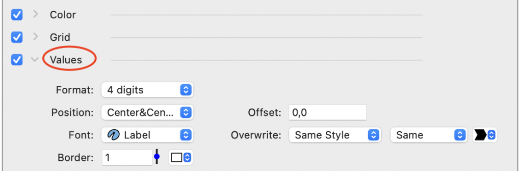
By default, the labels will have a white border so they can be seen regardless of a light or dark color in the grid.

Independently control each element: Color, Grid, Values. Here we have only Color and Values checked.

Contours
You can also drawn lines at what are called contours, lines of equal value along the scalar field.
Select the Contours check box to draw contour lines.
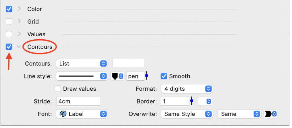
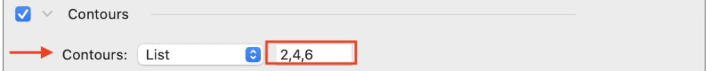
Nothing is drawn until you specify the location of the contours. Here, we type in values, but you can choose a column with values from the drop-down menu.

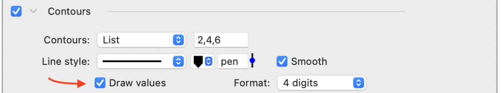
Here the values are drawn and Refine is checked in the Color section.

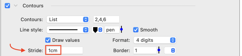
Change the Stride option to customize the distance between the labels in units of measure. If you type only a number in this box, the value is interpreted as pixels or specify mm, cm, or in.

Output
There are two types of output you can get from the Scalar field command.
- Grid locations – use the command to generate a grid, whether or not you are drawing anything.
- Contour lines – use the command to output the x-y locations across each contour line.
Grid locations
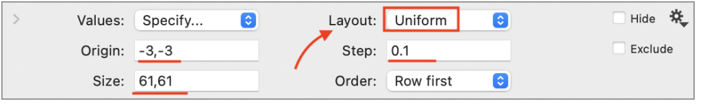
For example, if you wanted to generate two columns with an X-Y grid, begin by setting up a scalar field command with Layout set to ‘Uniform’. Then set the Origin, Step size, and Grid Size.
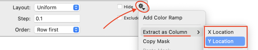
Next, click the gear menu. Select ‘Extract as Column’ and output X and Y.
One use for this is to calculate values across a 2D function using an Expression column. And then plot that using a second scalar field command.
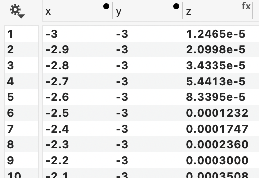
For example, here the extracted x and y values are used to calculate z:
z = 3(1−x)2exp(−x^2-(y+1)^2) −10(x/5−x^3−y^5)exp(−x^2−y^2) −1/3*exp(−(x+1)^2−y^2)
Here, z is shown using a second scalar command, where contours are drawn at integer values.

Contour lines
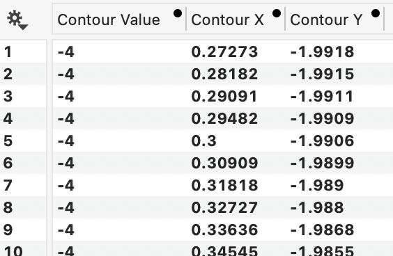
When you have contour lines created, you can also use the gear menu to extract a column of X and Y coordinates for the contour lines.
For example, here is a representation of the first few rows that are extracted from the graph above.
Here you can see the extracted contour lines from the above example, using the Plot command.

Examples
Download the example files to see how the following graphs are made.
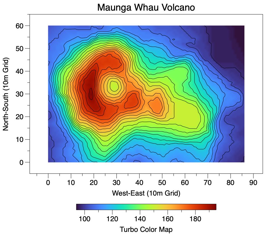
Volcano Data
The Scalar Field is used to draw example topographic data from the dataset, volcano (sample dataset in R). Contours are also added along with a Color Ramp Legend.

DataGraph Examples: CONTOUR LINES & COLOR RAMPS. Access by opening DataGraph.
Uniform Grid
The Scalar Field is used to represent a 10×10 uniform grid of data in three columns (x,y,z). A Color Ramp variable provides the color.

Download: Scalar-Field–XYZ-with-Labels.dgraph
Uniform vs. Non-uniform
The Scalar Field is used to represent a column of numbers on a uniform (Cartesian) and a non-uniform grid (rectilinear). Each image below uses the same data (z-direction), but the data are mapped to different x-y locations.

Download: Scalar-Field–Vary-Layout.dgraph
Random Field
The Scalar Field is demonstrated for a random field of 100×100 uniform grid size (x,y, and z data). A Color Ramp Legend is also displayed on the graph.

Download: Scalar-Field–Random-with-ColorRamp.dgraph
Logarithmic Data
The Scalar Field is used to visualize a randomly sampled, log-uniform distribution. To do this, the Color Ramp variable Transition menu is set to ‘Logarithmic’ to appropriately represent the data.

Download: Scalar-Field–Logarithmic-Scale.dgraph
Microarray Data
The Scalar Field command is used to visualize a microarray data set. In this case, ‘y’ is a text column (categorical variable) and the text is used to label the y-axis.

Download: Scalar-Field–Microarray-Data.dgraph
Trippy!
The Scalar Field command is used to create a square grid, represent values using a Color ramp, and draw contours. The grid is also mapped into other shapes (circle, twist, cone).

Download: Scalar-Field–Trippy.dgraph