DataGraph version 5.1 is full of additions and improvements that started with user requests. We think this version has a little something for everyone.
This page includes a link to YouTube demos, a summary of some key features, and the full release notes below.
YouTube Demos
Check out the following playlist on our YouTube Channel, where we show off new features in version 5.1x. Make sure to subscribe to see the latest demo.
Updated Function Command
Easier to draw and explore expressions with the Function command. Unknown variables are automatically added as local variables in the command detail. Set to the global variables, or use the built-in slider to explore how the function changes.

New Link to Files
Link to URL/File, online or locally. Works for comma-separated text (CSV), or JSON formatted data. Set a timed reload for data that is frequently updated or being collected over short time intervals.
You can use this new functionality to link to data saved online, such as in GitHub repositories. For example, here is a file that links to the Palmer Penguin data set.
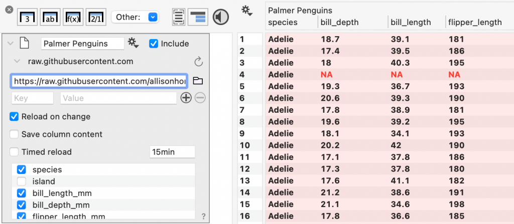
Link: https://raw.githubusercontent.com/allisonhorst/palmerpenguins/main/inst/extdata/penguins.csv
New Functions
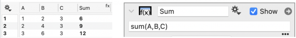
By popular demand, we added two new functions, sd() and sum(), to make it easier to calculate these parameters across columns. For example, to sum across rows from three columns A,B, and C, enter sum(A,B,C).
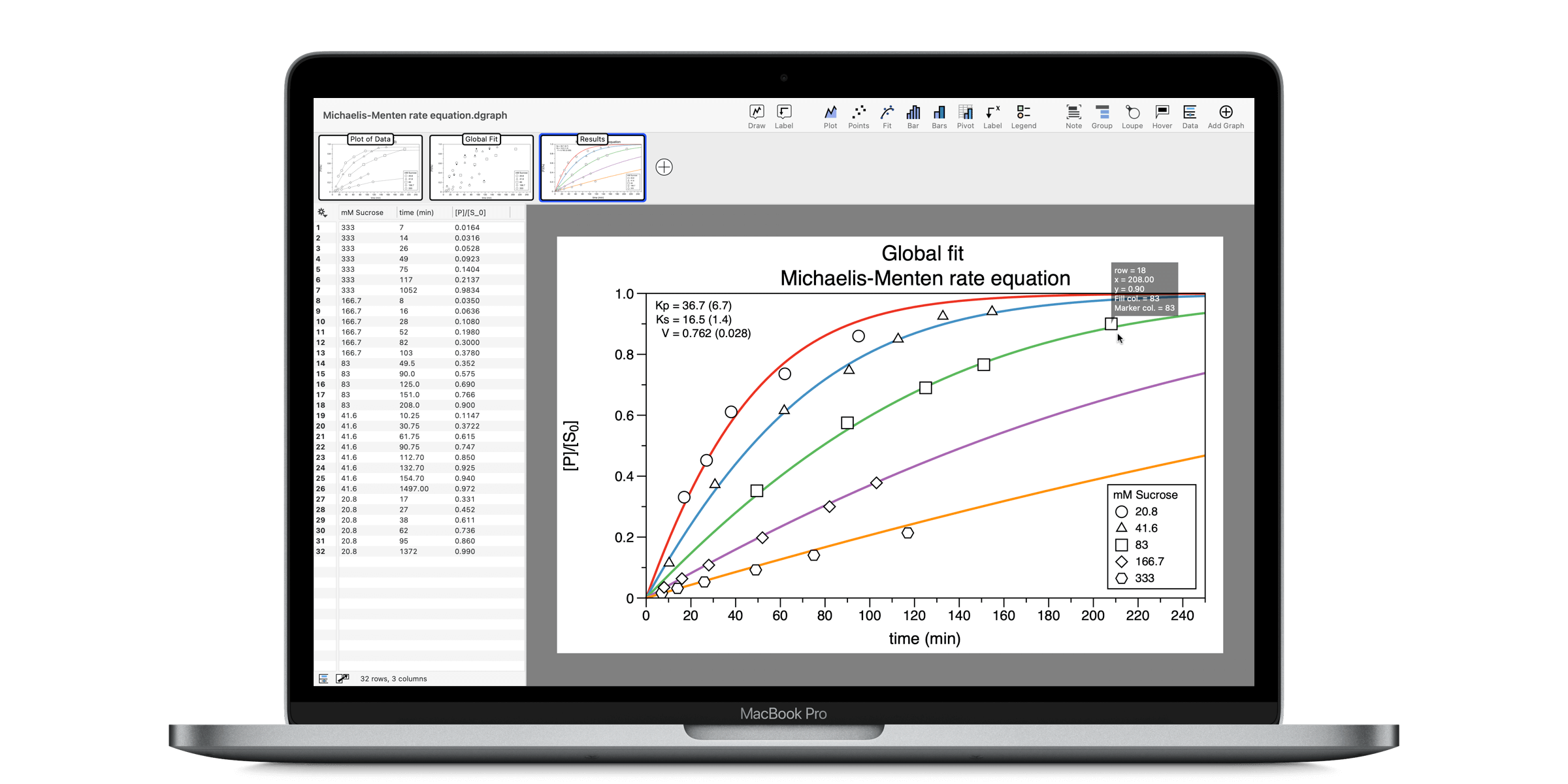
We had a request to add a special function, Lambert W., or lambertw(). This function is useful for solving a wide variety of problems, including Michaelis–Menten kinetics (Wikipedia: Lambert_W_function).
To learn about these and other functions, see our updated Function reference.
Watch a YouTube Demo of multiple input functions.
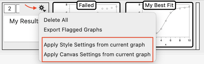
Format a Graph Group
Now you can apply Style and Canvas Settings to a subset of graphs in a Graph Group. In the past, you could apply settings to all the graphs in a file using the gear menu from the settings themselves. Now, you can select the graph that has the formatting you want to apply.
Click the gear menu on the Graph Group to select the settings to apply.
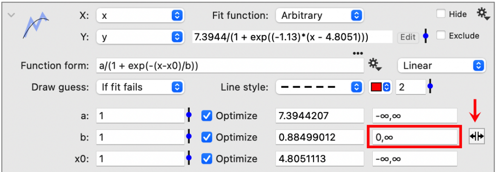
Non-linear curve fitting
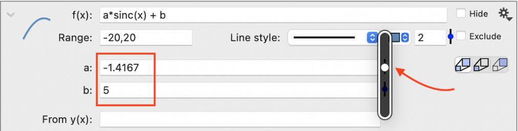
In the Fit command, the Arbitrary fit (non-linear curve fitting) now has the option of adding bounds on parameter coefficients. By default, the range is set to (-∞, ∞). You can constrain the maximum value, the minimum value, or both.
In the following example, the lower value for b is set to zero, limiting the coefficient to positive values, and providing a good fit of the data.

Confidence Intervals
For the first time, DataGraph now has a way to draw confidence intervals around a mean value. This option has been added to the Box Command. The new “Point + Interval” drawing type can display the mean or median along with different intervals, such as the min/max, percentiles, or confidence intervals around a mean.
This functionality allows you to group data and display the mean with a confidence interval.

You can also show the middle percentage around the median value. Here the median point is combined with showing all the points in the distribution.

Full Release Notes
Key Features
- Built-in Getting Started Guide.
- Easier to draw complicated expressions with the Function command.
- More built-in functions – sd(), sum(), and lambertw().
- Link to Files, CSV or JSON, locally or online.
- More options and improvements in the Box command.
- Constrained non-linear curve fits in the Fit command.
- Find and Replace (⇧⌘R) has more options, including Regular Expressions.
- Apply style and canvas settings to graph groups.
- New contour options in the Scalar Field Command.
- Option to use ‘Focus Mode’ as default under Settings.
- Visual updates for the latest macOS.
New Shortcuts
- The toolbar now has a button to turn the Hover on/off.
- Swap mode has a new shortcut (⇧⌘D).
Other Improvements
- Find (Edit > Find or ⌘F) now includes empty cells or invalid number/date cells.
- Compute standard errors using the Multivariable Fit command.
- Scalar field contours have a new smooth option (linear vs. cubic splines).
- The Violin Plot (Box command) better represents outliers.
- Extra axis is now more careful when drawing overlapping x/y axis.
Fixes
- Tokens now work for the Box command for multiple boxes.
- Fixed an issue when exporting date columns to an Excel sheet.
- Fixed an issue with logarithmic binning in histograms.
- Other fixes and improvements.