DataGraph version 5.3, we’ve improved several aspects of the program to make it easier to create and format publication-quality graphs. This includes more options for plotting categorical data, more color ramp options, improved formatting for split graphs, and more.
YouTube Demos
Our demos will show you new features in action and provide other helpful tips and examples to get the most out of new features.
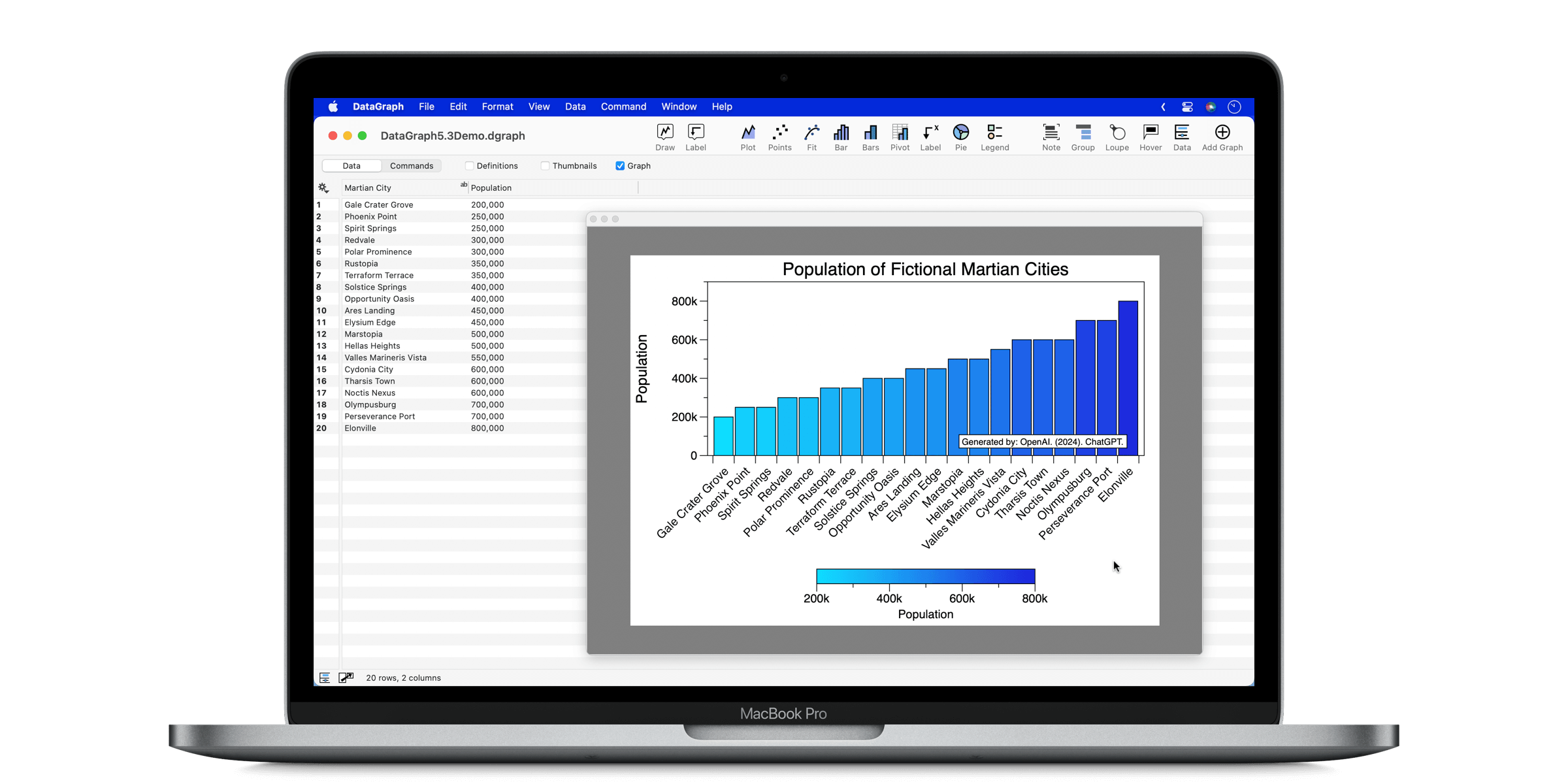
Easier to Plot Categorical Data
You can now use Text columns as direct input to the Plot, Points, and Bar commands, making it easier to make graphs that combine categorical and numerical data.

Here is an example with the Bar command.

Before this update, these three commands only accepted Number columns as input. You could customize the Axis settings to switch to a categorical axis, but now you don’t have to!
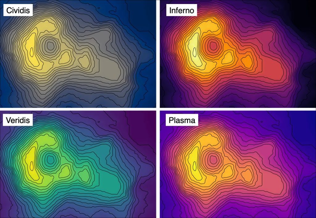
New Color Ramp Options
The Scalar field command has been upgraded with new color ramps. The old Rainbow color ramp was replaced with ‘Turbo’, an improved rainbow color ramp.
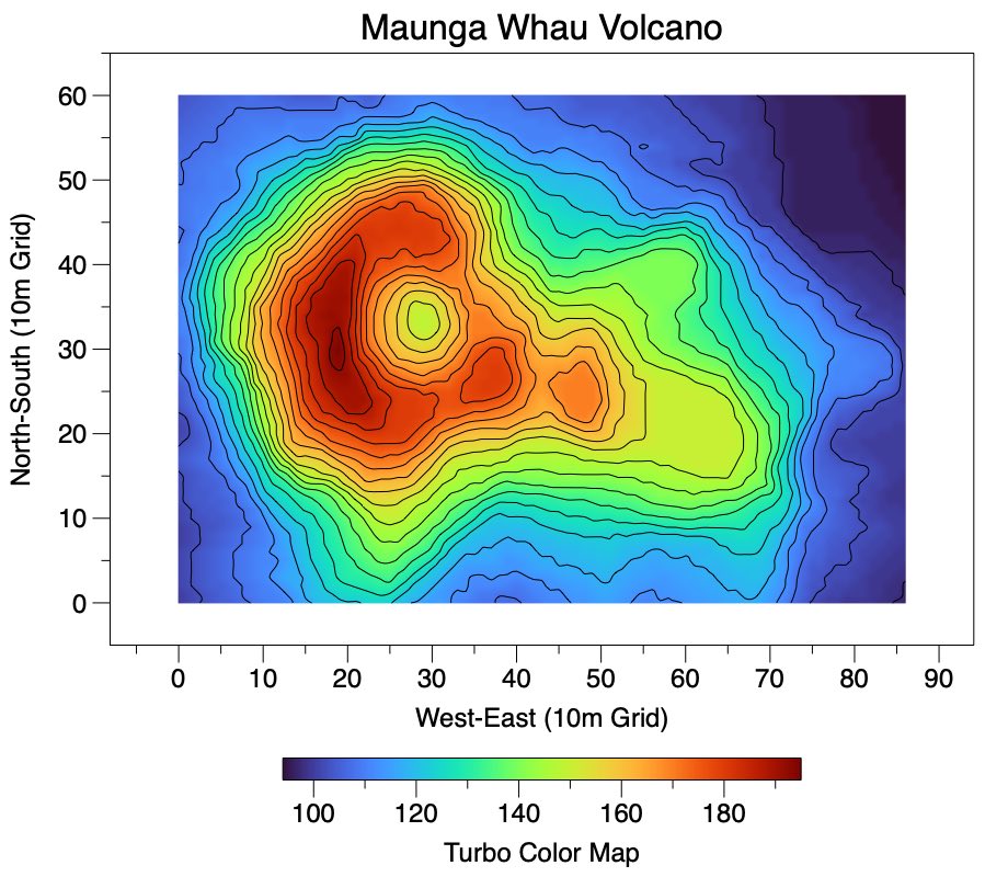
Several continuous color ramp options have also been added.
Other improvements to the scalar field Color ramp legend include:
- Automatically sets up a color ramp when added to an existing scalar field.
- Add the color ramp yourself using the gear menu on the scalar field.
- Added a label for the Color ramp legend.
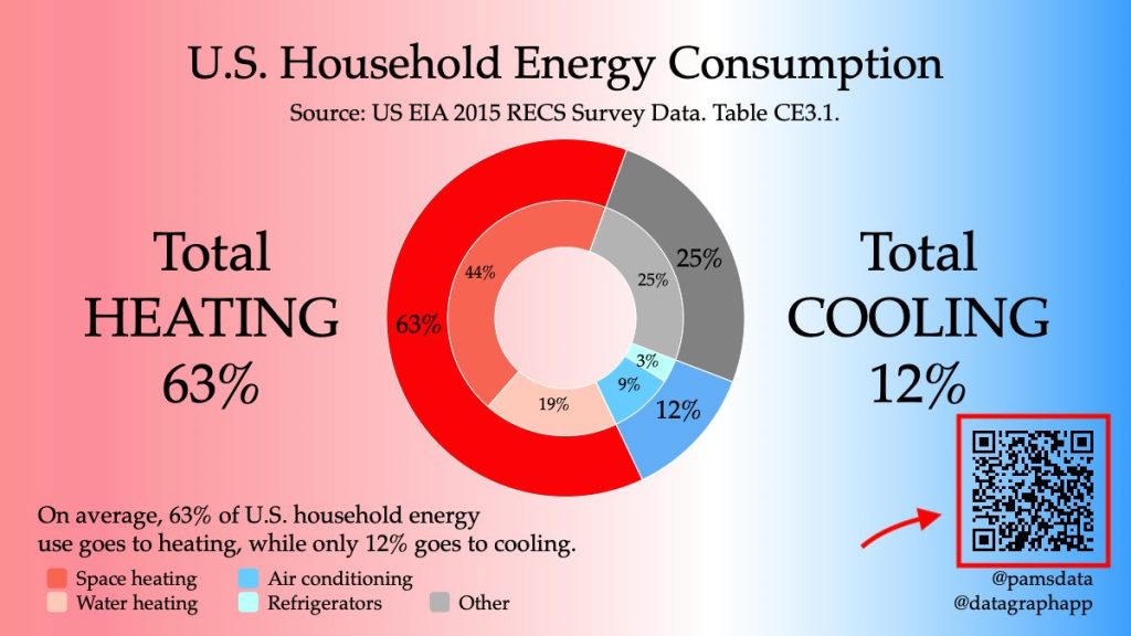
New Feature to Create a QR Code
Now, you can use the Graphic command to create a QR Code.
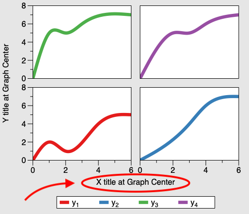
Easier Centering for Split Graphs
Added a “Graph Center” option for the Text, Legend, and Custom Legend commands, making it easier to center items on split graphs.
Better Importing from Excel
Improved “Import File…” when you don’t have any columns selected. Now, Excel documents are imported with sheets separated into groups.
Formatting Improvements
- Improved heuristics for adding padding to the axis range.
- Added a numerical format option for the token field, ignore leading 0. Now you can format 0.14 will be formatted .14, a style required by some journals for numbers that will always be below 1, such as an R value.
- The axis background is now clipped by the axis in the “Axis Box” style setting.

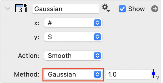
Data Smoothing
We have added a Gaussian Smoothing option for the Plot Action. Set the Action to ‘Smooth’ and the Method to ‘Gaussian’. Use the slider to adjust the standard deviation. Note that x has to be set, but it is not used in the calculation.
Fixed
- Fixed Labels in the Pie command offset properly for horizontal/vertical locations.
- Fixed an issue with binary columns and the dgraphs file format.
- Improved the Magnification command. There was an issue with exporting to PDF where the graphic changed (added a background). The problem was that it should always have included the background if you specified a fill. This only applied when the source range exceeded the current display range.
- Fixed an issue with creating a movie from a scalar field.
- Fixed an issue with the “Style set” functionality in the style settings.
- Fixed a crashing bug in the function fit command (arbitrary fit).
Leave a Reply
You must be logged in to post a comment.