Author: dgteam
-

Understanding Tidy Data
Learn how the concepts of Tidy Data can make analyzing data faster and easier. Topics include: 0:00 Introduction 1:25 An overview of Tidy Data Concepts 7:12 How to tidy your data using DataGraph: Example 1 16:41 Example 2: Billboard Dataset (remove blanks, convert data types, sorting) 29:28 BillBoard – What artist has the most weeks…
-

Data Exploration | Nobel Prize Dataset
In this webinar, we illustrate techniques for exploring data in DataGraph. Learn how to mine data using pivoting, sorting, and filtering. We use a dataset on Nobel prize winners as a use case. The dataset contains over 100 years of data on prize winners along with attributes such as gender and country. Quick Graph If…
-

Monte Carlo Analysis in DataGraph
This webinar will teach you how to conduct a basic Monte Carlo Analysis using DataGraph. Monte Carlo Analysis allows you to represent variability and uncertainly in what would otherwise be a single, deterministic calculation. This approach is used in multiple fields such as financial analysis and health risk assessment. The basic approach involves generating distributions…
-

Emergence of Electric Vehicles
In this webinar, we examine data on the emergence of electric cars. 0:00 Introduction 2:43 Overview of Datasets 10:36 U.S. Alternative fuel vehicle inventory data 26:33 Electric vehicles in Europe 32:56 Q&A – How to change from linear to logarithmic? 37:35 Q&A – How to reverse X axis for the Pyramid chart? 48:23 Next Time…
-

What’s new in DataGraph 5.0
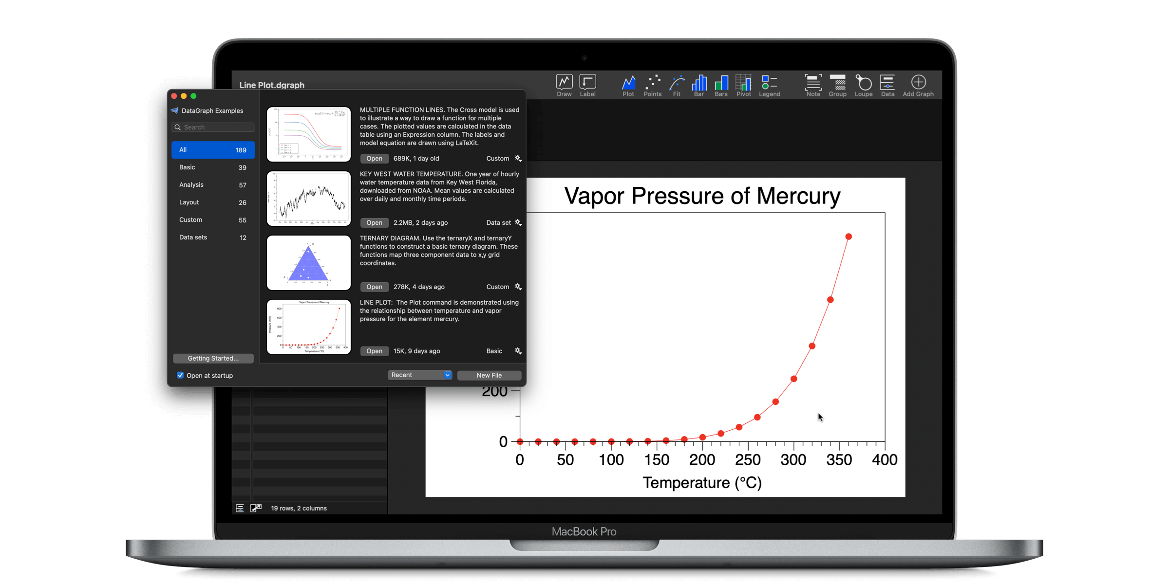
A primary goal for Version 5.0 was to make it easier for new users to get started while helping existing users to become power users! The new example file window is a big part of that effort. Version 5.0 also has a new look with a new toolbar, providing quick access to all the DataGraph…
-

Automating Tasks in DataGraph
In this webinar, we demonstrate how to quickly import data, some examples of automating common data prep tasks, along with a demo of the command line interface. DataGraph makes all of this very easy! 0:00 Introduction 1:19 Example 1 – Automated update of column headers. 5:21 Example 2 – Automated fill for row entries. …
-

Avoiding Errors in Genomic Data
Learn about the continuing problem of Excel errors in genomics data and how to avoid these errors using DataGraph. We also demo using a variable to set the duration of an animation. Introduction 0:00 Introduction New in the Beta! 4:08 New in the Beta! Watch a demonstration of using a variable to set the duration…
-

What’s new in Datagraph 4.7
DataGraph 4.7 is a significant update that works better and has a number of important tweaks and useful additions. This version features a new scalar field command and pop-up notes. We also added new options based on user’s feedback, such as text outlines for labels and drawing intermitting points in line plots. Enjoy! Key Features…
-

April Webinars: Chart Challenge with DataGraph!
This month we have been inspired by the #30DayChartChallenge on Twitter. The challenge has five overall categories and each day has a specific theme. To participate, all you need to do it post a graph using #30DayChartChallenge that is inspired by the theme of the day. Here are the DataGraph webinar topics for this month,…
-

Webinar: Creating Scalar fields in DataGraph
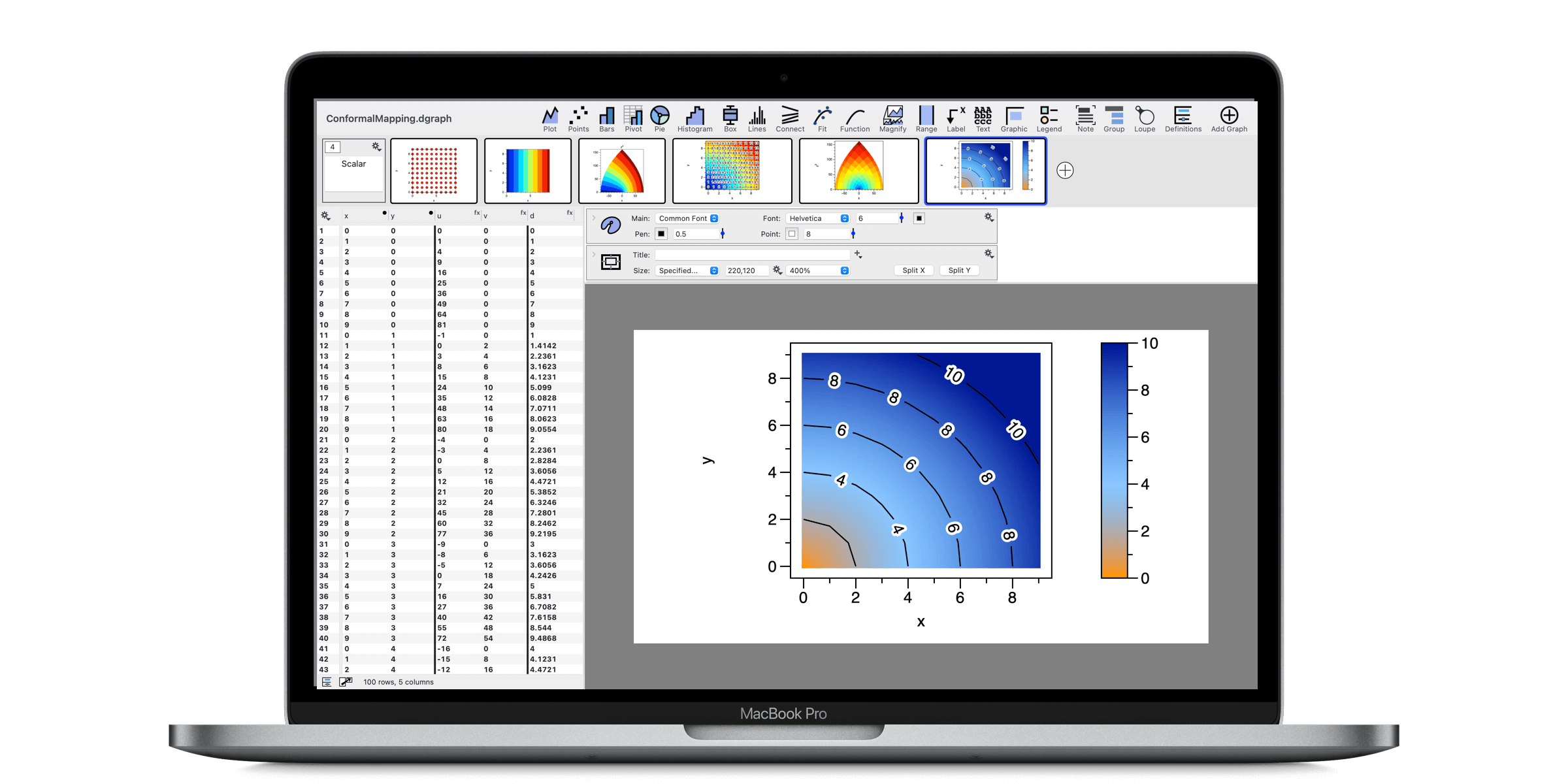
Scalar fields are two dimensional representations of data, functions, or physical quantities across a surface. For example, topographical maps are a common example of a scalar field, where the elevation at a given x,y location is represented by varying the color. Join us while we explore examples using the new Scalar field command. The command…