Mindblown: a blog about philosophy.
-
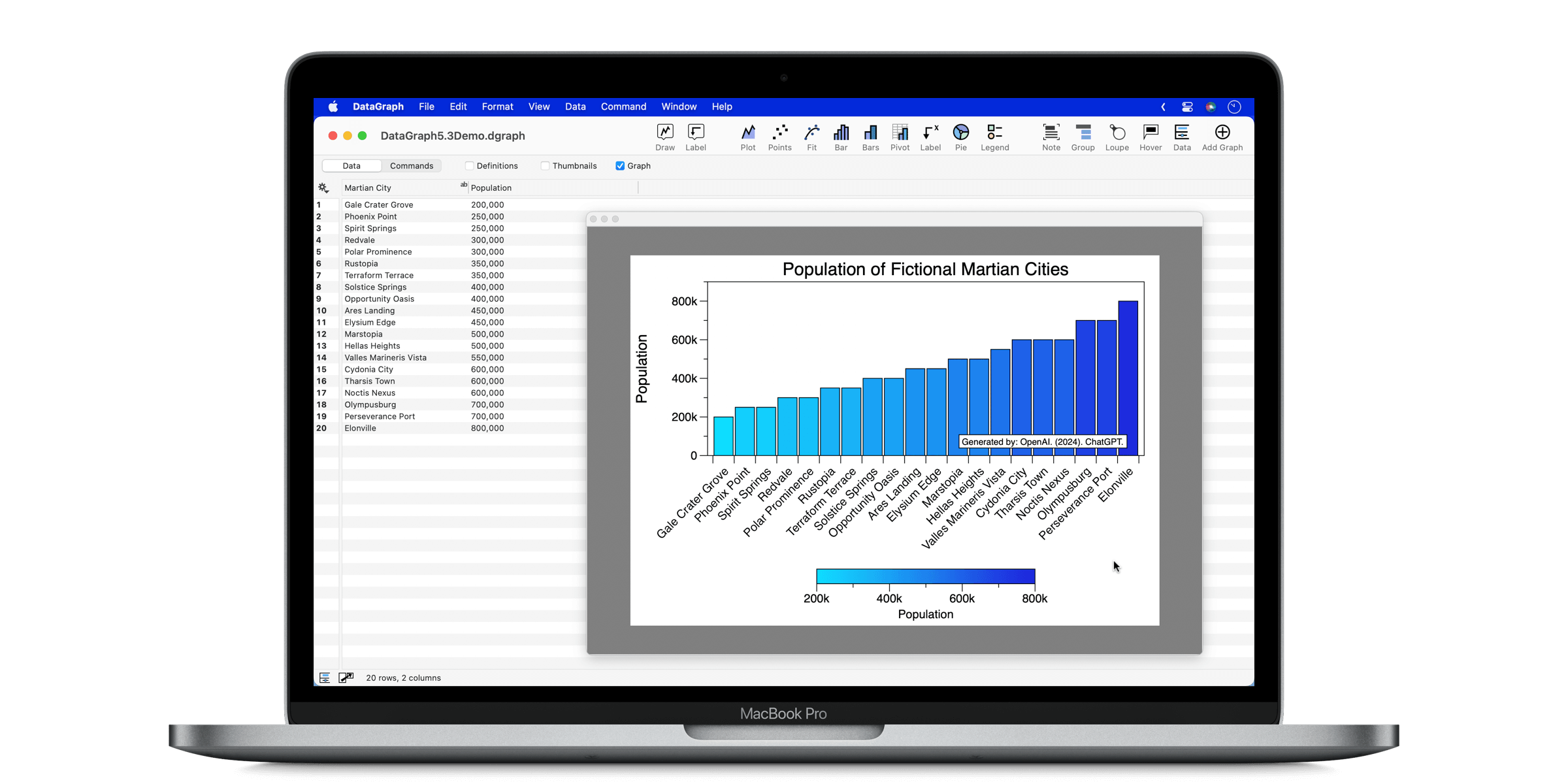
What’s New in DataGraph 5.3
DataGraph version 5.3, we’ve improved several aspects of the program to make it easier to create and format publication-quality graphs. This includes more options for plotting categorical data, more color ramp options, improved formatting for split graphs, and more. YouTube Demos Our demos will show you new features in action and provide other helpful tips…
-
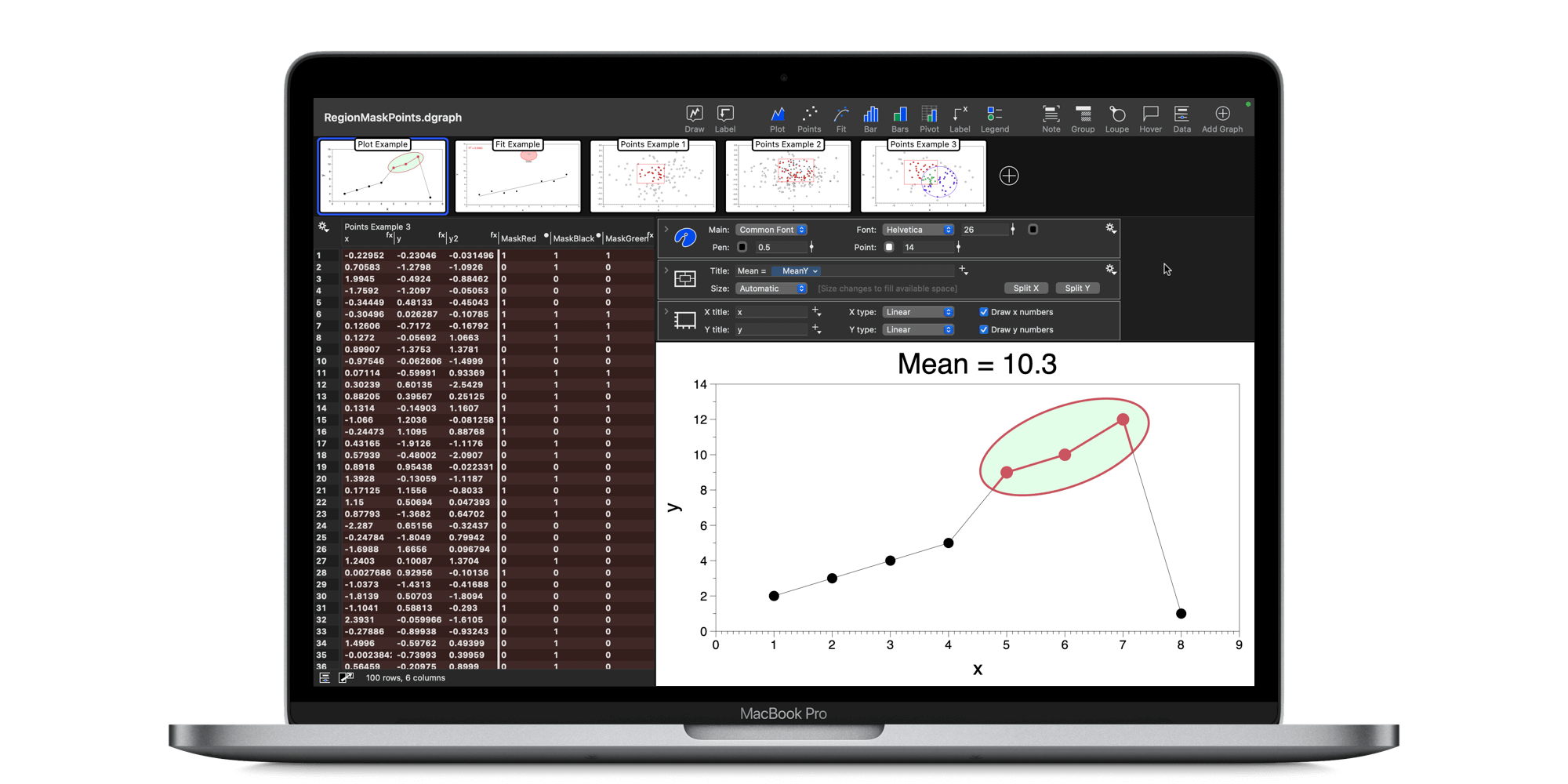
What’s New in DataGraph 5.2
The biggest thing in DataGraph 5.2 is the new single file format option. This new format makes it easier to share files and works better with cloud syncing services. DataGraph 5.2 also introduces a new capability for the Region command, which can interactively select and highlight a group of points from a graph. Check out…
-
What’s New in DataGraph 5.1
DataGraph version 5.1 is full of additions and improvements that started with user requests. We think this version has a little something for everyone. This page includes a link to YouTube demos, a summary of some key features, and the full release notes below. YouTube Demos Check out the following playlist on our YouTube Channel,…
-

Exploring UN Population Data
Description On November 15, 2022, the world population topped 8 billion people! In this webcast, discover techniques for exploring data using the United Nations World Population Prospects database. Learn to extract and filter data. Use the data to create line graphs and population pyramids. Download the example file from DataGraph: File > On-line Examples, “World…
-

Create Data-Driven Color Schemes
Description Learn how to create a data-driven color scheme. Understand the difference between, categorical, sequential, and divergent color schemes, and when best to apply them. Use the built-in color scheme variable in DataGraph to quickly build a color scheme or create your own. The color schemes in DataGraph were developed ColorBrewer2.org. Learn more about the…
-

Create a Custom Graph Theme
Learn how to create a custom graph theme. DataGraph has a style sheet approach that lets you separate the graph options from the style of a graph. Customize colors, backgrounds, gridlines, tickmarks, and more to create your themes. Create styles and themes that can be appiled to new graphs and moved between files. This webinar…
-

Create a Moving Bubble Animation
In this presentation, you will learn how to create a moving bubble animation, from start to finish. Topics 0:00 – Introduction 2:26 – Overview of GapMinder Example File 4:45 – Summary of Steps 7:45 – Step 1 – Get and Prepare Data 21:14 – Step 2 – Plot and Animate 31:05 – Step 3 –…
-

Engage Your Audience with Dynamic Presentations
Learn how to turn static graphs into dynamic presentations of data. Topics 0:00 Introduction 6:20 Basic examples of data reveals and data highlighting 10:38 How to create reveals in DataGraph to export into Keynote/Powerpoint 14:29 How to use Presentation Mode 18:35 Example 1: Reveal with a set variable 23:10 Example 2: Animation variable for bar…
-

Great Looking Graphs for Presentations
Master the settings needed to ensure your graphs look great when used in a presentation. Topics 0:00 Introduction 1:02 Presentation Tools 3:58 Three Rules for Good-looking Graphs 7:58 Rule 1: Use Vector Graphics (or make sure dpi is high enough) 20:10 Rule 2: Use Consistent Scaling 27:50 Rule 3: Use Transparency 36:07 Q&A Description We…
-

Understanding Tidy Data
Learn how the concepts of Tidy Data can make analyzing data faster and easier. Topics include: 0:00 Introduction 1:25 An overview of Tidy Data Concepts 7:12 How to tidy your data using DataGraph: Example 1 16:41 Example 2: Billboard Dataset (remove blanks, convert data types, sorting) 29:28 BillBoard – What artist has the most weeks…
Got any book recommendations?