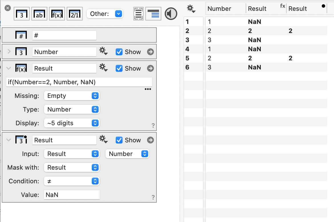
Works like a charm! Thank you for this recommendation. I have never used a Mask column, just masking within plots. I learn something new every time I use this application and I LOVE IT!
Thanks!
Kirk
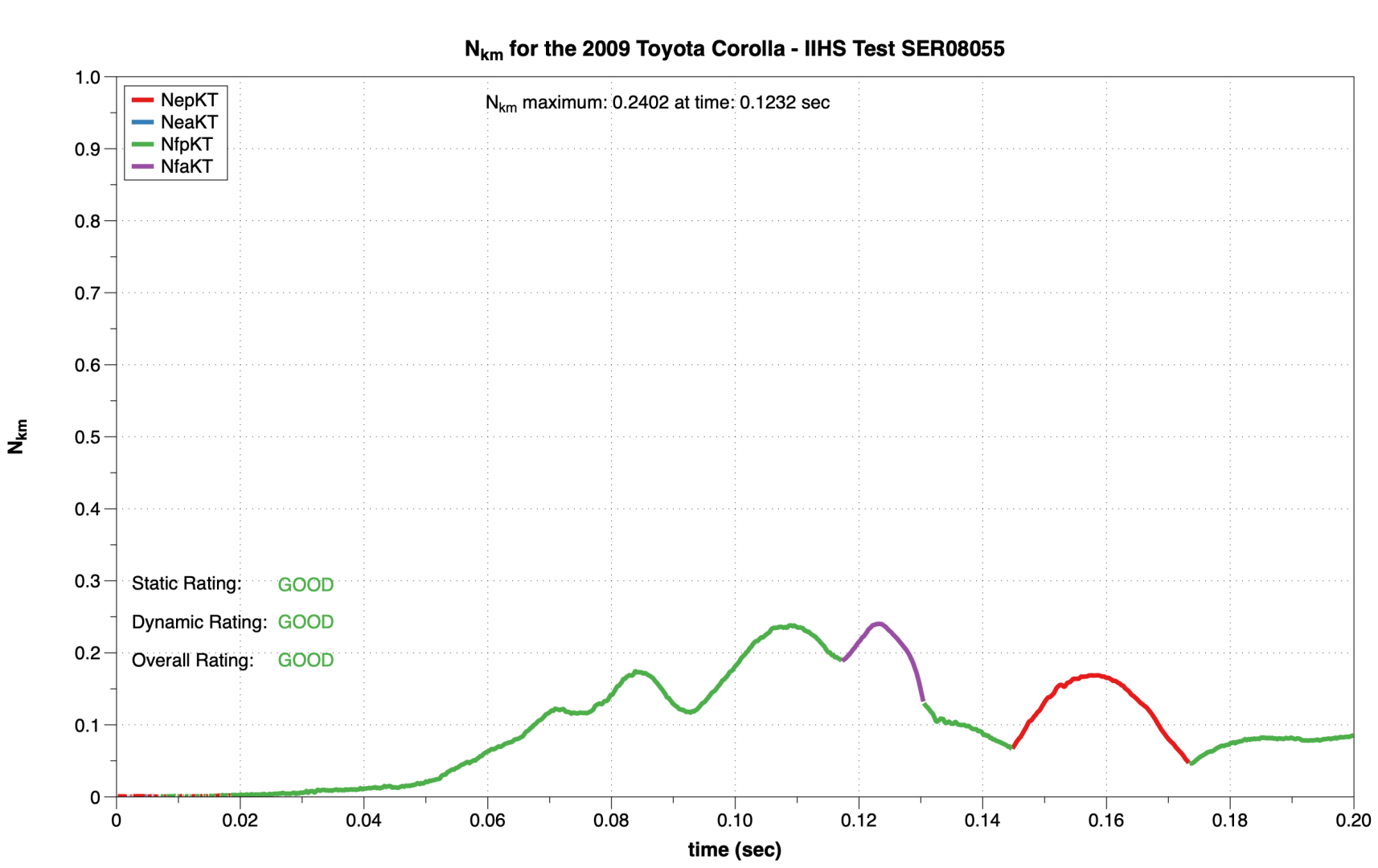
PS – some additional context. I am using DG to analyze automotive crash test data, including computing some calculated measures of injury tolerance. For one parameter, there are four combinations of calculated values, depending upon when the time history of the head upon the neck response generates anterior (“a”) or posterior (“p”) shear force (Fx) and depending upon whether the sagittal bending moment (My) is in flexion (“f”) or extension (“e”). I use conditional expressions to parse the four conditions (ep, ea, fp, fa), calculate the value for that point in time – if the condition is satisfied, then the value is computed, otherwise, NaN. This permits me to plot four separate conditions in a single plot with four colored segments depicting the particular condition at any point in time (First figure below).
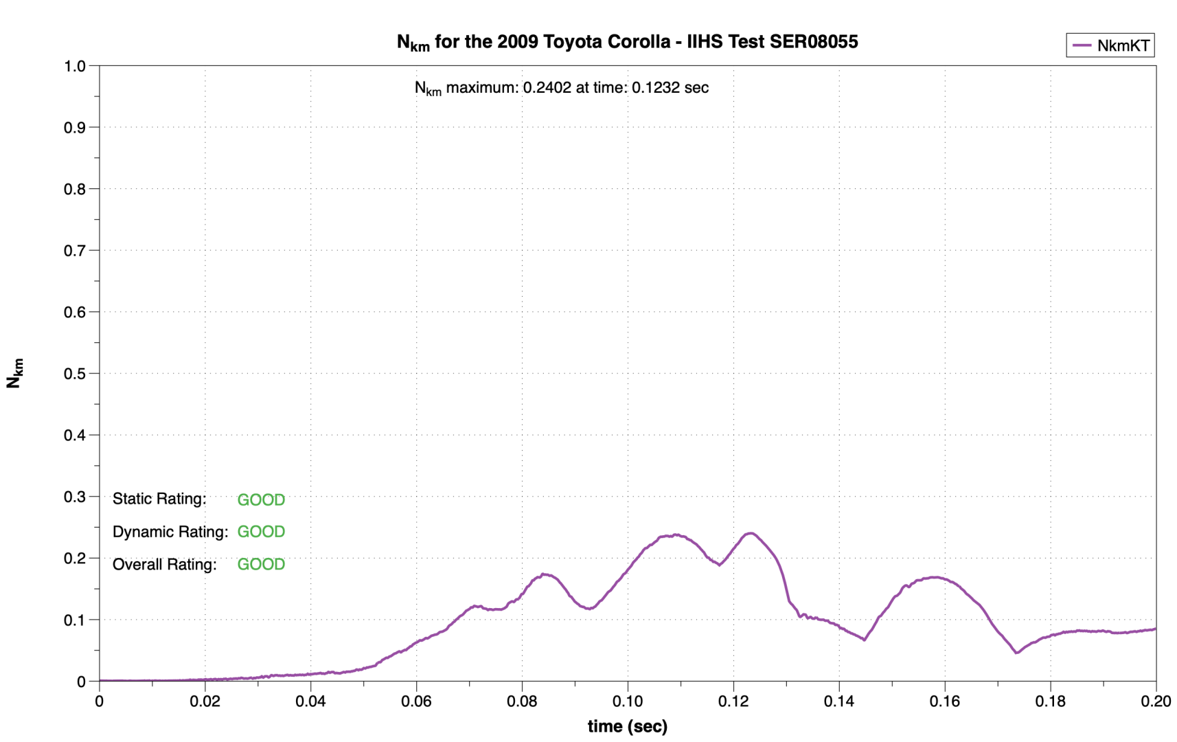
Combining the four curves into a single curve, via the operation you suggested, provides a master curve from which I can pick the maximum value across the entire time history of the data (Second figure).
The calculations in DG have been validated against R code I have written, as well as the calculated value produced by the test facility.
kirkt.
 kirkt
 dgteam