How to filter data in columns?
Welcome to our Forums › Technical Support › Support Desk › How to filter data in columns?
- This topic has 12 replies, 2 voices, and was last updated 3 years, 9 months ago by
petercreate.
-
AuthorPosts
-
June 24, 2020 at 12:44 am #4404
petercreate
ParticipantIf I want to select some specific data from a column, how can I manage this in the DG? I remember I can do this with the filter function in Excel and then I get what I need from some attributes I choose, and it’s also possible to do this in R with $. I can’t find the similar function in the DG, yet. Does it have or not?
June 24, 2020 at 10:49 am #4408 dgteamModerator
In DataGraph, you can filter data using masks. There is a simple example in the following article showing how you apply a mask in a command: How to Select Data
You can also apply a mask on a group of commands (Command group) or use the Mask column. You can also extract data that has been masked in a command back into a data table, to make a smaller table.
You can filter using on text, number, and dates.
June 24, 2020 at 12:30 pm #4410ParticipantThanks. I practised all recommendations. It’s not possible to choose what I need from a column associated with rows. For example, I want to choose a few countries with cases and dates in the Covid dataset. Simply with the mask command, I cannot make that.
June 24, 2020 at 2:46 pm #4423dgteamModeratorWe added more examples to the Command group article on applying Multiple Criteria, to show how to apply multiple criteria and to nest different types.
You can also use variables like the Text Set in the masks to have a menu to select countries.
Does that help?
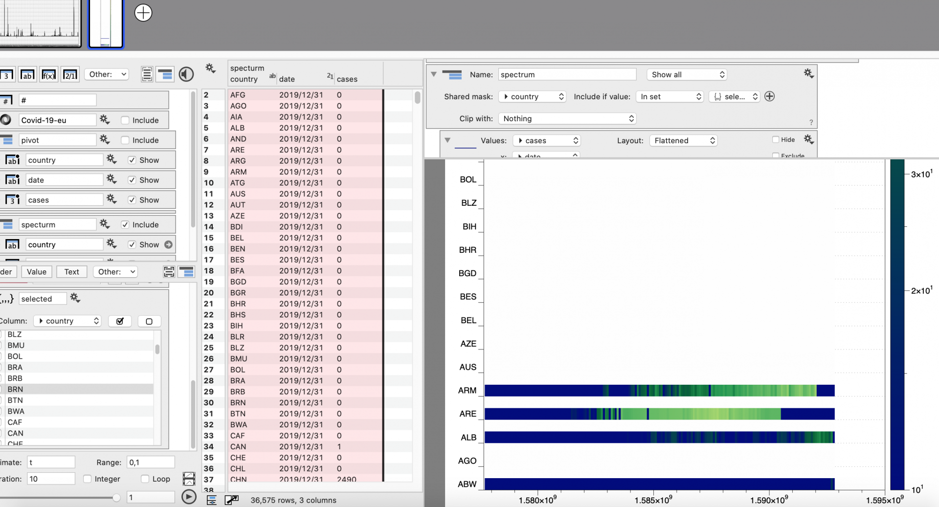
June 25, 2020 at 4:15 am #4424ParticipantThanks for your reply. They helped a lot. I made progress on my chart as shown here.
An emerging question is how the program can dynamically update the country axis avoiding showing the unselected country codes and make the x-axis show real dates instead of numbers.
 June 25, 2020 at 6:12 pm #4425dgteamModerator
Looks like a very interesting graphic! This looks like the new Scalar field correct?
The mask should remove these categories completely, so this looks like something we need to fix for the command before we add to the release version. What you can do now is to use your Text set to create a Mask column of the input.
We tried that with a simple example and it seemed to do the trick.
To show a proper date axis, try adding a command that understands dates like the Points command and hide it from view.
 June 26, 2020 at 3:14 am #4428Participant
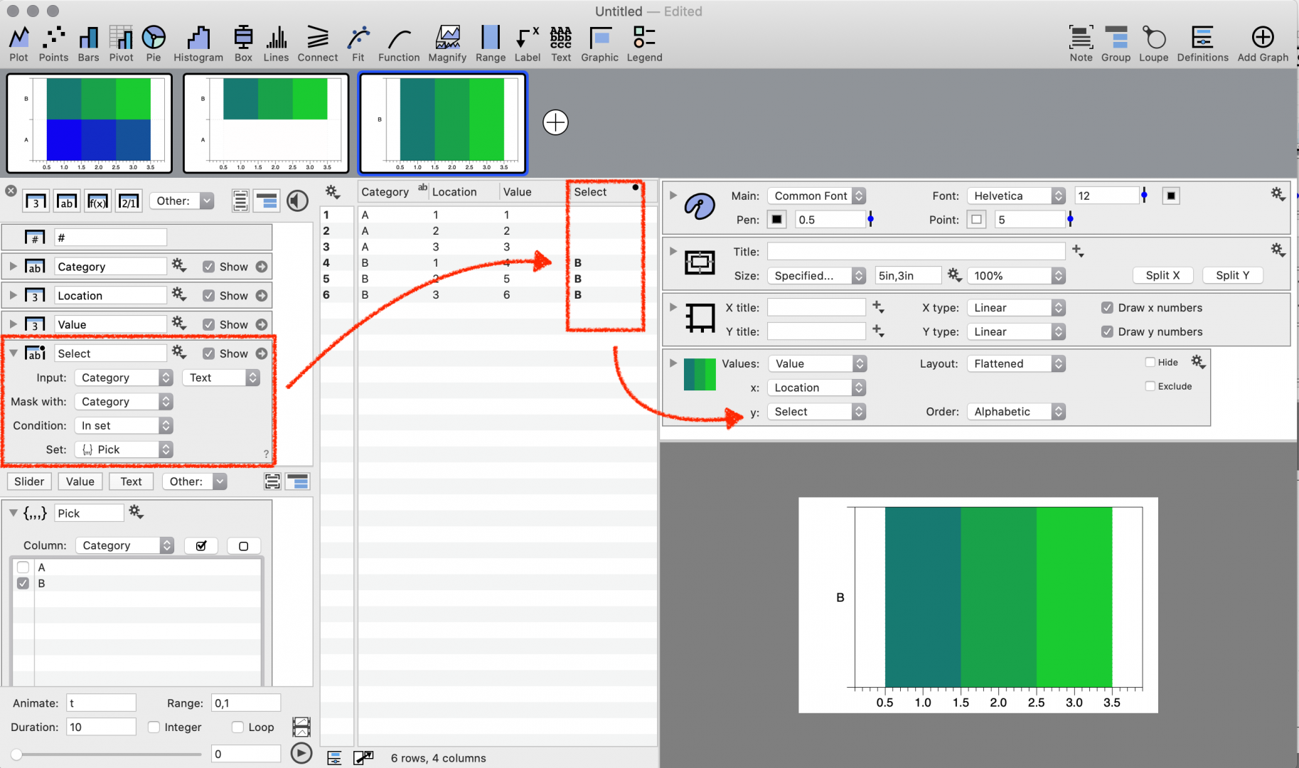
Looks working. But I was stuck at the first step. How could I get the data I marked in the picture? It was generated as a text column and in action or from command?

—–
I get it. I used the “add scalar field” command and followed the instruction you showed. The point I missed was using the mask command to create a select column. The points command allows creating new date labels covering the previous numbers. A great and flexible tool!

————-
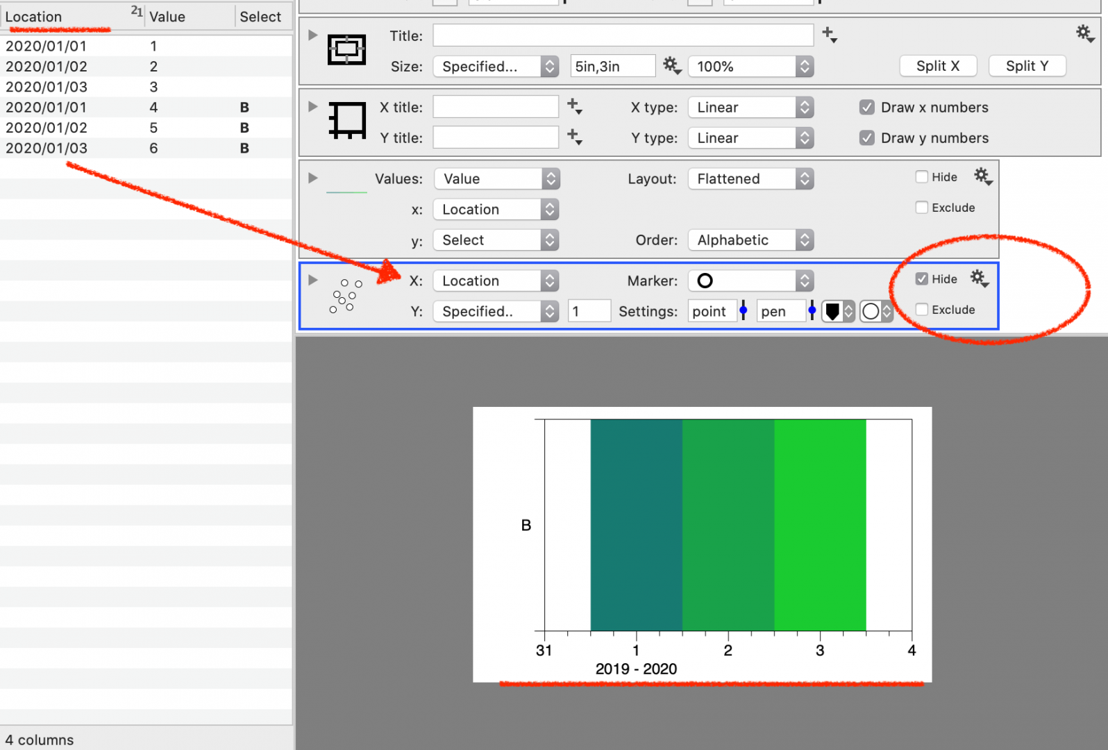
The updated post is about the link between pivot values and those extracted “from command”. When the data column is in date format, the extracted data from the pivot column will be arbitrarily converted into numbers, which can not be converted back to dates. This will not allow automatically making a plot shown above but having to make a workaround by copying the date column in numbers and converting them to date. After all, the plotting workflow is not all connected to .json source data. That is my experience in doing this. Maybe the coordinator has a way out.
-
This reply was modified 3 years, 9 months ago by
-
This reply was modified 3 years, 9 months ago by
June 26, 2020 at 6:00 pm #4432dgteamModeratorYes, the From command column does not format dates, so you see the raw number value behind the data.
We may be able to have the dates show properly in the future but here is a work around.
1 – Add an Expression column and enter the name of the column you extracted.
2 – Change the Type to ‘Date’
 June 27, 2020 at 8:10 am #4435Participant
Thank you. The workaround can manage this only if you operate manually when the data updated every day. However, it’s not possible to link the whole process with the source data. I’ll have to wait for future fixing.
June 27, 2020 at 6:23 pm #4436dgteamModeratorYou should be able to get this to work from the source data, and have it all updated automatically. Using the expression column on the extracted values will update automatically and convert to dates. Thus, you do not need to copy the date column to numbers and convert them to a date. Feel free to email us the file, maybe we are misunderstanding, but this should work.
-
This reply was modified 3 years, 9 months ago by
-
AuthorPosts
- You must be logged in to reply to this topic.
Welcome to our Forums › Technical Support › Support Desk › How to filter data in columns?