How to make a Multi-color Bar Graph
Make a multi-colored bar graph using DataGraph.
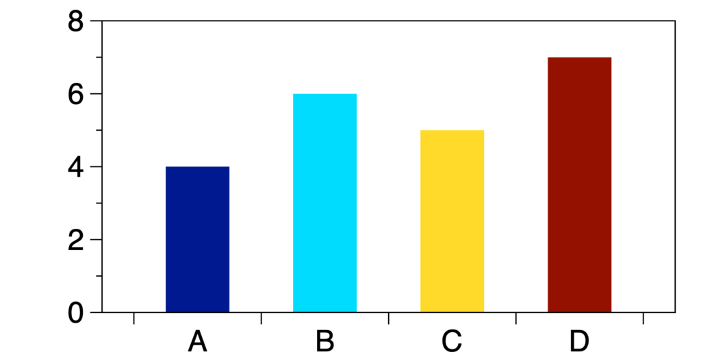
For this example, the graph will have categories on the x-axis, like a standard bar graph, but each bar has a different color.
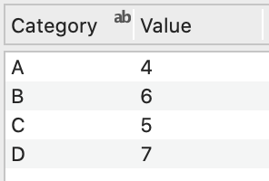
Input Data
For this example, you need two columns.
Create the Graph
There is no one command for making a multi-colored bar graph with categories for axis labels. Instead, use two commands. The Bars command changes the axis to categorical. The Bar command has the flexibility to draw multi-colored bars.
Axis Labels
Start by creating a single-color bar graph using the Bars command.
- Highlight the text column (on left) and number column (on right) in the data table.
- Select Command > Add Bars or click the Bars command shortcut in the toolbar.
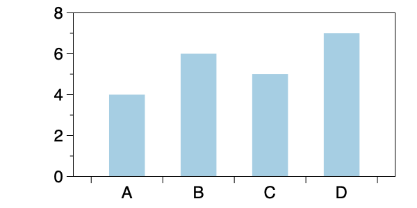
NOTE: Instead of using the Bars command, you could change the Axis settings. Here we suggest using the Bars command as a quick way to get the desired format.
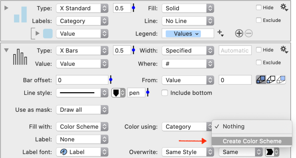
Fill Colors
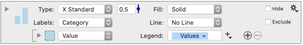
Next, add a Bar command and fill with a color scheme.
- Highlight the value column.
- Select Command > Add Bar.
- Expand the command.
- Set Fill with to ‘Color Scheme’.
- Set Color using to the ‘Category’ column.
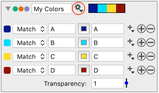
- Select ‘Create Color Scheme’.
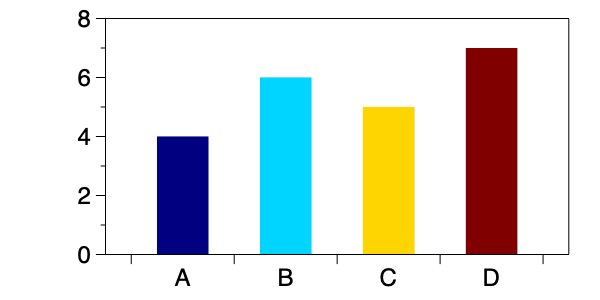
Now the fill color changes with each ‘Category’ based on the color scheme variable.
To access more color suggestions, click the gear menu on the color scheme variable.
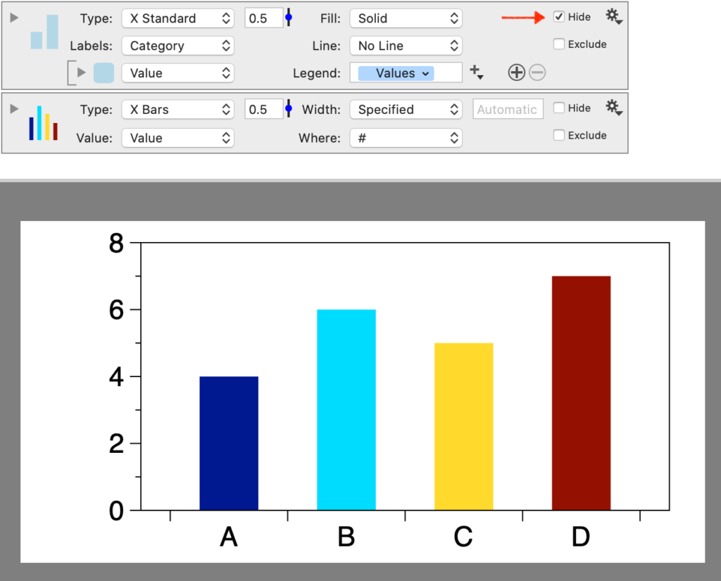
Drawing Order
Because of the drawing order, the multi-colored bars are drawn above the light blue bars. You can also hide the Bars command completely.
Video Demo
Here is a one-minute video demonstration. At the end of the video, notice how the axis labels change to the numerical scale when the Bars command is Excluded.